My Favorite Things from the Annual Kips Bay Decorator Show House 2018

Well better late than never! I've been wanting to share my Kips Bay Show House tour with you since forever, but have been side tracked with my full-time job-- what a pesky little nuisance it's been (not the helping people part, the amount of time it takes from my day part). Thankfully I'm planning to go part-time in the fall, and should have more opportunities to do things for Trulery, like keep up with the blog, see consulting clients, teach, and do research on dress and emotional functioning. I'm really excited about getting the chance to do  different things so I'll keep you posted. But back to the Kips Bay! This year I went back with my friend Maribel fully expecting to see fun, quirky, and chic designs I can steal. I brought my camera this time, but of course neglected to take my wide angle lens, making it kind of difficult to capture full rooms or wider spaces. So instead of featuring full rooms, I've captured favorite aspects of rooms I really like-- which is what I'm usually drawn to anyway when I go to show houses. I look forward to taking bits and pieces of rooms I can store and use in my own space.

This year's show house was beautiful-- a 19th century Upper East side mansion originally designed by August Hatfield in the neo-Grec style (think stately Brooklyn brownstones with simple lines and incised, carved ornamentation). This year there were lots of lady-like spaces with Chineoiserie, mixed in with edgy, alluring, and colorful interiors. Here are some of the spaces that caught my eye.

Kips Bay Katie Ridder.jpg

This room, simply entitled "Bedroom" was designed by Katie Ridder. It feels sweet and inviting with it's bohemian mix of prints, textures and styles. I really appreciated the stenciling on the walls. It didn't feel hokey, and was a crafty way to add visual interest to the top part of the room, which kept it from being too bottom heavy.

Kips Bay Katie Rider 2.jpg

Here is the other side Ridder's room. It's modern, fancy, and proper with the mirrored wall making the space feel more expansive and dramatic. The abstract, modern artwork ties in all the colors nicely.

Kips Bay David Netto Design.jpg

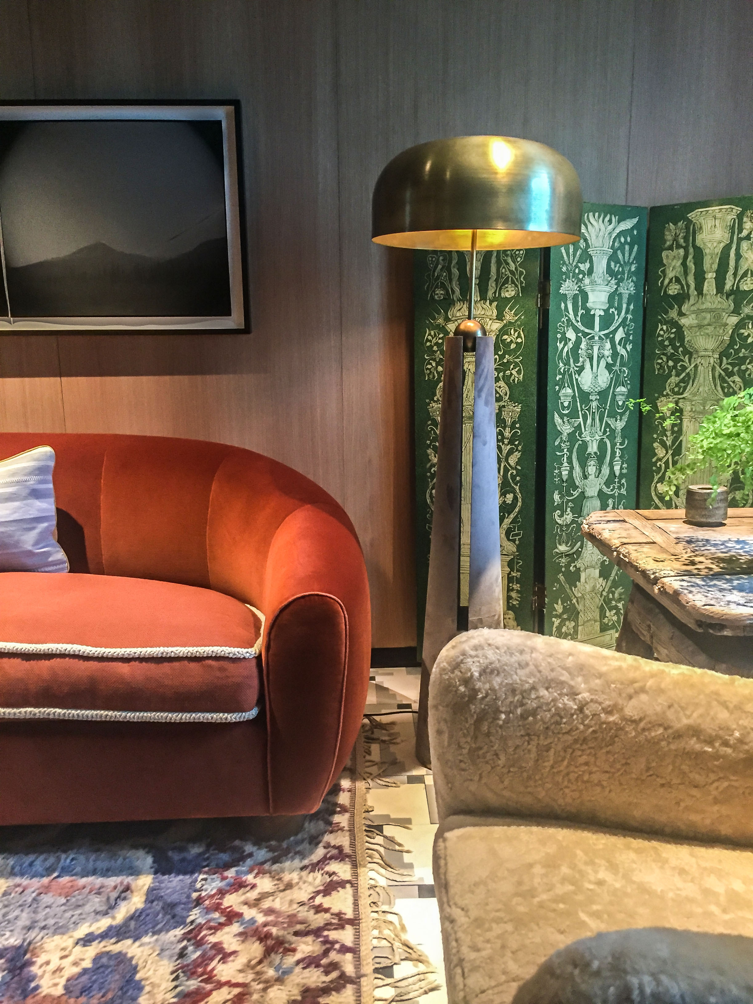
There was a lot going on in this room and I found it quiet enjoyable (I'm kind of a maximalist although I try not to be). This room, "Cherry Bitters", designed by David Netto, has a mix of modern, mid-century, and ornate furnishings with white wrapped books for a strong architectural statement.  I'm not exactly sure what the name Cherry Bitters is referring to but the cherry wood walls make the white and bits of color stand out for an overall modern statement.

Kips Bay Philip Mitchell Design.jpg

This little corner of Phillip Mitchell's room, "Drawing Room", was just one of the cozy nooks in this room. The elaborate picture frame with the cheeky picture, the rattan with floral printed cushions, the wall of art, and the moldings all create a space that feels both upscale and relaxed at the same time.

Kips Bay Brian Del Toro.jpg

Designer, Brian Del Toro calls this "Laura's Room." And I don't know who Laura is but I can imagine Laura living here. This traditional Chinoiserie room with it's recognizable bird, floral motif is offset with modern, graphic lines like the scalloped tufting of the headboard, angular side table, and boldly shaped chandelier.


Kips Bay Del Toro 2.jpg

All the pretty extends to the other side of Del Toro's room. This must be where Laura gets gussied up for her date with... Tod (?). 

Kips Bay Alexa Hampton.jpg

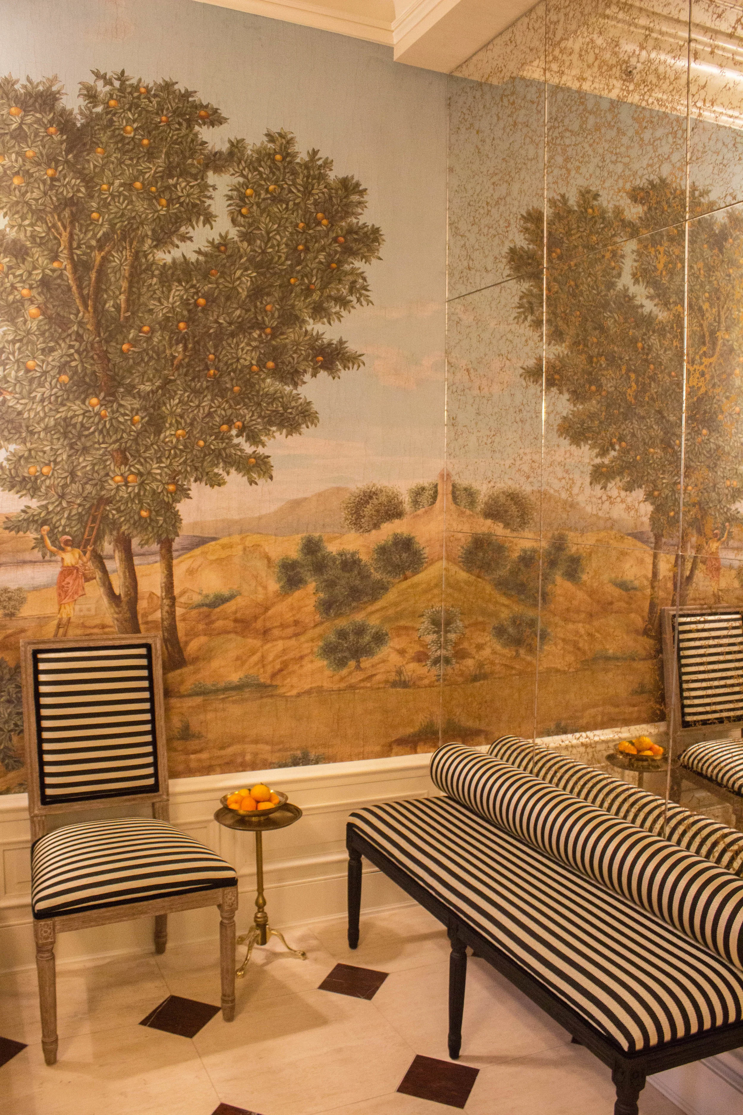
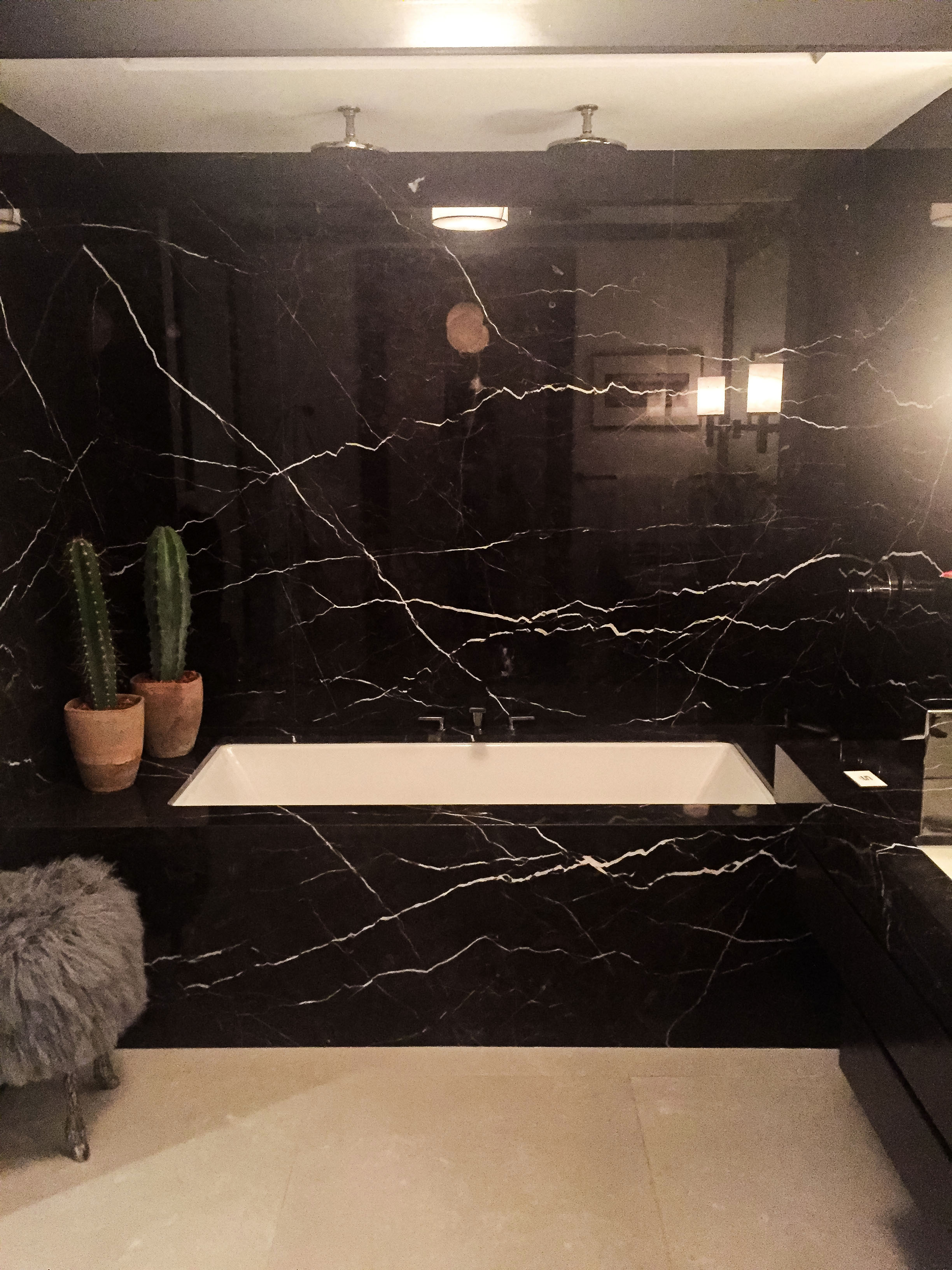
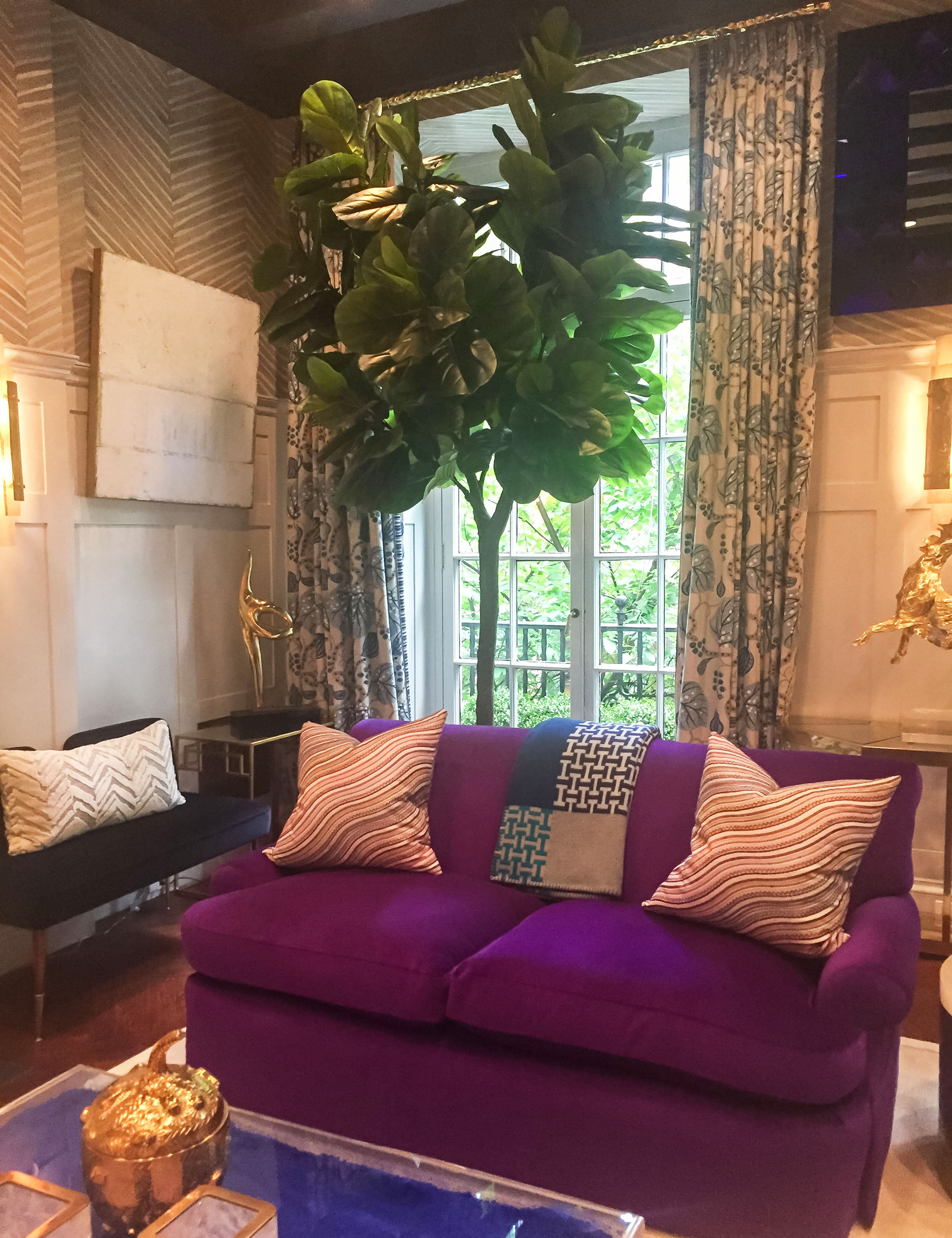
"Olympia Folly" is the name of this room designed by Alexa Hampton, and it pretty much describes the essence of the room. The room draws from the classical period (think Greek and Rome architecture during BC or the early centuries) and brings it into the 21st century. I like the  pairing of orange and red, and the mural wall covering.

Kips Bay Sasha Bikoff1.jpg

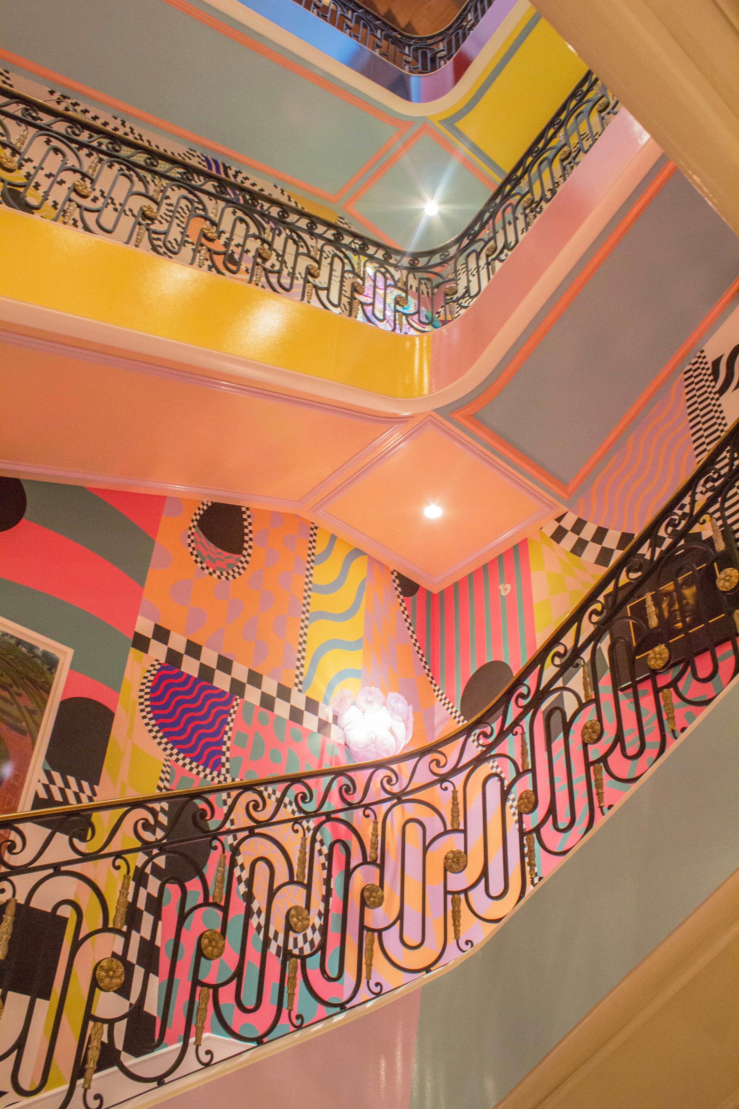
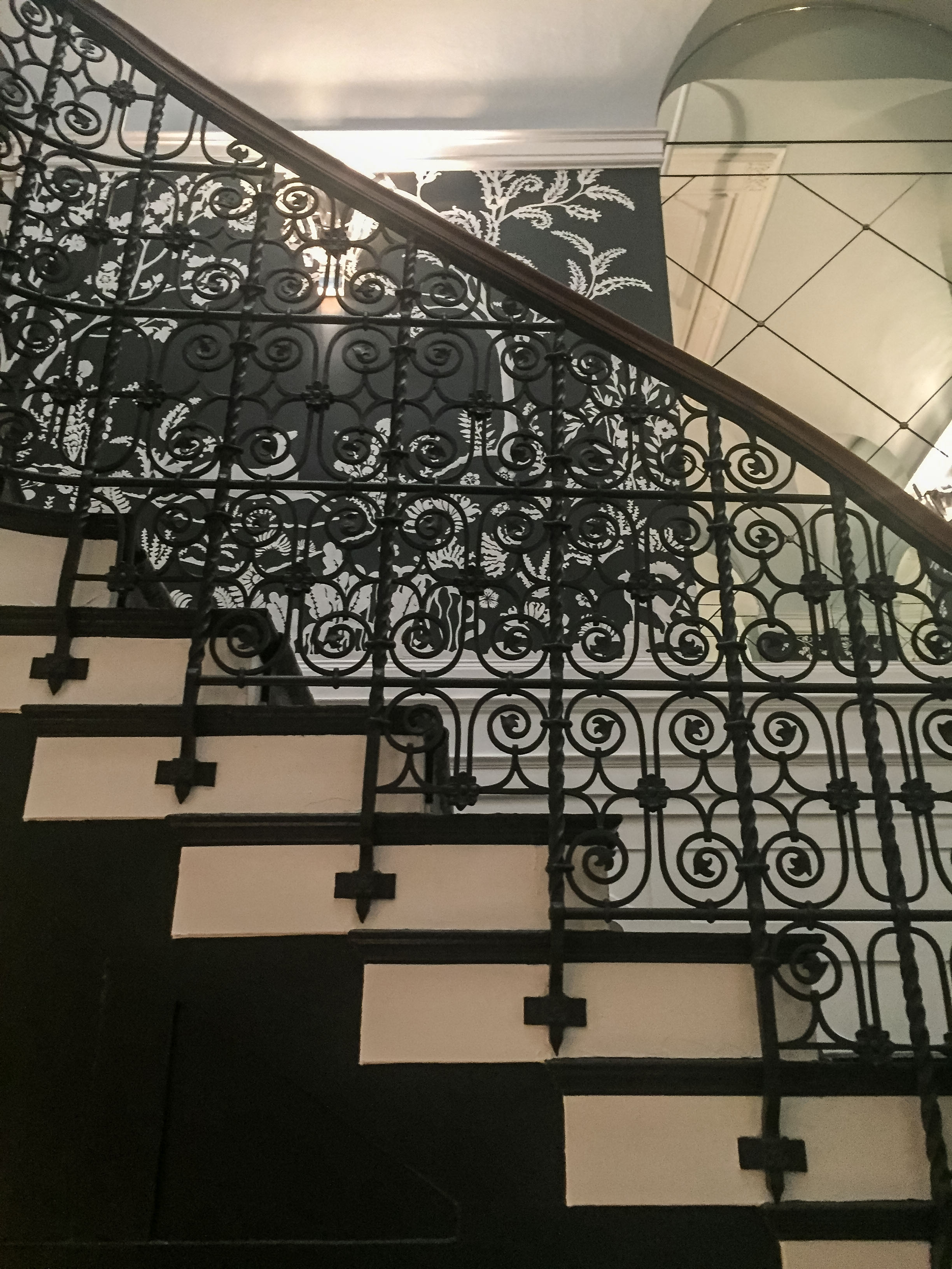
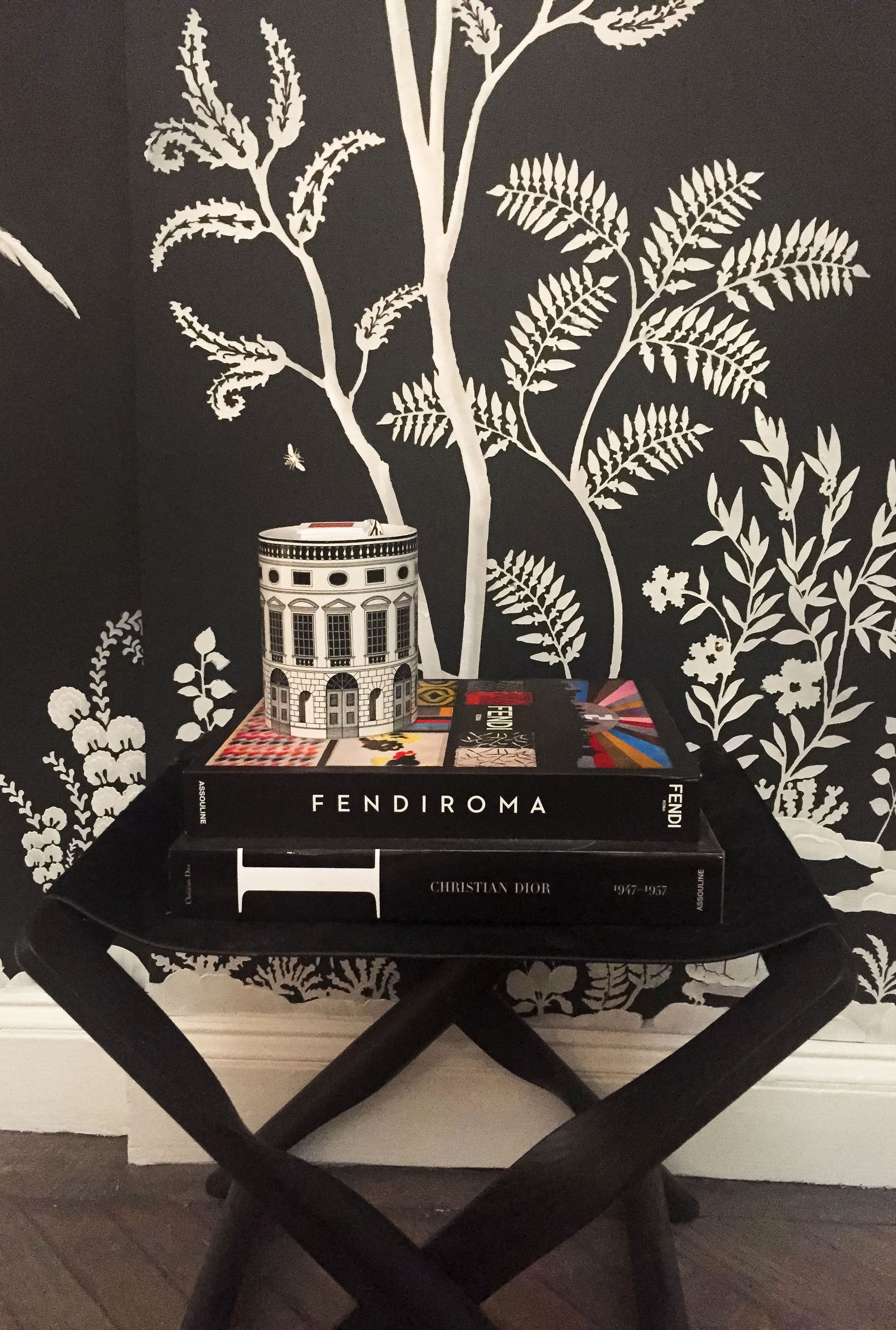
Sasha Bikoff's "Stairway to Heaven" hallway was a showstopper. I'm only sorry I didn't have my wide angle lens to capture it more fully for you. But as you can see it's a smorgasbord for the senses. She incorporated black and white artwork of hip hop artists on the walls giving it an edgy, party-like-a-rock star feel.

Kips Bay Sasha Bikoff.jpg

I dig these chairs, and together with the waterfall mirror, they capture the ultra modern, fantasy vibe of the hallway. 

Kips Bay Marcia Tucker.jpg

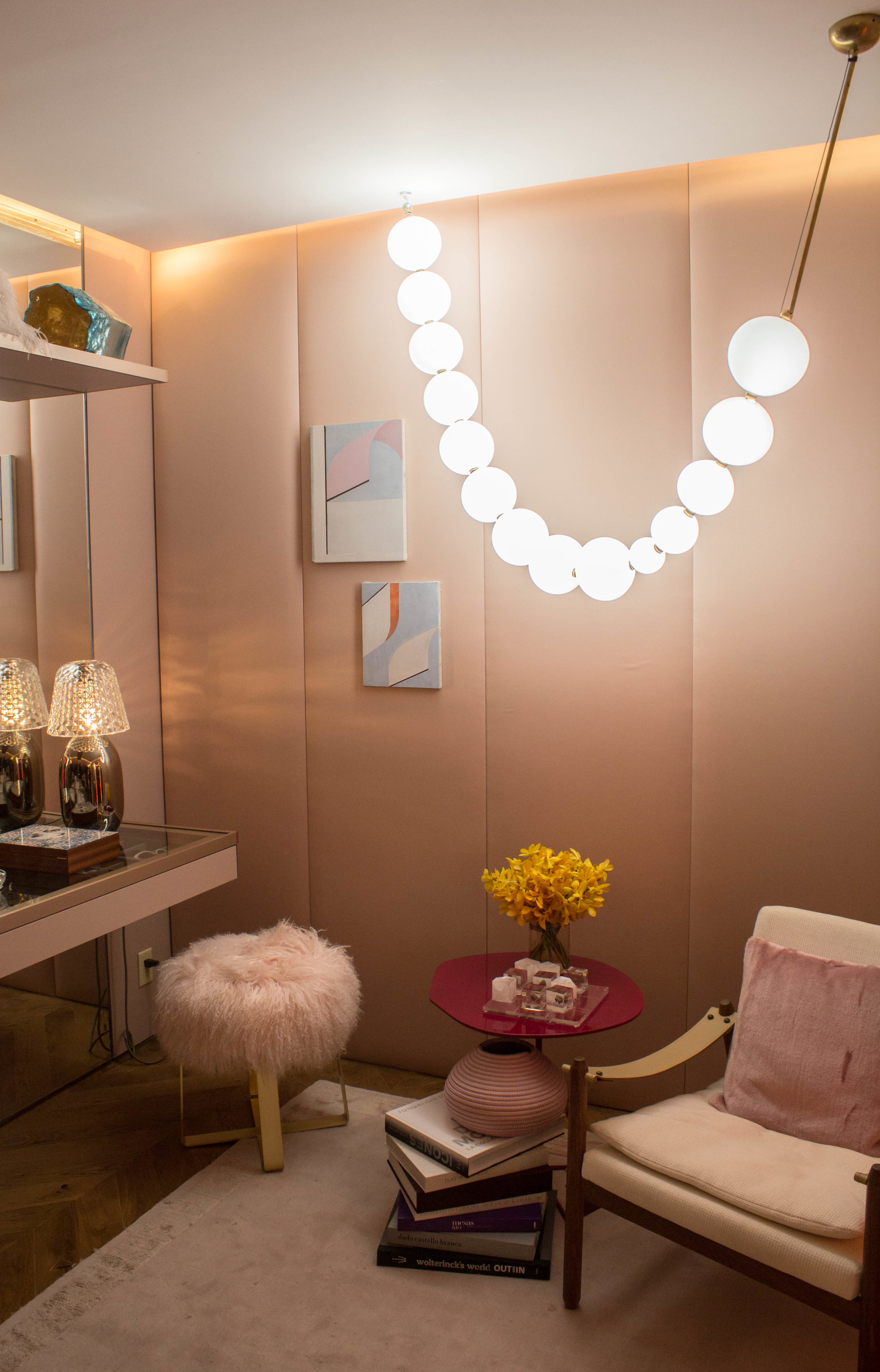
I really loved this "Look of the Day" dressing room by Marcia Tucker. The muted colors, cushy padded walls, feminine details, clean lines, and bold lighting did it for me. Just goes to show a chic dressing room doesn't have to be decked out with glitzy, glammy furnishings and stand out colors.

Kips Bay Barbara Ostrom.jpg

This rainbow ceiling in Barbara Ostrom's "Art and Ala Carte" room is so ooh-aah, and pleasantly unexpected in this grand, first lady style space. 

Kips Bay Entrance.jpg

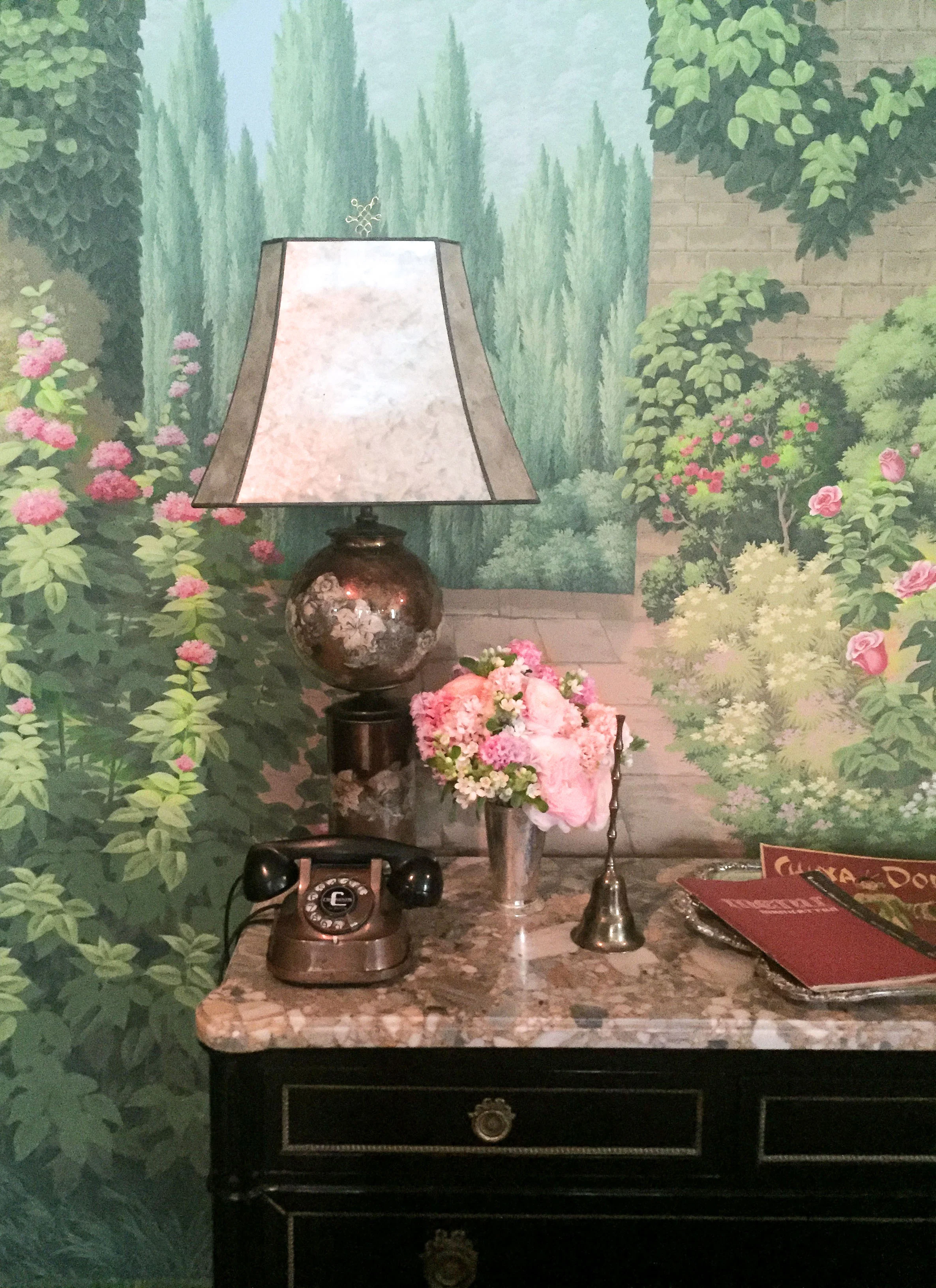
This is the entryway to the show house, and I loved the mural against the black and white fabric. I actually planned to put a black and white forest motif mural in my dining room, but after seeing this colored one, it's changed my mind about colored murals. 

What part of the show house do you like the most?

Highlights from Kips Bay Decorator Show House 2017

Hi There! A few weeks ago I had the opportunity to attend the annual Kips Bay Decorator Show House for the first time. I made it to the show house last year but couldn't go in because I had my baby with me (no kids under 6 admitted). I'm sure you can imagine the frustration of getting all the way there only to be turned away. So I was even more determined to go this year, and went with my friend Maribel. This year the event was held in a 1905 Upper East Side mansion that just happens to be on sale for a modest $26,800,000! (no biggie) It was an absolutely beautiful home with a winding staircase, elevator, and 12 feet high ceilings. Here are some of the highlights captured by my premium iPhone 6 (unfortunately, I left my camera).

This room was designed by Nick Olsen of Nick Olsen Inc. and I loved his bold mix of patterns,  textures, and styles. It's as if someone just effortlessly threw a bunch of stuff from different decades together and it works. Oh, and that wood veneer wallcovering?! It made me want to go to a tile store and start putting up floor tile on my walls. It's such a creative alternative to wallpaper or paint. 

I adored this room by Billy Cotton with its luxurious fabrics and moody vibe. Word has it that (and I may be botching this up a bit) the room was inspired by a heartwarming story involving a fashion designer and a elderly woman.  The fashion designer became fond of an elderly homeless lady nearing the end of her life and decided to put together a room for her using all the old fabrics and trinkets she acquired throughout her lifetime. I loved the story and could really envision this bedroom belonging to an elderly woman who lived her life to the fullest, and had the remnants of beautiful fabrics to show for it. 

This black marble bathroom by Scarpidis Design is everything. Its so luxurious, and I love that they accessorized it with cactus plants. It gives the bathroom a slightly bohemian vibe and makes the full-on glamour space feel accessible. 

This is one of the hallways in the home. I've been looking for a settee like this with its feminine lines and luscious velvet texture, for some time. It feels like something that could be from the 80's or from the 30's, and I could see it in a bedroom with a stack of books next to it like so, to keep it from looking too precious. 

This room designed by Neal Beckstedt of Neal Beckstedt Studio, had a modern worldly vibe to it. It feels like the home of someone who has traveled, and each piece is a stand-out. 

Duo design team KristenKelli put together this room packed with pops of color and patterns. I imagined this being the home of a really tanned Miami couple who loves to party.

This room by Ken Fulk was just about my favorite, and it comes complete with a full back story. The theme of the room is M'adame's Magical Menagerie; and as the story goes, the lady of the house, Madam F., outlived three husbands and is known for putting on colorful dinner parties. She lives in a well-appointed home with a lovely garden and has a growing secret collection of wayward zoo animals in her garden. There are fully fletched out secondary characters like Mikhail, the butler who believes in doing things the right way; and even the animals have names and traits like Frances, the unforgiving elephant, and Genevieve, the languorous leopard. Don't you just love when a room is inspired by an elaborate story? It really helps to make the room come alive and in this case, feel magical. See more pics of this room below.

showhouse animal room lamp.jpg
showhouse animal room chairs.jpg
showhouse animal room flowers.jpg

This double width staircase makes the space feel so grand, and that decorative wall? It's hand   painted.

showhouse basement.jpg

The delux basement was kept dark, moody, and upscale with it's sumptuous fabrics, and gold and black marble finishes (see below). It's perfect for a Great Gatsby style party. 

And I leave you with this striped ceramic parrot. Its a cool way to update a traditional accent, don't you think? All in all, I really loved all the patterns and textures in this home and felt inspired to incorporate some of it in my own home like the leopard print wall-to-wall carpeting or black marble. What inspired you the most about the show house this year?

Decorating with Green: 1 Couch 2 Ways

Hey There! How have you been? I've been busy with my design psychology consulting service, working my full-time job, and being a mom of course. Working on my consulting service has really been a refreshing outlet, and I've been thinking a lot about how we can use our homes to encourage psychological, social, and spiritual well-being. So when the folks over at Douglas Elliman Florida Real Estate asked me to create a style board post in honor of Pantone's 2017 color of the year-- greenery, I thought it was a fun opportunity to think about how I would use green given its benefits. Used in moderation, green is life-affirming, and symbolizes new beginnings, growth, and vitality-- all the things that come to mind when we think of spring. And this definitely resonates with me because I'm constantly looking for ways to grow and reach my potential.

Green is such an accessible color because you can find it everywhere in nature. And there are a couple ways you can take green. If you know a little something about color, you may know that pairing complementary colors gives a feeling of excitement while pairing colors close on the color wheel tends to give a feeling of calm. So if you want to create excitement when using greenery or another shade of green, pair it with reds and oranges, or some variation like purple or fuchsia. On the other hand if you are looking for relative calm, trying pairing green with blue or yellow. I created two living rooms with a gorgeous green couch I've been wanting for a while, although at almost $10,000 I'll be happy with a less expensive option. It's a few shades deeper than greenery but you can get a feel for how green might work with colors to create a room that is more exciting or a room that's more calm. Check it out below.

Pair greens with fuchsias and/or oranges for a feeling of excitement.

Pair greens with fuchsias and/or oranges for a feeling of excitement.

Pair green with blues and yellows for a more calming effect.

Pair green with blues and yellows for a more calming effect.

Which room do you think is more you? As you can see I incorporated plants which is a great, easy, and inexpensive way to add greenery to your décor. What other colors do you like to pair with green?

Sources:

Room 1

1. rug 2. couch 3. coffee table 4. picture 5. plant 6. books 7. chairs 8. side table 9. lamp 10. floors 11. window   12. pillows 13. curtains

Room 2

1. rug 2. picture 3. chairs 5. lamp 6. pillows 7. curtains


My Fall Working Girl Wishlist

Hi there! How was the rest of your summer? I've been busy  trying to move forward with some of my goals for the year. You may already know that I'm in the process of transitioning to a more creative career with my start-up interior and wardrobe consulting company.  I'm thrilled to be able to incorporate by passion for design with my background in psychology, but there are a lot of little steps I have to take to make sure that the company has a strong foundation. Also, you may not know  that I'm  an aspiring children's author and writer, and I'm excited to announce that I've recently joined on as a contributing writer for The Everygirl.  Twice a month you can check out my articles on a range of different topics related to mental health and wellness, and I've gotten some really good feedback so far. You can check out my latest article here. And as though that isn't enough, I plan to start my decorating course this fall. I'm really looking forward to it all, but I find that I'm constantly trying to find that work/home balance. Don't get me wrong, I love having three little ones at home, but like a friend told me the other day, you're not going to get all that cuteness without a cost —exhaustion! So here we are at the beginning of fall, and I absolutely love new seasons,  namely fall and spring. They're always exciting for me because it's a chance to start fresh. I especially love a fall wardrobe because there are so many opportunities for showcasing your personal style with layering and substantial pieces like boots and coats. Only there are tons of trends this season I can barely keep up. I usually peruse through magazines and websites to give me inspiration  and direction. Otherwise, I find that I don't have a sense of what I want or like, and I'm liable to buy pieces that don't move me or add umph to my wardrobe, you know what I mean? So I've put together a wishlist of sorts, some pieces are definitely out of my price range, but still useful in helping me to flesh out the look I'm aiming for this season. I've really been drawn to modern shapes and texture lately. They offer a nice alternative to more traditional silhouttes, and add a little something to a classic wardrobe. I also got bit by the over-the-knee boot craze, and I'm currently on the hunt for a pair. I don't know what it is, but all of a sudden I just wanted an over-the-knee boot. I've  seen them styled in really cute ways, and I suppose I just succumbed to the hype —isn't that always the way? After looking over my wishlist I noticed that I'm really into feminine, girly, quirky pieces. (No surprise here.) All them are ones I'd wear to work on a day that I was feeling pretty creative and chic. So I decided to call it my working girl wishlist. Check it out.

 My Fall Wishlist

It's hard to pick out a favorite since I love them all, but I absolutely adore those lace-up shoes. Everyone seems to be wearing the pointy-toe version which I like as well, but I like that there's a round toe option.  Oh, and there's something about that blush bow blouse that just reeks of pretty, and it looks great on the model. What are some of your favorite trends this season? And what goals are you trying to accomplish for the rest of the year?

bow blouse||puff sleeve sweater|| floral pants|| lace-up shoes|| ruffled blouse|| cape|| fringed sweater||leather culottes|| tweed dress|| tweed pants|| midi skirt|| over-the-knee boots

Sarah's House Project: Boys' Bedroom Reveal

Finally. The boys bedroom is finished. Well at least for now anyway. I like to think that a room is never really finished, it just evolves, you know. All in all, I absolutely loved decorating my boys' room. Yes, the process was trying, especially during times when I was waiting for an item only to find that it wasn't the right fit or what I wanted, or when I tried  to buy something only to find that the item was sold out. But I try not to get too upset about those things  because it always works out in the end. And if I never knew it before, I certainly know now that interior decorating is my passion, and (I'm pleased to say) a service I'll be offering under my new creative consulting company, Truly, LLC (read about it here). So without further ado, let me take you through the design process.You may recall from my mood board (here) that the guiding theme for the project was:

  • Traditional
  • Modern
  • Pop culture
  • Global Style

Or also known as Traditional Modern Meets Pop Culture With A Dash of Global Style. It's essentially a conglomeration of what appeals to me and the boys. Of course, the boys are into superheros and legos, and me, I like a traditional boy's room that infuses modern touches with a sense of multiculturalism. But to be sure that the room felt like their own, I made sure to display familiar items, ones they made themselves, like the wooden bracelets or their drawings. When they get tired of the drawings, they can always switch them out so the artwork continues to feel fresh. They also wanted to make the ceiling light look more like the  death star and insisted (along with their dad) on coloring it free hand with a  black marker. It's not something I would have done, but hey, it's not always want we want when we live with other people, right? So needless to say I made some concessions in the room. But all in all, we're all happy with it, and that's what truly matters. BB rug
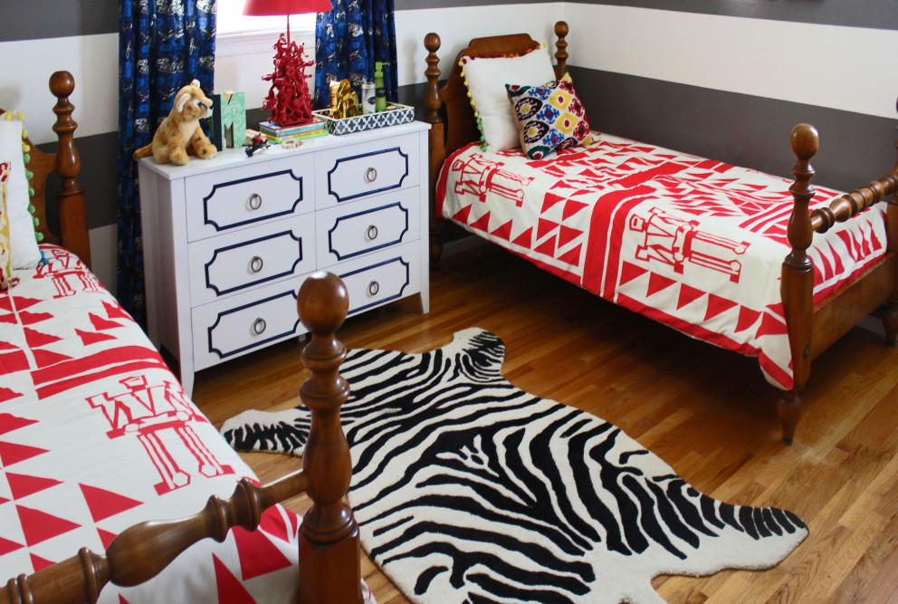
I chose the zebra rug early in the design plan. If you saw my inspiration rooms (here), you may know that I was initially looking for a zebra print headboard. But I had a really difficult time making it happen so I opted for the rug instead. And I really like the way it glams up the room a little. The  duvet came later in the design and adds a nice pop of color. I initially chose a cream patterned duvet that had an ethnic vibe to it, but since it was sold out I looked for other options. I really like this one because it's kid friendly, and the modern triangle can also be interpreted as ethnic, a perfect fit for theme of the room. BB front view BB I side
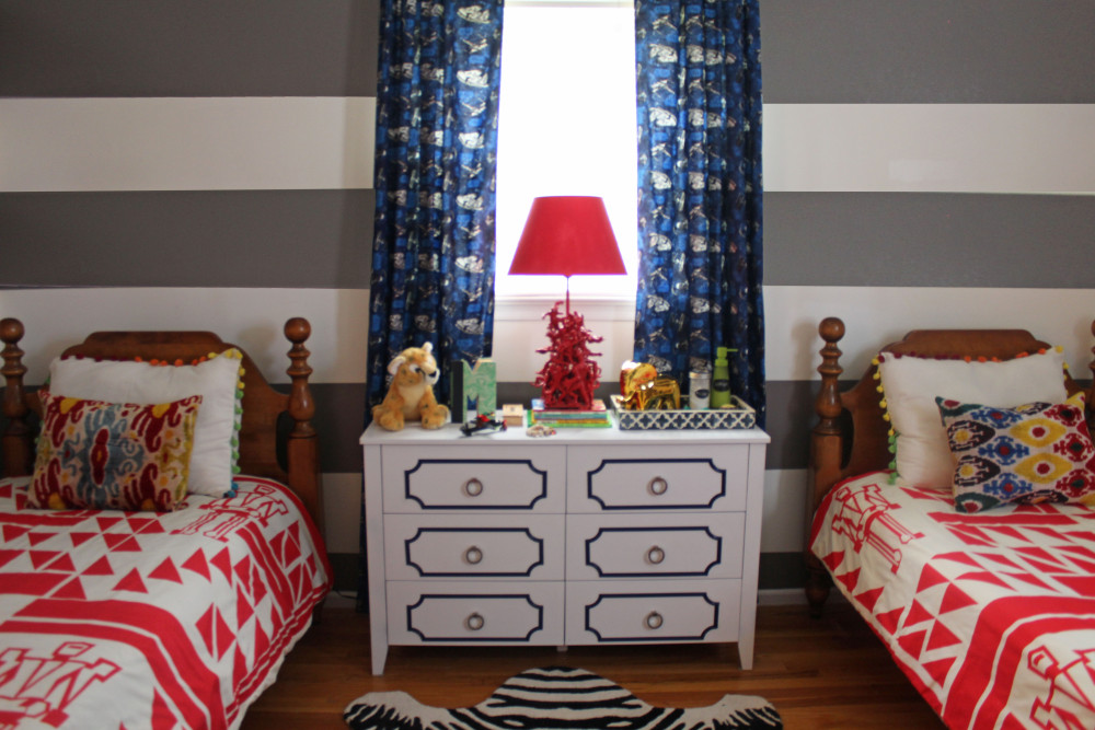
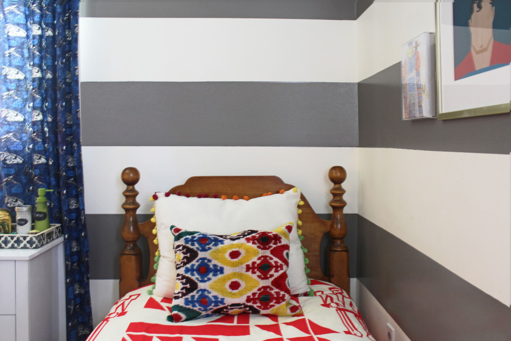
These multicolored ethnic and pom-pom pillows tie in much of the colors in the room. Whenever I'm looking for a color scheme I usually like to find all the colors in a piece of fabric, or pillow so that it gives a sense of cohesiveness, and doesn't feel like just a hodge-podge of colors that don't speak to each other. BB side dresser BB lotion and powder
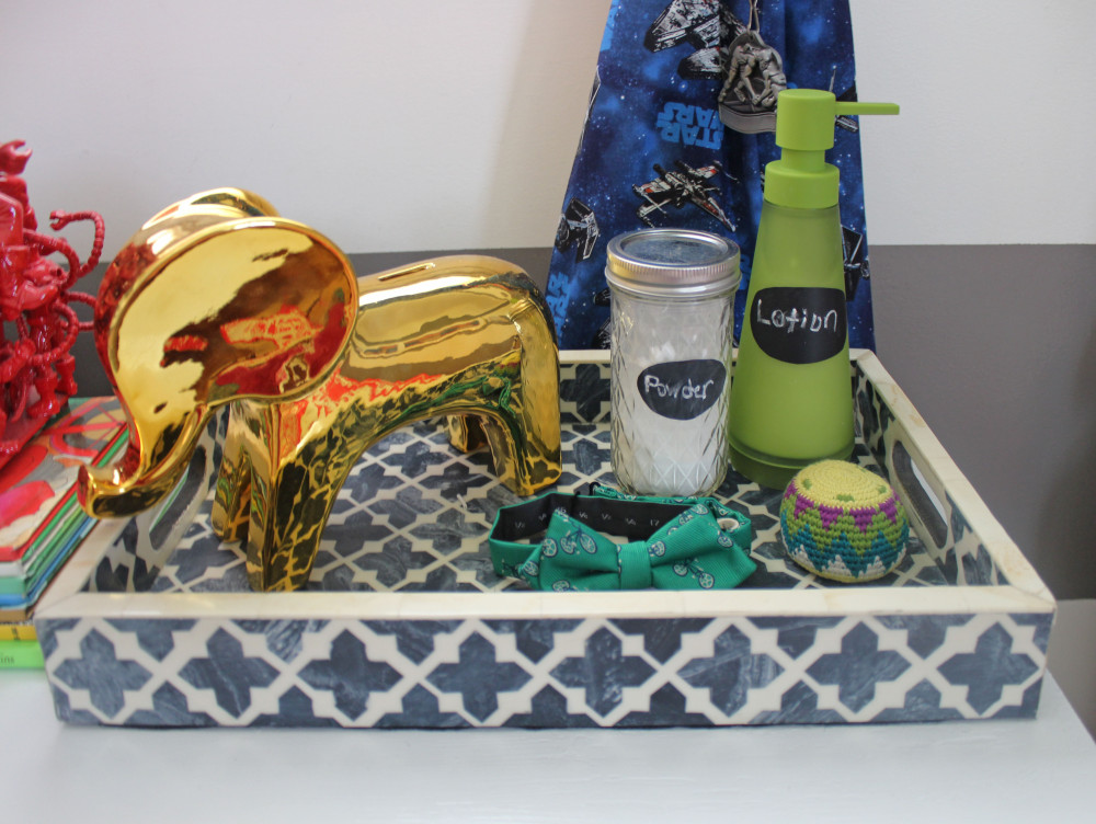
I didn't want to keep the lotions and powder in the original packaging. I wanted to present them in a more original way that feels consistent with the design of the room. So I used bottles with chalkboard tape to label the items for a fun touch. BB pouf
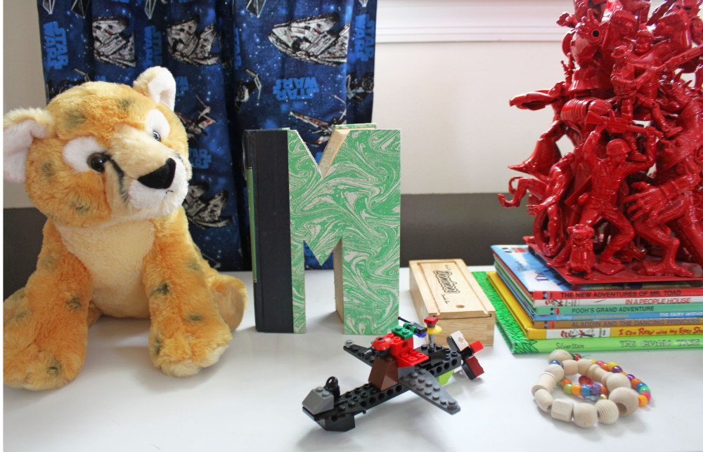
Of course I had to include all their friends, ha. BB tall dresser angle 
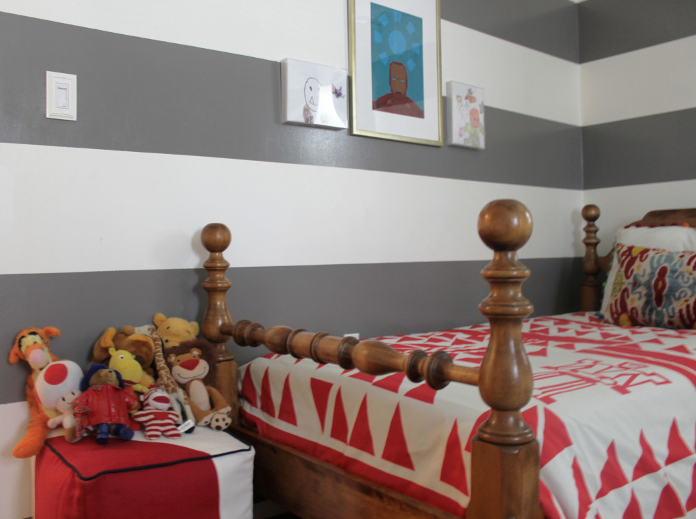
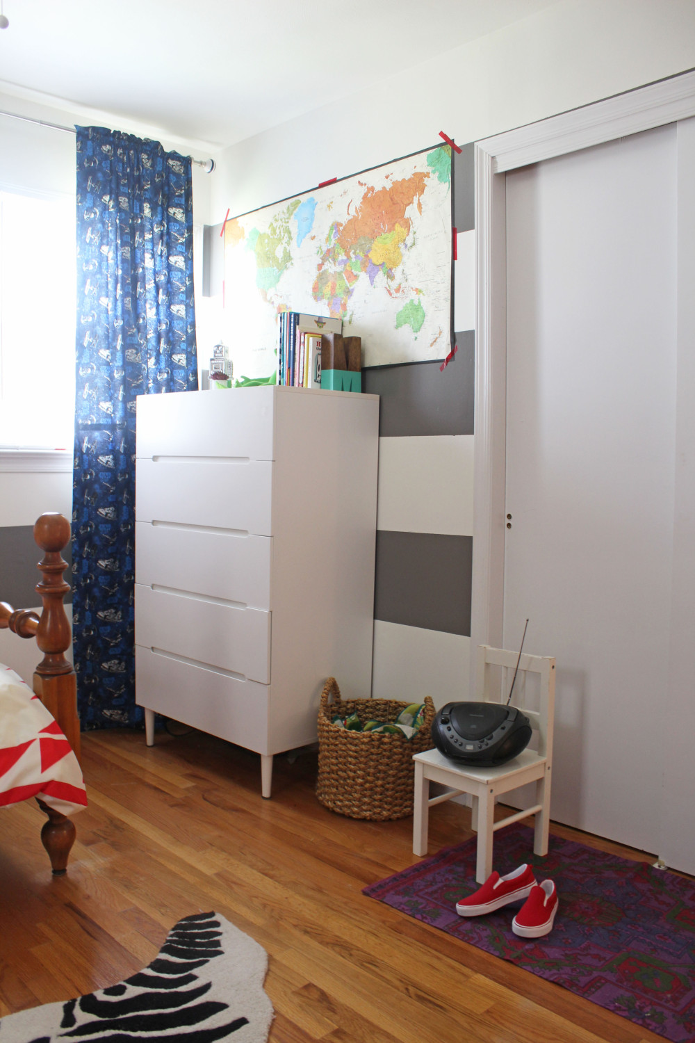
This basket houses their laundry, and I put a piece of fabric over it as a make shift cover. BB kermit
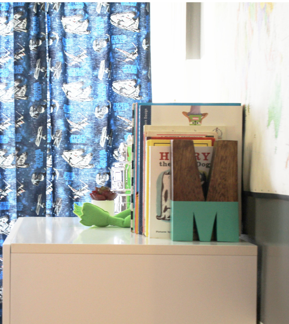
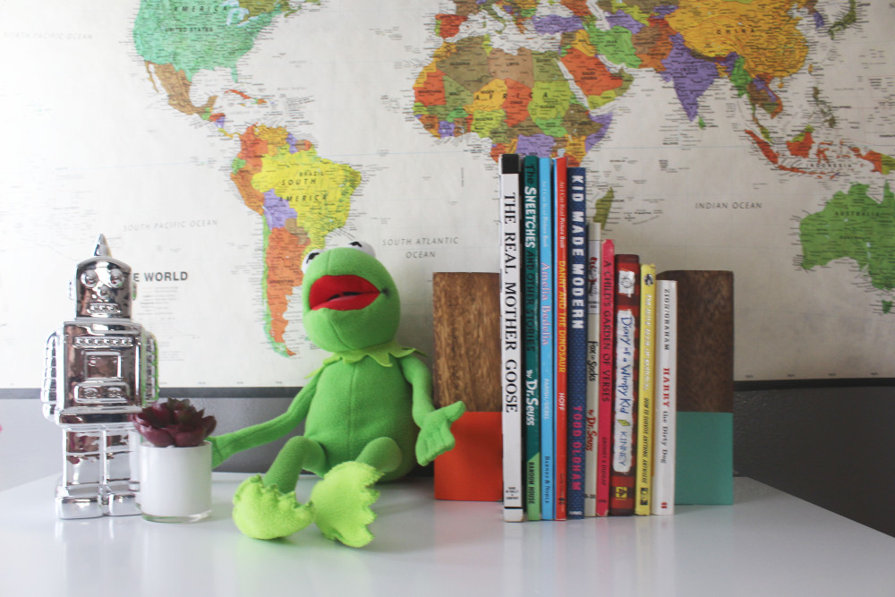
Books are big in our house.  My eldest loves to read, and books can make most any space feel cozy. BB MSo there you have it. Hopefully you've been inspired with ideas for your own space. If so, I'd love to hear about it. Below are links or resources for some of the major items in the room:

Communicating with Color: Magenta

Hey all! Hope you've had a good week and were able to bounce back from all the challenges you've had to face. I've decided to bring back my column, Communicating with Color since color has so much psychological significance. After all, we interpret the world through color, and it certainly impacts our mood. You can see my previous Communicating with Color posts here and here. I hadn't thought much about magenta until I was trying to decide on the right color to reupholster my new vintage office chair (see it on my Instagram here). To give you some perspective, my office space is in the family room, and it's painted white with white wood floors (kind of like a studio). I plan to bring in pops of color, and an eclectic mix of furniture to create a modern, glamorous bohemian vibe.

At first I thought I would reupholster the chair in white leather, which is pretty and what all the kids are doing these days. But with my white walls and floor, I felt like I needed something more. Strong warm colors like red and orange didn't appeal to me because they're not flexible enough to blend easily with other colors I might bring into the room. And cool colors, like blues and greens didn't appeal to me either. I think it may be because I have a turquoise blue sofa in there already. But I had this one magenta pillow with a funky hodge-podge of warm and cool colors on the front like orange, violet, and if you stare at it long enough, pink. It's the kind of pillow that makes it easy to bring in an unexpected mix of colors.  That's when I decided that magenta would be a great choice for my chair. It's versatile without sacrificing drama and excitement.

After doing a little research, I learned that magenta is a relatively new color created in the 19th century as a result of the Industrial Chemistry Revolution. Like other warm colors, it creates high arousal, stimulation, warmth, and excitement. But surprisingly, magenta isn't really a color at all. Meaning it has no wavelengths and doesn't exist in the spectrum of colors. Rather, we psychologically perceive magenta to make up for the gap between red and violet which are at both ends of the light spectrum. Maybe that's why magenta is so flexible and linked with creativity. They say magenta personalities are entrepreneurs and inventors, free-spirited and non-conformists. And that's exactly what I want to communicate in my office space where I make all my dreams come to life. Here are some magenta pieces you can use to infuse your space with energy and passion. Some of the pieces are no longer available, but I figured I'd include them for inspiration.

magenta-final9.jpg

What do you think of magenta? Do you use it in your home?

 Fern Living metallic wallpaper via Domino || magenta pouf via Lulu & Georgia|| magenta Peacock chair from the The Family Love Tree via From Moon to Moon||Burberry trench coat|| magenta sofa via One Kings Lane|| green patterned pillow via Lulu & Georgia|| blue Jil Sander clutch via Farfetch|| magenta pumps via Banana Republic