My Favorite Things from the Annual Kips Bay Decorator Show House 2018
Well better late than never! I've been wanting to share my Kips Bay Show House tour with you since forever, but have been side tracked with my full-time job-- what a pesky little nuisance it's been (not the helping people part, the amount of time it takes from my day part). Thankfully I'm planning to go part-time in the fall, and should have more opportunities to do things for Trulery, like keep up with the blog, see consulting clients, teach, and do research on dress and emotional functioning. I'm really excited about getting the chance to do different things so I'll keep you posted. But back to the Kips Bay! This year I went back with my friend Maribel fully expecting to see fun, quirky, and chic designs I can steal. I brought my camera this time, but of course neglected to take my wide angle lens, making it kind of difficult to capture full rooms or wider spaces. So instead of featuring full rooms, I've captured favorite aspects of rooms I really like-- which is what I'm usually drawn to anyway when I go to show houses. I look forward to taking bits and pieces of rooms I can store and use in my own space.
This year's show house was beautiful-- a 19th century Upper East side mansion originally designed by August Hatfield in the neo-Grec style (think stately Brooklyn brownstones with simple lines and incised, carved ornamentation). This year there were lots of lady-like spaces with Chineoiserie, mixed in with edgy, alluring, and colorful interiors. Here are some of the spaces that caught my eye.
This room, simply entitled "Bedroom" was designed by Katie Ridder. It feels sweet and inviting with it's bohemian mix of prints, textures and styles. I really appreciated the stenciling on the walls. It didn't feel hokey, and was a crafty way to add visual interest to the top part of the room, which kept it from being too bottom heavy.
Here is the other side Ridder's room. It's modern, fancy, and proper with the mirrored wall making the space feel more expansive and dramatic. The abstract, modern artwork ties in all the colors nicely.
There was a lot going on in this room and I found it quiet enjoyable (I'm kind of a maximalist although I try not to be). This room, "Cherry Bitters", designed by David Netto, has a mix of modern, mid-century, and ornate furnishings with white wrapped books for a strong architectural statement. I'm not exactly sure what the name Cherry Bitters is referring to but the cherry wood walls make the white and bits of color stand out for an overall modern statement.
This little corner of Phillip Mitchell's room, "Drawing Room", was just one of the cozy nooks in this room. The elaborate picture frame with the cheeky picture, the rattan with floral printed cushions, the wall of art, and the moldings all create a space that feels both upscale and relaxed at the same time.
Designer, Brian Del Toro calls this "Laura's Room." And I don't know who Laura is but I can imagine Laura living here. This traditional Chinoiserie room with it's recognizable bird, floral motif is offset with modern, graphic lines like the scalloped tufting of the headboard, angular side table, and boldly shaped chandelier.
All the pretty extends to the other side of Del Toro's room. This must be where Laura gets gussied up for her date with... Tod (?).
"Olympia Folly" is the name of this room designed by Alexa Hampton, and it pretty much describes the essence of the room. The room draws from the classical period (think Greek and Rome architecture during BC or the early centuries) and brings it into the 21st century. I like the pairing of orange and red, and the mural wall covering.
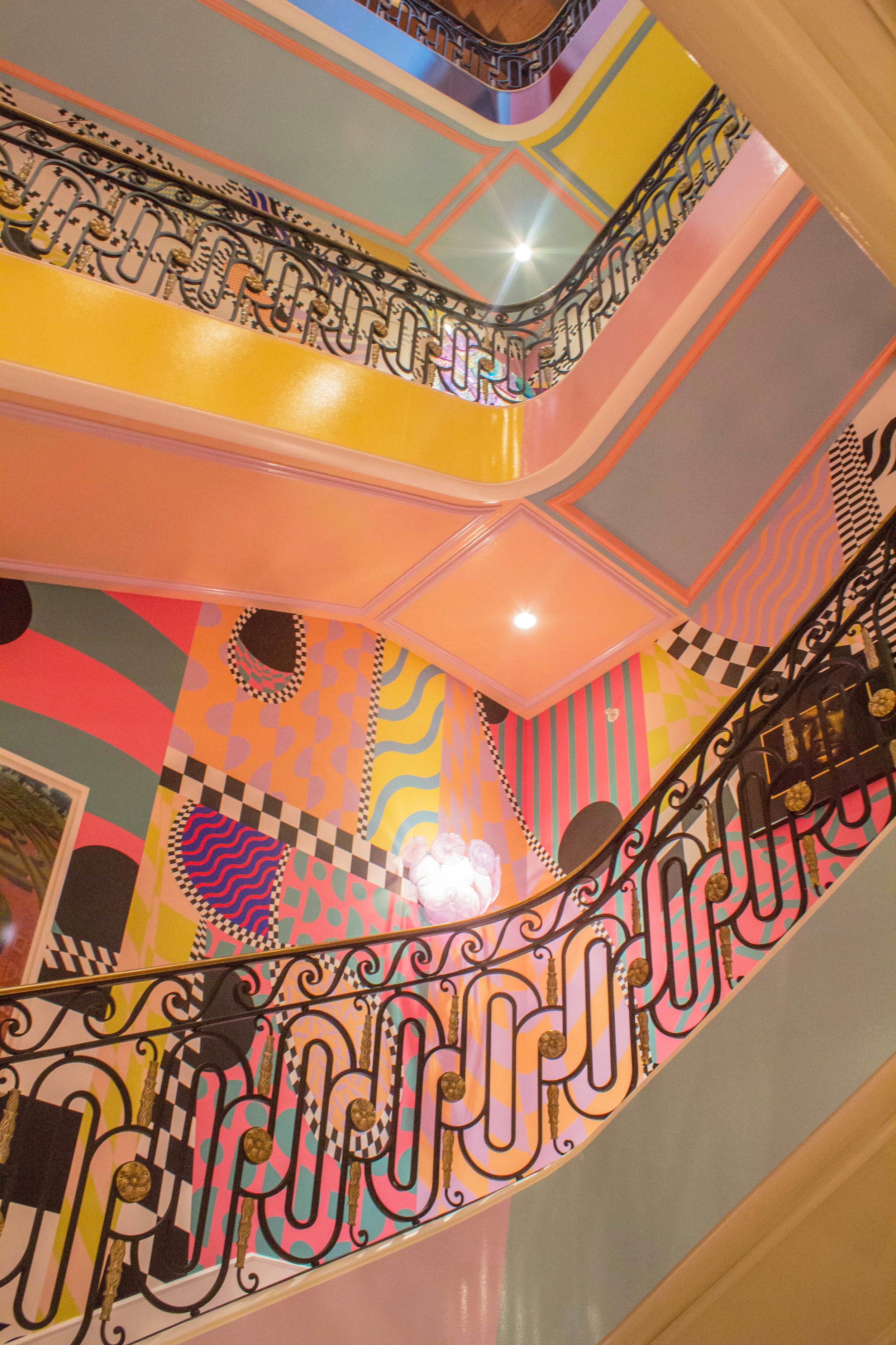
Sasha Bikoff's "Stairway to Heaven" hallway was a showstopper. I'm only sorry I didn't have my wide angle lens to capture it more fully for you. But as you can see it's a smorgasbord for the senses. She incorporated black and white artwork of hip hop artists on the walls giving it an edgy, party-like-a-rock star feel.
I dig these chairs, and together with the waterfall mirror, they capture the ultra modern, fantasy vibe of the hallway.
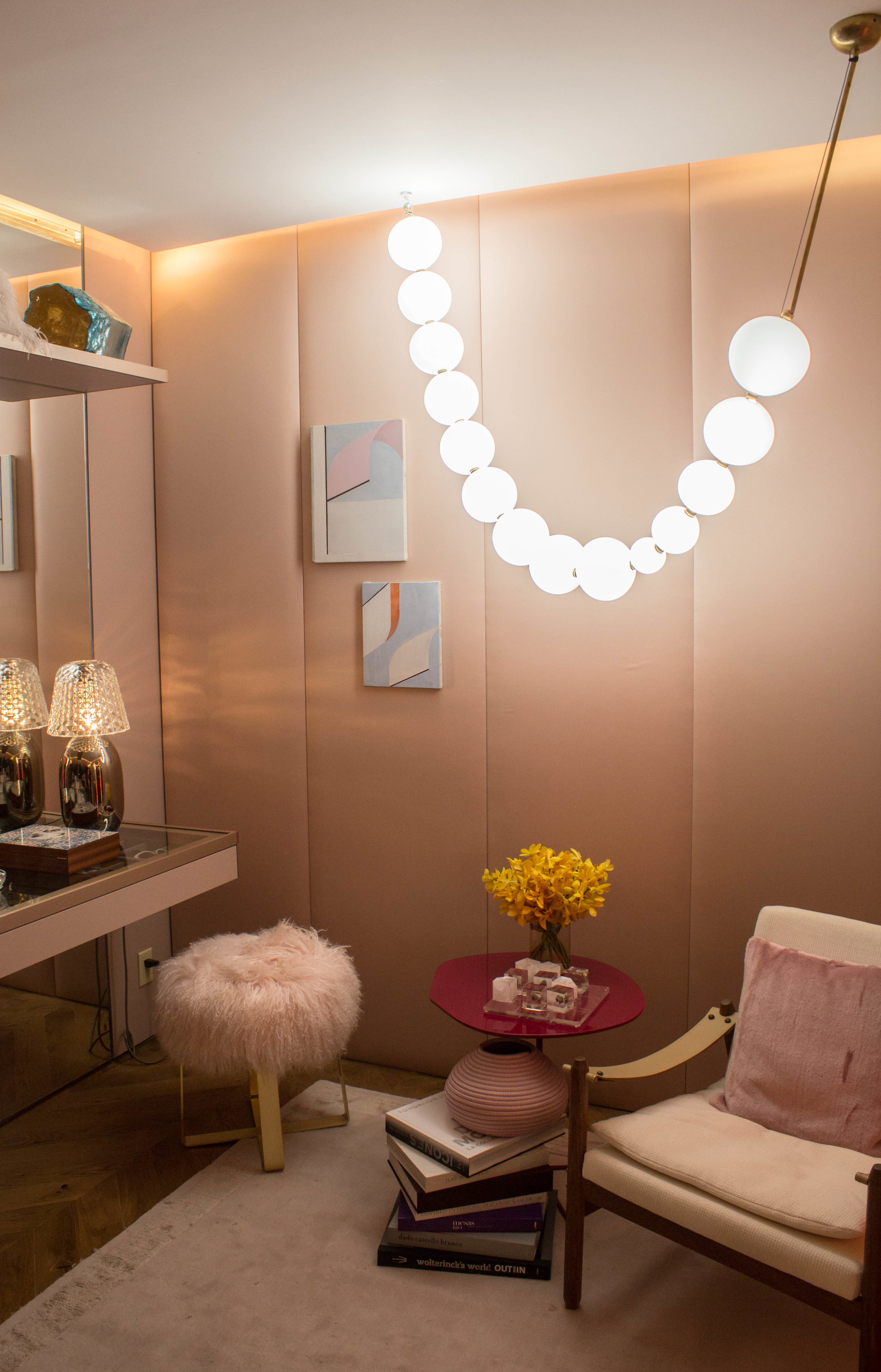
I really loved this "Look of the Day" dressing room by Marcia Tucker. The muted colors, cushy padded walls, feminine details, clean lines, and bold lighting did it for me. Just goes to show a chic dressing room doesn't have to be decked out with glitzy, glammy furnishings and stand out colors.
This rainbow ceiling in Barbara Ostrom's "Art and Ala Carte" room is so ooh-aah, and pleasantly unexpected in this grand, first lady style space.
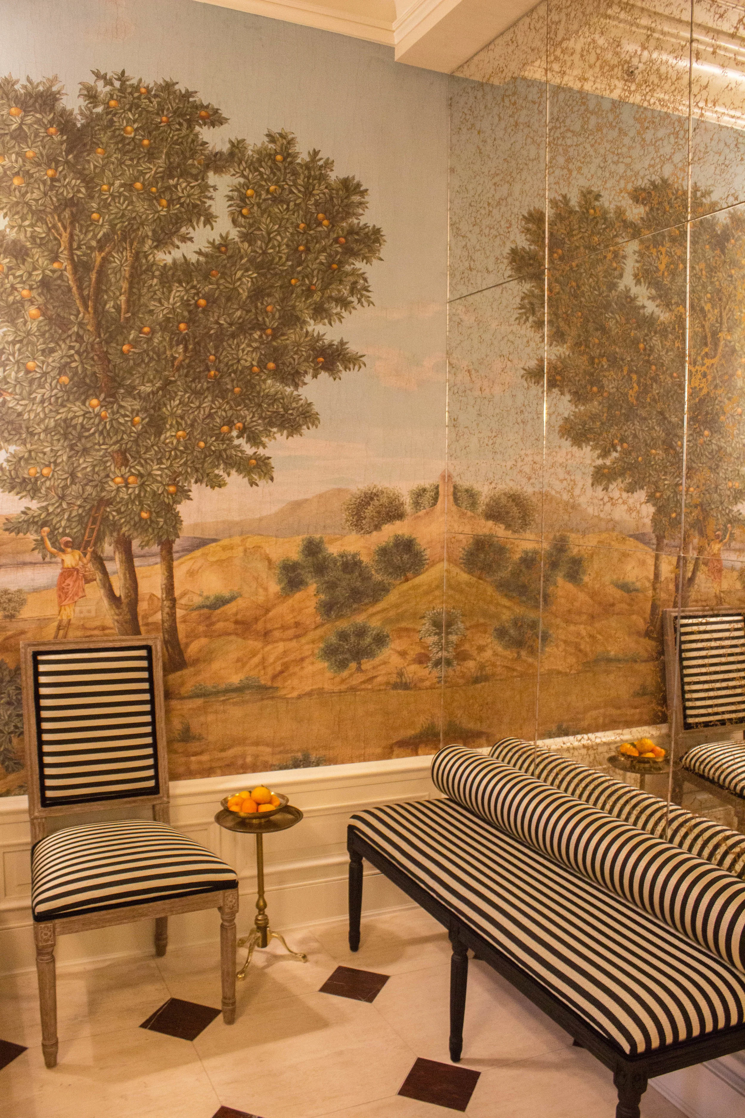
This is the entryway to the show house, and I loved the mural against the black and white fabric. I actually planned to put a black and white forest motif mural in my dining room, but after seeing this colored one, it's changed my mind about colored murals.
What part of the show house do you like the most?


