
4 Wardrobe Color Palettes That Will Get You Excited About Your Outfit
What colors in your wardrobe do you tend to wear the most? Some of us lean towards black or neutrals, others of us tend to choose bright colors, and the rest of us fall somewhere in between. The reasons for our color preferences may be as varied as our idiosyncrasies. Color consultant, Karen Haller says in her book, The Little Book of Colour, that when we perceive color, light waves pass through the same parts of the brain responsible for emotions. So color is very much an emotional experience, and if we’re looking to get excited about our outfit, we can do it through using different wardrobe color palettes.
In a previous post, I mentioned that any time we see a color, our reaction is based upon a combination of factors like our physiological response to color, our personal and cultural associations with it, and the context in which it’s presented. So when people say they don’t like a certain color, it’s an emotional response that can be attributable to a number of experiences they’ve had with the color, and they may not even be fully aware of all of them. What’s more, their perception can change depending on the specific mixture of the hue and the other colors the hue is paired or grouped with.
Personally, I tend to like any color that’s presented in an interesting way. When I feel like I have nothing to wear, challenging myself to come up with different and refreshing color combos can be a way to create a more positive emotional experience. So if you’re looking to get out of a color rut, try these color palettes to get excited about your outfit.
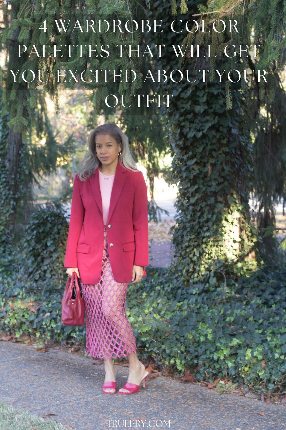
Monochromatic Color Palette
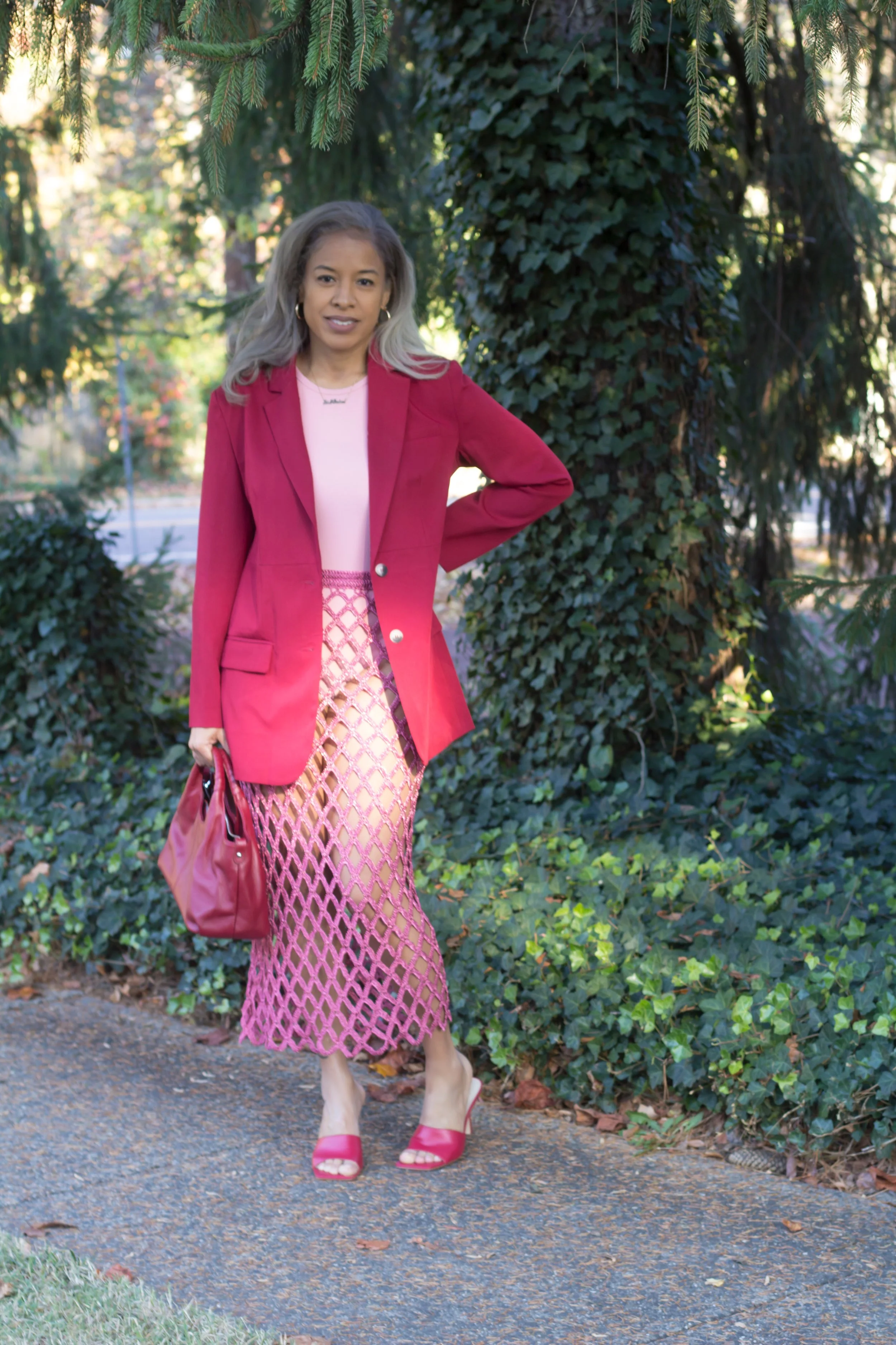
A monochromatic color palette is made up of one hue. When we think of a monochromatic outfit we may think of a single mix of a color, and this could feel very limiting. But one hue can have many different presentations when you mix in hints of black (shades), gray (tones), and/or white (tints), all of which give a different feel from moody to cheerful. Here’s my take on a burgundy color scheme with a mix of tints (e.g., pink and blossom). The color mix keeps it from feeling monotone, although that could be a look too.
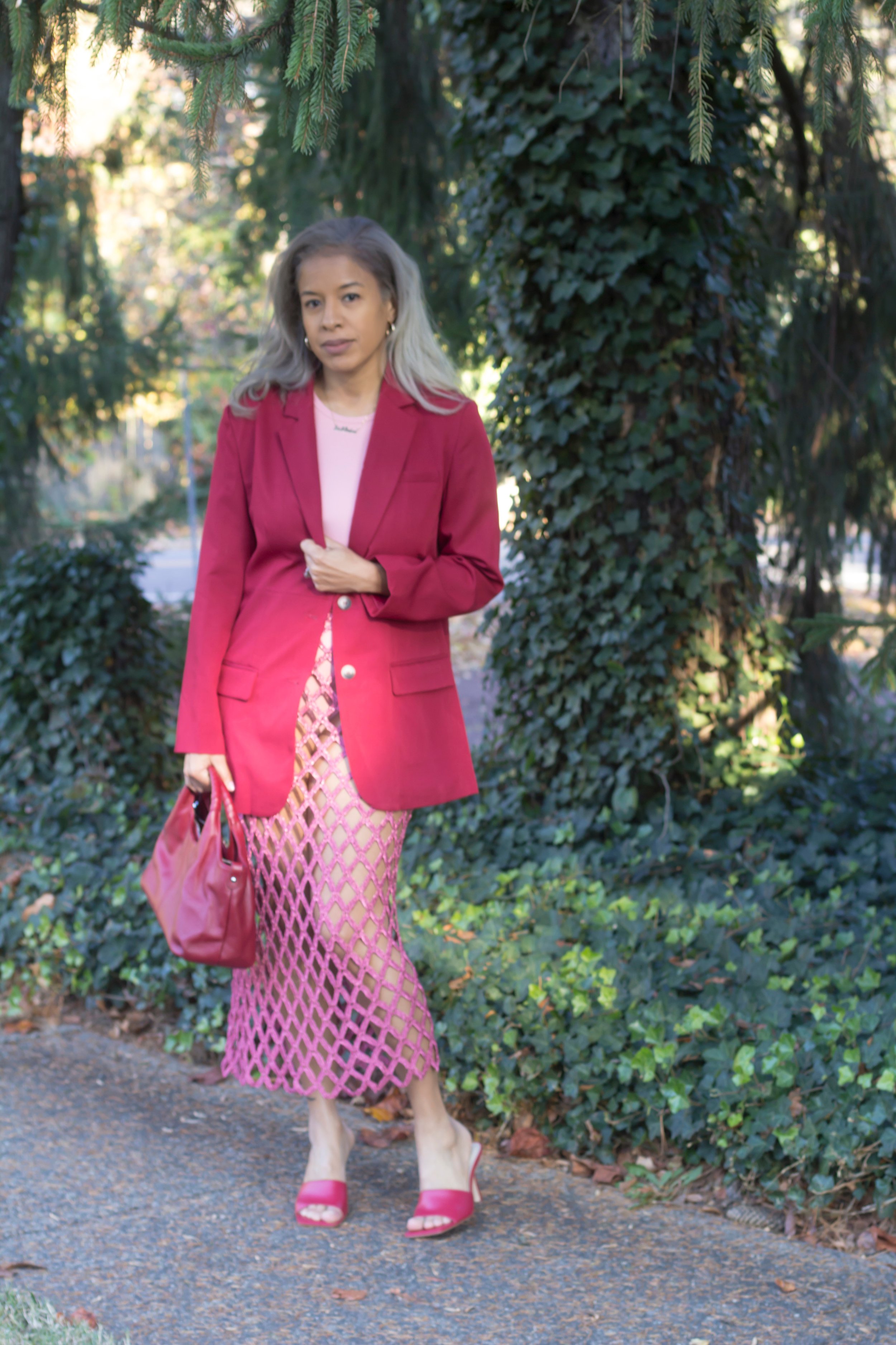
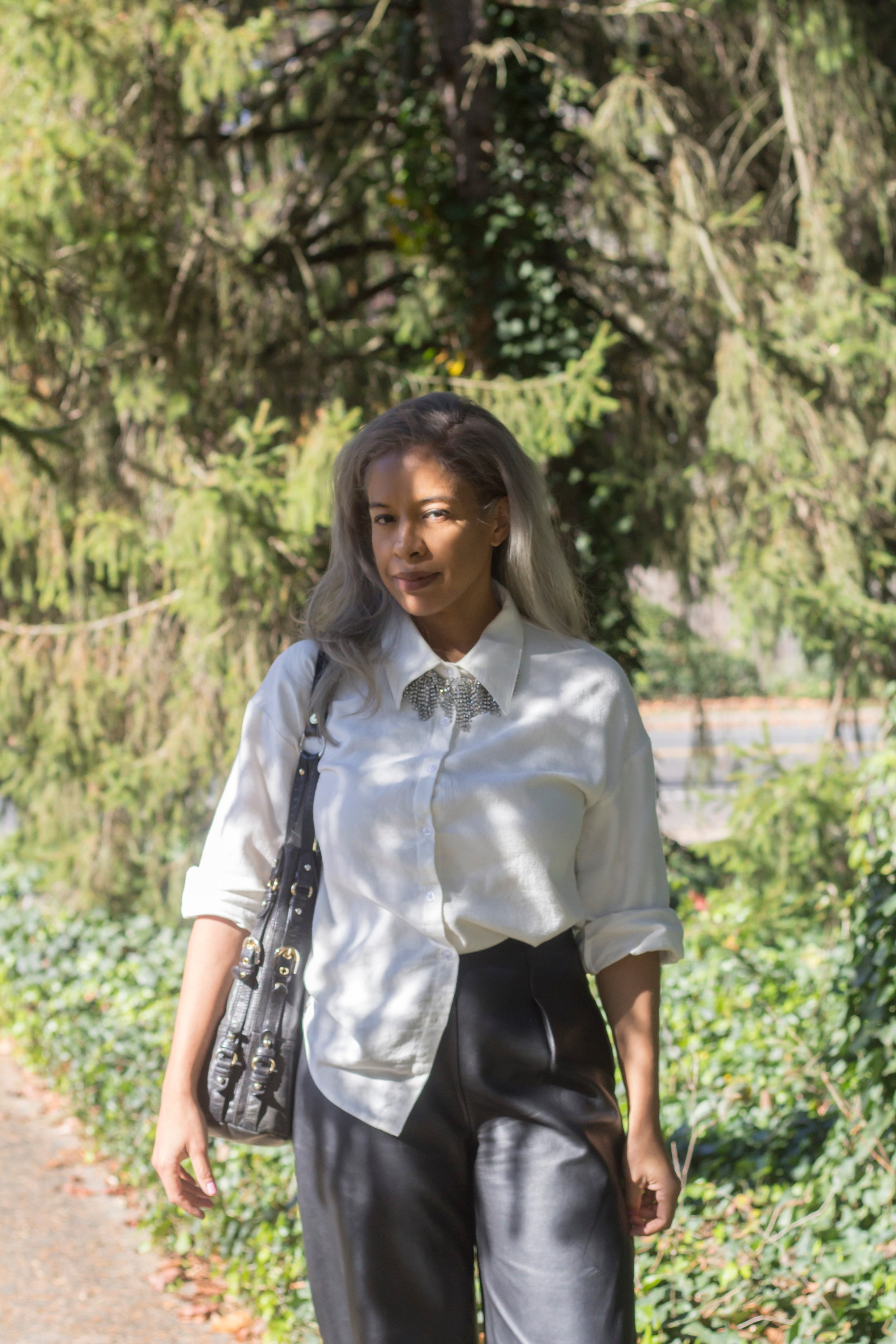
Achromatic Color Palette
If you’re not into bright colors, an achromatic color palette may be great for you. It’s an outfit with no color; and consists only of black, white, or gray. It’s dramatic with a cool, urban vibe. And you can add different textures to the no-color scheme for interest. Here, I mix in leather to play up the edgy appeal.
Complementary Color Palette
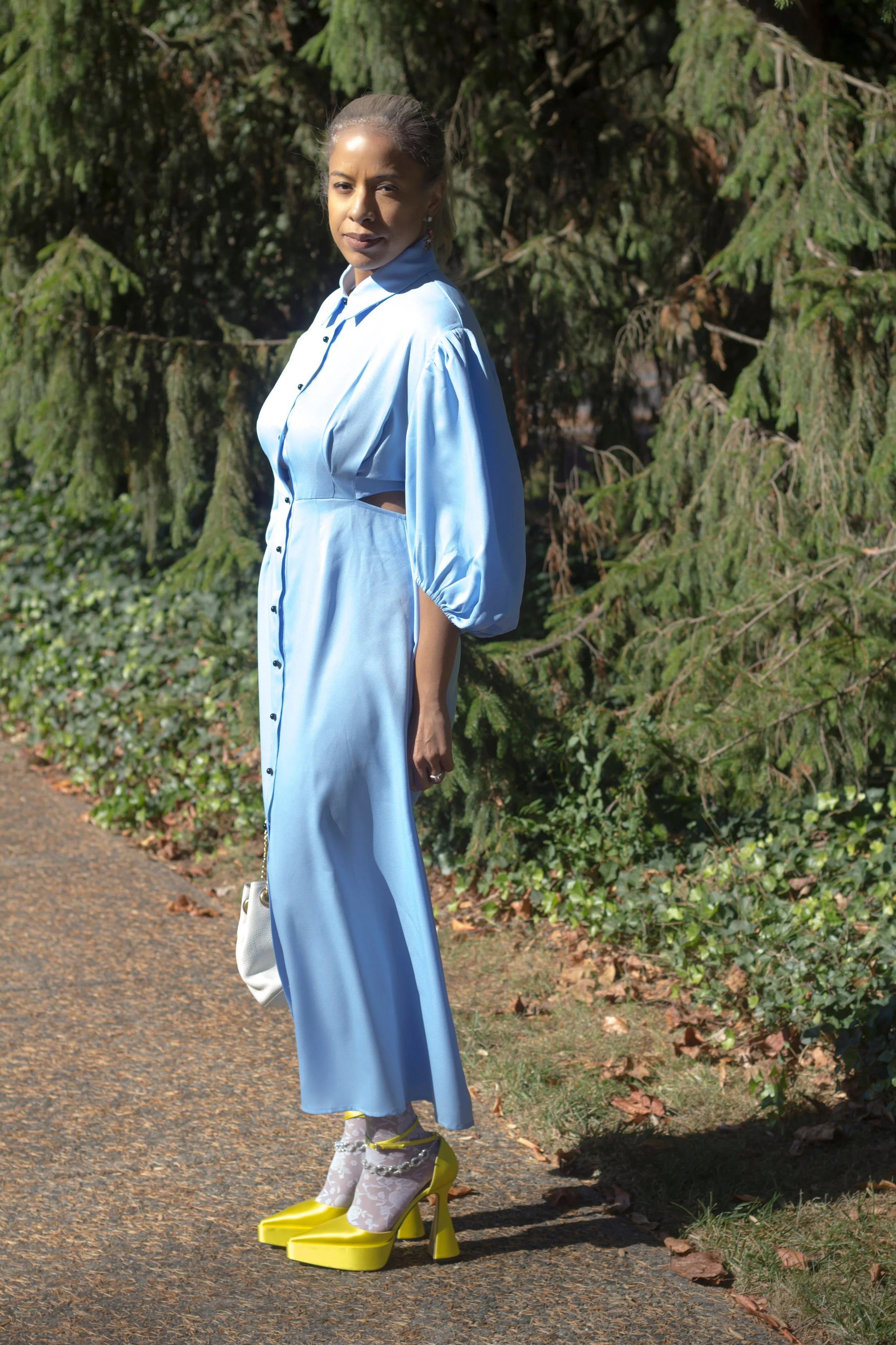
Complementary colors just fit–literally. When you mix two equal amounts of complementary colors, such as red and green, they create a perfect balance, neutralizing each other to form brown. They’re colors on opposite sides of the color wheel; and when worn together, they intensify each other. For my complementary pairing, I chose bright yellow and light blue for a delicate, whimsical feel.

Analogous Color Palette

Analogous colors, like red and orange, are next to each other on the color wheel. It’s been said that unlike complementary colors which intensify each other, analogous colors soften the other. I always feel there’s an interesting tension with analogous colors, perhaps because it lacks color contrast and appears almost imbalanced or tonal. For my analogous colors, I chose deep blue (minus the shoes) and green. Because there is no bright focal point in an analogous color scheme, there’s nowhere to balance out the eye; and I think this creates a kind of boldness that makes the color pairing appealing.

What color palettes are you drawn to and why? Feel free to share it with us.