Pantone Marsala: A Color That Captures the Moment
So with all this talk about Marsala being the Pantone Color of the year, I had to find out more about Pantone and how they chose their colors. I've been hearing about Pantone for some time now, yet never really knew the back story. But I'm pleased to say *swinging my hair back in satisfaction* that I learned quite a bit in my pursuit.

Pantone started as a commercial printing company in the 1950's and Lawrence Herbert, an employee who bought the company in 1962, invented the well-known Pantone Matching System, a system that standardizes colors— you may have seen the bound color swatches. This makes it easier for designers, manufactures, retailers, and customers to communicate color choices accurately and figure out what colors go with what.
Fast forward a few decades, and now Pantone is known as a leading authority on all things color. Pantoneview.com, a color service, connects creatives with color experts for a monthly fee. They highlight what is happening in the world of color, including current color trends across all areas of design. This is where you can learn what the color of the year will be. From what I understand, various countries have what are called color standard groups, and representatives from these groups meet for two days of presentations and debate to decide the color for the following year. It all seems very intense, doesn't it?
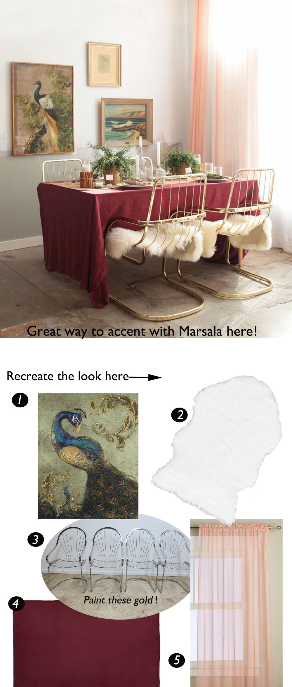
So why Marsala? They say the color of the year is meant to capture the spirit of the times, and when reading about what the experts had to say about Marsala, words such as earthy, hearty, nurturing, and fulfilling were used. This seems in stark contrast to all the social unrest we've had lately from tension between police and the masses to terrorism and beheadings. And with such rapid advances in technology, we are bombarded with information and reality TV-like drama all the time. So of course it would not be unusual to want to resort to a color that feels nurturing and comforting, kind of like apple pie or chicken noodle soup. Marsala is often compared to wine which is glamorous and luxurious, a big trend in design for some time now. But Marsala isn't necessarily an in your face Hollywood Regency glamour kind of color (although it can be with the right finishes and furnishings). Instead it is more organic or natural, perhaps a nice contrast to the obvious glitz and glam we've been accustomed to. I also noticed that there seem to be different shades of Marsala, or at least people are interpreting it a little differently. I've seen it look anywhere from a near rose pink to as dark as burgundy or wine. Either way, Marsala has not been an easy-to-love color for me. I think I'm just not used to seeing it in modern and chic décor. But I enjoy when designers can reinterpret unexpected colors or furnishings in an interesting way. This table setting (below) by Emily Henderson is a great example of this.

One thing about Marsala is that it's very versatile. With it's brown and brick red tones, it goes with everything from red to pink to blues. I really like it with the peach/pink curtains— it creates tension with the marsala, and I find a certain amount of color tension invigorating. I also really like the gold chairs and fur seat covers. It feels very glamorous and sexy admist the lovely vintage pictures, dainty curtains, and rustic marsala. The entire mix creates such interest, don't you agree? I've sourced a few of the pieces in case you'd like to recreate the look. I chose pieces that I think really define the look and make it pop. So what do you think, would use Marsala in a room?
peacock print || faux sheepskin || wire cantilever chairs || wine/marsala burlap tablecloth || sheer pink curtains
