3 Design Myths That Keep You Confused About Your Style

Between social media, magazines, and blogs, we’re inundated with home decor. And what may be inspiring for a moment, often ends up feeling overdone and tired pretty quickly. This can make it difficult to pin down what we like or our style; and we might be drawn to a lot of different styles at any one time. The other day, I saw someone post they don’t know what their style is because they love a bit of “everything.” And this is very much what being overwhelmed can feel like. 

While I don’t know all the reasons this person had difficulty finding their style, research shows information overload can lead to anxiety. And while anxiety may be a strong word, there is something to the idea that overexposure to so many interior styles can leave us feeling uncertain about our ability to decorate in a way that feels right for us, especially for those who tend to have anxiety about finding the “right” furnishings.  As a result, we may be inclined to follow “rules” that sound good but work against us. So here are three design myths that may keep you confused about your style and alternatives you can consider.

Myth: I have to pick one style.

Alternative: I can blend styles I love and make them harmonious.

Vintage stores with all different styles can be overwhelming. So I often just let my eye roam until I catch something interesting. And when I find interesting objects in all different styles, I challenge myself to find a common thread among them.

During my interior design training, instructors really pushed the idea that we have to pick one style for a room. They threw around terms like french country, mid-century modern, or contemporary for us to consider. And while eclectic was acceptable, we were made to identify one major style for a room. 

While I understand the benefits of this, I also found it to be quite restricting. So when my instructor said my living room design wouldn’t work because it had too many competing styles, I was pretty bummed. She didn’t get my vision. She didn’t see it would translate well in real life. But of course, like the  disciplined student I am, I redesigned the room only to find the updated version pretty blah compared to my original one. 

I still don’t believe you have to pick one style, but I would say there is an art to remixing different styles into one in a way that feels harmonious and unique to you. Research shows that identifiable style is formed when we have a repertoire of design solutions we use (e.g., adding black to create moodiness or substance), and this comes through repeated exposure to styles we like. So as we draw from a  variety of styles, we can begin to create a harmonious space by identifying the elements of each style we are drawn to. Then find a running theme that ties disparate elements together, making it easier to establish our unique style.

Personally, I love urban modern, classic/ traditional, and faded glamour styles; and my  running theme is based upon a character I call “urban lady who lunches”. It’s supposed to capture a worldly woman who loves classic pieces with a twist, and embodies all the elements I’m drawn to. You may appreciate this character theme, but if it’s too dramatic,  choose a theme that feels right for you. 

Myth: My space will look stylish if I keep up with trends.

Alternative: My space will look stylish if the trends I choose reflect me. 

Mushrooms have been having a moment and you may be weary about seeing them everywhere. But if you really love them, keep them. The trend will eventually pass, and all that will be left is the context you’ve created for them.

I love trends as much as anyone. They’re significant symbols of what’s happening in culture, and allow us to communicate our cultural sophistication. But keeping up with trends doesn’t necessarily guarantee you’ll have a stylish space. That is, style it’s more about your ability to tap into your creative vision. We certainly don’t have to adopt every trend. And what’s more, we don’t have to ditch trends b/c they’re no longer “in.” This may be harder said than done as it takes internal resolve to still love a trend whose moment has passed. But it’s also admirable and a sign you’ve really tapped into your inner creative. 

I once heard a designer say she loved a trendy Moroccan rug long past its “moment”, and continued to hold onto the rug because she had an affinity for it. Similarly, I remember when chevron was everywhere, and honestly I was sick and tired of it. But now that the trend has subsided; I don’t feel as annoyed by it anymore. This made me realize trends and furnishings are all about the context we give it. If you genuinely like something that is trendy or not, style it in a way that is true to you and it will be timeless. 

According to research, today’s youth are drawn to trends that reflect self-expression and their values; and I believe this is a trend we can all get behind. So the next time you see an object you like for your home, but hesitate because you’re concerned it may not be trendy or be too trendy, ask yourself if you genuinely like it, why, and how you envision it working for your space. This will help you determine if it will work for you. 

Myth: Don’t buy decor you love if it  “doesn’t go.”

Alternative: If you really love it, you can make it work. 

This green frog is certainly a speciality item. And if you really love it but don’t think it will work in your space, think about how you would use it if you could (umbrella stand?). If you still can’t think of a place for it, walk away from it. And If you’re continuing to think about it, it’s a good sign it’s for you. The only caveat is that it might not be there when you get back, but this is just the risk you take.

I can’t tell you the amount of times I questioned whether something I like would “go”. Sure, making our home feel harmonious is design 101, but there’s a blind spot in interior design.  What shouldn’t go or feel harmonious in theory, may actually feel harmonious in real life. Being able to know if it does or not takes some trial and error to get right. According to research, one way style is created is from repeatedly executing design solutions you recall from memory when needed. In other words, the more you practice following your vision or intuition, the easier it is to know if an object is right for you. 

All in all, I believe if you really love an object, there is a reason, and you can always find a way to make it work. It helps to think of how something can work in your space even if you don’t have a spot for at the moment. This way, you can work towards creating a space for it. I have four square ottomans in storage that I plan to reupholster in different color velvet. I envision putting them in the basement or sunroom once it’s completed, and think it will work really well. So the next time you see an object you strongly feel belongs with you, don’t hesitate just because it doesn’t go with furnishings you can easily switch up. Rather consider how you can make it work. 

Now it’s your turn, how has your design style evolved? Are there myths you have fought against or truths that work for you? Share your experiences with us. 

How to Choose Bathroom Paint Color, According to a Psychologist

Photo by me through Midjourney. yellow is a warm, optimistic color that energizes. the warm pink tiles with the yellow paint create an energetic and cheerful Vibe.

Often when people have asked me the best color for a particular room, I’ve struggled to answer because colors can affect each of us differently.  I’ve since attempted to narrow down a few considerations when choosing colors for specific rooms, starting with the bathroom. So if you’re interested in how to choose bathroom paint color, according to a psychologist, read on. 

Let’s start with some basic info about color. Color is characterized by wavelengths of visible light. The sensation we experience when objects reflect light is what we recognize as color. When light hits an object all the colors get absorbed except the one we see. So when we see orange, all the other colors have been absorbed with the exception of orange.  Full absorption is black and full reflection is white. 

For simplicity, colors can be divided into warm and cool colors. Warm colors like red, orange, and yellow are longer wavelengths; and cool colors like blue, green, and purple are shorter wavelengths. Long wavelength colors hit the retina for a longer period of time, and tend to energize and excite us. On the other hand, short wavelength colors hit the retina for a shorter period of time, putting less strain on the eye. They tend to calm us. To complicate things even more, a hue, the basic attribute of the color we see (like red or green) can be cooler or warmer depending on what other colors it is mixed with. 

Photo by me through Midjourney. THis Glossy Red is sure to stimulate sleepy mornings.

Beyond our basic physiological responses to color, we also have cultural and personal experiences with color that affect our reaction to it. Researchers have used the term Ecological Valence Theory (EVT) to explain how shared ecological experiences result in near universal associations between colors and emotions. For instance, many of us associate yellow with the sun and perceive the color as optimistic. But this may not be the case in hot, dry climates like Egypt where the sun can feel more antagonistic than optimistic. Essentially, we tend to prefer colors associated with things we like. This can explain why many of us are drawn to turquoise and watery greens that remind us of the sea, airy freshness, and/or cleanliness. 

Beyond near universal pairings between colors and emotions, we also have our personal experiences with color. If a color reminds us of a bad experience we’ve had, we will likely have an adverse reaction to it, even if it is generally considered a pleasant color.

Now that we’ve gotten the basics of color out of the way, let’s consider how we approach choosing a color for bathrooms. First, we need to answer some questions about the characteristics of the bathroom. Here are some to start with but you may have more.

  1. Is it a communal bathroom, the only one in the house?

  2. Is the bathroom one to luxuriate in, or is it wash and go?

  3. What is the mood you want for your bathroom?

  4. Are there windows in the bathroom or is it purely artificial light?

  5. If your bathroom has a window, what direction does it face, north, south, east, or west?

  6. If your bathroom has purely artificial light, is it cooler or warmer light?

Photo by me through midjourney. This cool, minty green may possibly soothe tough work days.

So if there is only one bathroom in the house and others are fighting for it, then possibly consider a warmer color, a stimulating one that prevents people in the house from lingering. Research shows that red tends to increase perceptions of speed, making time seem to go faster. On the other hand, if you want bathtime to be a luxurious experience, consider cooler colors like blue, green, or purple, and in deeper shades. The deeper tones have richness and weight, and can feel supportive. For a wash and go bathroom others aren’t fighting over, still choose a more stimulating color as mentioned above. 

Once you’ve determined the function, you’ll also need to determine the mood. Do you want it to feel homey and cute, cool and minimal, elegant and chic, dramatic and sexy, or something else? Warmer or cooler colors will work for any mood, but it is the way these colors are used that will give the mood you are looking for. For instance, homey and cute may be reflected through bright and balanced, complementary colors; and dramatic and sexy may be reflected through one bold color. Keep in mind that complementary or contrasting colors will also be more stimulating; and colors on the same side of the color wheel will feel less intense and more soothing.

If there are no windows in the bathroom, you’ll need to consider the artificial light used. Soft, white light is known to make warm paint colors more intense since it picks up the warm tones in the soft light. Cooler paint colors appear more dull since the soft light doesn’t pick up the cooler tones. Fluorescent lights are known for giving off a bluish color, and share similar temperatures to cooler paint colors. If you have fluorescent lights, consider using cooler paint colors to give a harmonious atmosphere, and intensify the cooler colors. 

If your bathroom has windows, you’ll want to consider that south-facing windows get the most light and heat, and north-facing windows receive the least light. East-facing windows are lightest in the morning, and give off cool light, whereas west-facing windows receive the most light in the afternoon, and the light is strong and hot. As follows, if your bathroom gets lots of warm sunlight, consider using warmer paint colors. The warm sunlight will enhance the wall color, creating a unifying feel. Similarly, cooler sunlight will enhance cooler paint colors.

But maybe you want something other than a unifying feel; and are looking for a dynamic contrast or visual interest. If so, pair warmer paint colors with cooler natural or artificial light, or warmer paint colors with cooler natural or artificial light.

Photo by me through Midjourney. This crimson glossy red has deeper, cooler blue or purple tones making it a bit more soothing.

Again, the answer to how to choose bathroom paint color is a complex one that depends on our physiological responses to color, cultural and personal experiences with it, the context in which the color is presented, the unique qualities of the room, and the function of the room. Here is a checklist/summary to make it easier. Consider the following:

  • The function and desired mood of the bathroom

Consider the function of the bathroom when making a decision about warmer or cooler paint colors. Warmer colors excite and energize, and entice people to move more quickly; and cooler colors calm and relax us, causing us to linger longer. Note that any color can be warmer or cooler, or have warmer or cooler undertones (like in the case of neutral colors).  Next, determine the mood you want (e.g., homey, minimal, elegant, sexy). This will help you decide how you use the colors (e.g., complementary colors may feel homey and cute).

  • Your cultural and personal experiences with color.  

Consider your ecological experiences with color as well as your personal experiences with it. For instance, green may remind you of nurturance and stability, or it may remind you of bad shag carpeting. If you are adverse to green, consider that there may be some shades of green you can tolerate that may be cooler or warmer.

  • The direction of the windows and temperature of the artificial light.

For a unifying experience, natural light (warmer or color) or artificial light should be the same temperature as the wall color. For a contrasting, visually stimulating experience,  you can contrast natural or artificial light with the wall color.

Hopefully these considerations resonate with you and/or you may have some new ones to add. Either way, let’s discuss, how do you choose bathroom paint color?

Apartment Therapy’s Small/Cool NYC Pop-Up: Which Small Space Design is Ideal for Your Personality Type?

Last weekend, I visited Apartment Therapy’s Small/Cool NYC shoppable pop-up in Brooklyn. I love getting inspiration from show houses and capturing memorable pics (all photos by me). It’s always fun to see what designers are up to, and how they’re using furnishings in new and unexpected ways. The Apartment Therapy show house is especially interesting because it challenges designers to be creative with small, cramped NYC spaces. Each room is given a title that reflects the look and feel of the room, and aptly captures the unique qualities each designer brings to the space. As I processed the overall feel of the rooms and the details in it, I wondered what personality types would be ideal for them. Or, what personality types would experience the rooms as the designers intended.  

According to design psychology, our response to spaces is partly attributable to our past experience with place; and a space may trigger traumatic or negative experiences, or evoke high positive associations with past places, sometimes below our level of awareness. What’s more, our personality, including enduring thoughts, feelings, and behaviors that were developed within the context of these past places, also impact our experience of place. And while personality is complex, Dr. Sally Augustin in her book, Designology: How to Find Your PlaceType & Align Your Life with Design, simplifies it for us, offering place types based upon a few basic components of personality.

Essentially, Dr. Augustin highlights three components of personality, including introvert/extrovert, conscientiousness, and openness to experience. Keep in mind that both extroverts and introverts may be great with people and have the ability to move a crowd. The only difference is that people who are extroverted tend to get their energy by being around others, and those who are introverted tend to get their energy or recharge by being alone. Conscientious people are engaged, orderly, and very specific whereas less conscientious people are more laid back. And those open to experience tend to be more daring whereas those less open to experience tend to stick with tradition or what they know. 

Of course, many people don’t fall neatly into any one category; and we may have more or less of any one personality component. But Dr. Augustin’s scale is a quick way to begin thinking about where you lean; and better determine what design styles are most compatible with a working understanding of your personality. For example, extroverted people tend to be more inclined to favor open spaces with high energy, whereas introverted people tend to favor calming spaces that are segmented and allow for private time. Conscientious people are inclined to keep things orderly without much effort, and those who are laid back may need more organizational tools to keep things in order. Those who are open to experience are likely to try something new and unusual than those who are less open to experience. 

So using Dr. Augustin’s personality components, I decided to link personality types to some of my favorite rooms in the show house. While Dr. Augustin uses fancy names to identify the varied dimensions of personality, I won’t identify those names here for the sake of simplicity. Instead, I will just refer to the personality dimensions  themselves. 

Drew Barrymore’s Sunny Style Studio: Extrovert, Conscientious, and Less Open to Experience

Drew Barrymore’s “Sunny Style” studio is said to feel like a “big hug”. It’s meant to be a “delightful”, “cheery”, and “functional”  space. And with pastels, rounded comfy seating, wood surfaces, and busy wallpaper, I’d say it is perfect for someone who is extroverted, conscientious, and less open to experience. 

Here’s why: according to the theory of color psychology popularized by Angela Wright, we are most responsive to seasonal-linked color groupings that match our personality patterns. Specifically, a spring-linked palette is characterized by bright and warm colors, containing no black. It’s associated with being playful, light in mood, and of course, extroversion. And let’s not overlook the William Morris-esque wallpaper. Research shows that curvilinear patterns like this are associated with friendliness and comfort, all very fitting for the gregarious person living in this “Sunny Style” space. 

Next, conscientious people are inclined to be organized and orderly with a penchant for details. So all of the open shelving and functional tools available in this room may be a dream for the more conscientious amongst us looking to show off their organizational skills. And while being less open to experience might seem like a negative, it isn’t. Keep in mind that personality categorizations are designed to help us gain self-understanding, not a judgment. So if you are less open to experience, it simply means you’re inclined to stick with the tried and true, leaning towards more traditional styling. And what’s more traditional than patterned floral wallpaper, wood paneled walls, and natural wood surfaces?

Hollie Velten-Lattrell’s Historic Nowstalgic Salon: Introvert, Laid-Back, Open To Experience

Hollie Velten-Lattrell’s salon appealed to my affinity for modern, English style. With it’s select vintage pieces and bespoke furnishings tied together with modern sensibilities, I’d say it best suited for one who is introverted, laid back, and open to experience. 

Here’s why: as mentioned above, introverts enjoy their alone time, and may want to step aside from the action a bit. Velten-Lattrell’s space has several different seating areas, also referred to as nested layers, that allow people different options within a larger space. So if someone prefers to be alone rather than talk with others, they can. Another thing to point out is the fairly neutral, faded color scheme with a few scattered patterns. Overall, it gives the feeling of calm, most suitable for those who are inclined to prefer relaxed rather than highly stimulating spaces. 

Those who are less conscientious tend to be carefree in their approach to design. And if an arrangement works, they may not exert the effort to change it. Velten-Latrell’s salon feels very easy-breezy, including its functionality as the floral print skirted sette doubles as a lounger. Personally, I’d love to lay out on the settee in front of that bespoke chandelier. The low-hanging skirted fixture creates a sense of intimacy and unpretentiousness characteristic of a more laid back vibe. And the coffee table doubles as both a place to hold drinks and play games, creating a lived-in, laissez-faire kind of feel.

I’d add that the introverted, laid-back person who is more open to experience would particularly enjoy the eclectic furnishings. A floral skirted sofa together with a glitzy mirrored side table; and a vintage modern chair (with to die for chrome legs and circle- shaped feet) next to an antique-looking tapestry is a treat for the daring. 

Kim White’s House of Hacks Living Space: Introvert, Conscientious, Open to Experience

Kim White’s cool, chic modern living space is loaded with multipurpose, functional, and well-appointed furnishings. It’s just right for the jet-setter who needs to come home and regroup before their next trip abroad. With a restrained, yet dramatic color palate; a marble coffee table that doubles as a dining table; and earthy, old-world furnishings sprinkled throughout, this space would be ideal for someone who was introverted, conscientious, and open to experience. 

Here’s my take: chic introverts would be really into this minimal color palette. Introverts also respond well to curated spaces enhanced with varied textures, secents, and sounds as they are particularly sensitive to sensory stimuli. 

As mentioned above, the creative functionality of the space would delight those high in conscientiousness. More than the marble coffee table turned dining table, the neo-traditional storage cabinet also houses a bar, and the wall-mounted desk folds up into a cabinet. These hidden functional items gives the conscientious their much desired efficiency and organization for a clutter-free look.

And appealing to the daring, the mix of earthy and old-world furnishing such as the tree stump stool and the weathered pot, along with classical styles like the bust stool, and modern, streamlined pieces creates a world traveled feel that suggests openness to different experiences. 

Maitri Mody’s Creative Cabinetry: Extrovert, Conscientious, Open to Experience

Maitri Mody’s charming and energizing Scandinavia-inspired space is sure to brighten up moody mornings. The cabinets are said to be “vehicles for self-expression” and when your home feels like you, it goes a long way towards fulfilling your psychological needs. I’d say this space best suits someone who is extroverted, conscientious, and open to experience. 

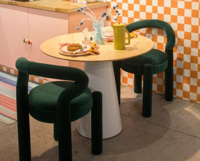
Here’s why: extroverts tend to be most responsive to highly stimulating spaces; and this is achieved with a number of details such as the bright colored square tiles, different color cabinets, and quirky knobs. 

The kitchen space also includes colorful options for storage; and I think it’s safe to say those high in conscientiousness would be very into it. While those less open to experience are not necessarily risk averse, they may not be as excited by painting their cabinets two different colors in the way those more open to experience might be. For the more daring, it’s an opportunity to go against the grain and try something unusual. 

So what do you think–does your personality style fit any of these rooms? Or, are you drawn to any of the rooms in spite of what we might think given your personality? Maybe you saw other rooms in the show house you’d prefer. If so, I’d love to hear about them and why…Share with us in the comments.

Struggling to Create Your Ideal Home? Try Changing Your Mindset

Grand red striped room made in Midjourney

letting my imagination rip with these ai rooms. Creating anyway you can even without the resources you wish you had is what keeps your passions going.

Grand Red Striped bedRoom created by me in Midjourney.

With social media, we have more access to ideal homes than ever before. No longer relegated to seeing the homes of a few select celebrities in magazines, we get to see homes by regular people who are killing it and making a name for themselves. It’s really easy to get inspired by the homes of these “regular” people, especially when you share a similar sense of style. But what if your vision is bigger than your wallet or resources, and you can’t make inspired changes to your home as quickly or as regularly as you’d like? You may end up feeling discouraged, begin to compare yourself to others, and start to doubt your sense of style. 

If this sounds familiar, you’re no different than the rest of us. But it’s important to be able to insulate yourself from this type of design discouragement that puts a damper on your creativity and ultimately your well-being. According to design psychology, our ideal home should meet more than our aesthetic needs, but our psychological needs as well. That’s our need for love, belonging, and self-expression. And if your home does not satisfy you psychologically— that is, if it does not feel like a true reflection of you, you may experience disconnect and distress, particularly if your experiencing disconnection in other areas of your life. 

Futuristic cottage created in Midjourney

futuristic cottage created by me in midjourney.


So while there are many ways to fix up your home with limited resources, this post is for those days when you feel too discouraged about the state of your home to look on the bright side. Oftentimes, it comes down to understanding the type of control you have over the design of your home. Theories of control propose that there are three types of control we can have over our environment. There is behavioral control, which is the ability to take action;  decisional control, the ability to choose; and cognitive control, the ability to change the way we interpret events in our environment.

We might not have the ability to take action and completely gut our bathrooms or kitchens. Or we may feel our options are too limiting to make it our ideal home, but we can change the way we think of our home; and reinterpret the way we believe we can make it better for us and those who share our space. I like to think of it as creative control. 

While reading through the fall 2023 issue of House Beautiful magazine, I came across the home of designer and co-founder of Collagerie and Colville OfficialLucinda Chambers. It’s a wonderfully, colorful, quirky, stylized home that has been curated over time rather than “designed” in the formal sense. Interviewed by Deputy Managing Editor, Olivia Hosken, Chambers shared that she has lived in the home for 30 years, and bought it when it was “shabby and uninteresting.” What’s more, she isn’t afraid to make design mistakes, championed the idea that there is always an opportunity to start over, and offered that it’s okay for a home to take a long time to come together.  

While we can make assumptions about Chambers’ behavioral and decisional control, her decision to move into a home that was less than enticing, and commit to making it her own over time suggests that she was able to maintain cognitive control. That is, she adapted during the in-betweens when maybe her home was less than she wanted it to be. Typically, homes that are well curated are appealing b/c of the joy each piece brings to the dweller; and in turn, the dweller is able to integrate it into the home in a way that is appealing to others. While a single keepsake, accessory, or furnishing may not be enough to make the whole house feel showcase ready, over time individual pieces begin to make a big impact. Don’t underestimate the ability to choose meaningful pieces from anywhere, a junk shop, big box store, or online that add something intangible to your burgeoning ideal home, making it feel more like a reflection of you, more psychologically satisfying. 

So for those moments when you are discouraged about your home decor and wish certain elements were in place, consider ways you can exercise cognitive control and think of your space in a different way. Here are some ideas.

Green grandmillenial room created in Midjourney

grandmillenial room by me in midjourney.

1. Leave a space empty

Years ago, I read an article in Domino magazine that addressed the reality of trying to decorate your home in your 20’s without the financial stability to afford coveted high-end pieces. It suggested leaving an empty space to make room (mentally and physically) for the high-end furnishings you will afford in the future. Not only is this practice designed to keep you focused on saving up for the piece you want so you no longer have to stare at an empty space, it is also a form of affirmation. That is, every time you see the empty space it reminds you of what you are working towards and gives you the zeal to go get it

2. Use filler furnishings

If the empty space doesn’t work for you, you can also include filler furnishings. Those are place holders you use until you get the piece you want. If you don’t yet have the couch, carpet, or curtains of your dream, use what you have or buy something in its place you don’t mind looking at. The filler piece should be pretty subdued and simple, styled in the best way possible until you get what you want. 

3. Purchase an affordable, unassuming accessory you enjoy

During shopping trips, you may not be able to find the grand pricey pieces you’re looking for or you may not have the funds to purchase them. But how about buying something that seems rather insignificant, yet adds joy to your space— like a cool postcard or a candle, or even collectibles like shells or buttons. Adding these little pieces to your space or a vignette can do wonders to lift your spirits.

Brown skirted couch, pink walls made in Midjourney

brown couch, pink room combo by me in Midjourney.

4. Rearrange furnishings

After seeing your furniture the same way for some time, you can begin to feel bored. So how about switching it up? Research shows that the places adults remember as their most favorite during childhood is the one they created themselves. There’s something about creating and recreating spaces with found objects that feel exciting and at times, magical. And rearranging your furnishings for a new look can give you the same jolt of excitement. It’s as if you you bought something new!

5. Do a deep purge

Sometimes, you may not be able to spend money but you can do a deep purge and get rid of everything that weighs your home down. Once you get rid of everything you don’t need, your home will feel lighter, fresher, and you’ll be in a better position to think clearly about what you need to fill the space. 

6. Create vignettes

While you may not be able to redesign a whole space, you can focus on creating smaller vignettes, and take pictures of them to build a moodboard that showcases your styling skills. It will no doubt expand your creativity, affirm your ability to be creative in less than stellar circumstances, and give you a dose of pretty while you wait to get the bigger design work done. 

What are some of the ways you take cognitive control of your space? Share it with us in the comments.

Does Your Home Meet Your Social Needs?

Interior design magazines and shows often give us clues about how our home can benefit our social life, at least ideally. We see influencers, and design connoisseurs entertaining and having friends over for weekend dinners with beautiful table settings and comfy living spaces designed to give us inspiration for our own gatherings. While it’s all so inviting, some of us may be more satisfied with our social life than others. And if we’re less than content with it, discouragement can cause us to lose hope in our ability to feel satisfied socially. Although design psychology cannot magically improve our social needs by the weekend, it can offer tools to help us better meet these needs and use the way we think about our home to do it. 

Whether you live alone or with others, it’s important for your home to be able to meet your social needs. This can mean allowing opportunities for building community, carving out time for privacy, or a balance of both. When we think of the rooms in a home, we typically think of common labels like living room, family room, dining room, and bedroom; but it doesn’t necessarily mean we use the rooms that way. We may use the dining room as an office, and the living room as a place to eat meals in front of the TV. It’s important to be clear on how you use the space so you can better determine if you are using it in ways that best support what you want to achieve socially. According to design psychology, your home can be designed to support the best version of you. If you are looking to expand your social network, or increase a sense of privacy, you can create a home that acts as a catalyst for those weekend dinners or much needed alone time. 

Consider how you establish relationships, build community, or make use of your private time

If you are looking to be more satisfied with your social space, consider how you establish healthy relationships, not just in your home but outside the home. That is, how do you build friendships or community? It can be hard to do when you do not have a job, a school, or any setting where you repeatedly see the same people (the ones you actually like). So it takes a little more effort; but either way creating community is about taking risks, putting yourself out there, and being friendly. You may not connect with everyone, but you can be open to what people who come into your life may give or teach you, and eventually you’ll find ones you connect with as well. 

Alternatively, how do you manage your alone time? Do you enjoy your privacy and see it as a way to develop a sense of independence; or do you feel isolated, lonely, and disconnected? If you feel the latter, it may be that you do not have an adequate sense of connection with others and/or yourself. Ironically, we can be with a bunch of people and still feel lonely, yearning for a type of self-love that others cannot fill. This typically requires deeper level work to address but design psychology can offer supportive tools while you’re in the process.  So with that basic framework in mind, how can you create a home that supports whatever your social needs are?

Consider open or segmented spaces

Angled seating and focal points allow for people to look away at a target to relieve anxiety. Links: 1st Dibs floral couch; One Kings Lane floral couch (see above for remaining links)

Generally speaking, a home can be divided into individual space, shared space, and public space; and we are satisfied when we have enough of each. For instance, those who are more extroverted, meaning they get their energy from being around others, may do well when a good portion of their space is public or shared. They tend to do well with open spaces as they have easier access to the people in their home. Alternatively, those who are more introverted, meaning they recharge or get their energy from their alone time, may do well with ample individual space. They tend to do well when spaces are segmented so they have a place to retreat and recharge. 

Therefore, if you are looking to create more segmented spaces, consider furnishings that divide a room such as a large bookcase, a screen, or position furnishings in ways that break up the space. Or, if you’re looking to create a sense of openness or expansion in your home, consider furnishings that do not block views, and furnishings that can be moved or swivel. 

Consider seating placement

Side-by-side seating options are good for people who do not know each other well. Links:
Parsons bench (see above for remaining links)

Any social setting needs seating, but the way seating is arranged can go a long way in making people feel comfortable or not so much. No matter our social needs, we all need some balance between privacy and socializing. So seating should be arranged in ways that allow people the option for both. For instance, people should have the freedom to move closer or farther away from others whether that means moving chairs or moving themselves in a large settee or sofa. It is a good idea to have flexible seating so that you can change up the arrangements to meet your specific social needs. 

With flexible seating in mind, you want to make sure you have a mix of face-to-face, side-by-side, and angled seating. You’d want to position chairs face-to-face for conversations that are not stressful and purely social in nature. Place chairs side-to-side when conversations may be tense or people do not know each other well. This way they have the option to turn their head to look at each other or look away at will. Similarly, place chairs at right angles or close to it when conversations may become stressful and people have the option to look away. Additionally, when chairs are positioned in a circle facing towards one focal point, it allows people to be social but also gives the option to look away and use the focal point as an excuse to do so. 

Consider seating type

How we sit in seats can promote creativity and concentration. Research shows that when people are in an expansive body posture, like in a recliner, they are less likely to be frustrated and think more creatively. This is based upon the idea that when in a more relaxed position, the excitatory system is inhibited. Thus, adding a recliner to your space can allow you or your guests the freedom to engage with others or their thoughts. But sitting upright has its benefits too. According to research, when we are sitting upright rather than slouching, we tend to have a more positive view of ourselves, and can be helpful when we are working or focused on a task. 

So whatever your social needs, these recommended changes can be a first step to making significant changes that can improve or enhance a sense of community or independence

Self-Empathy in Design: Using Objects to Create a Fulfilling Space

tortoise wavy glass bowl

Years ago when my teenage niece visited my two-bedroom apartment in a very builder’s grade apartment complex, she commented, “my friend [who lives a few doors down] has the same apartment as you…but yours looks so different…Hers is like a box.” My perceptive niece was referring to the contrasting approaches her friend’s family and I had to home design. In typical maximalist fashion, my apartment was filled with color and things. And while I didn’t see her friend’s apartment, I assume the family either wasn’t into decorating and/or didn’t have the (emotional) resources to create a sense of home. 

For some, decorating is not a priority; and simply having a home that meets basic needs for shelter and safety is enough. However, according to the design psychology hierarchy of needs created by design psychologist, Toby Israel, we can have a self-actualized home, i.e., a home that supports the best, most fulfilled versions of ourselves, only if certain needs are met. These include needs for shelter and safety, social and psychological needs, and aesthetic needs. 

While needs for shelter are basic and necessary for survival, psychological and social needs are also important but often minimized or overlooked. These are needs that meet our desire for a sense of love, belonging, and esteem, as well as a need for community and privacy. It’s deeper than just having a pretty home, it’s about having a home that supports us emotionally and allows us to integrate different parts of ourselves, particularly the parts that have been suppressed due to societal constraints. 

In her latest book, Designing-Women’s Lives: Transforming Place and Self, Israel highlights the challenges women architects and other female place-makers have had in creating human-centered projects within the context of a male-dominated field that values objectivity and rationality over subjectivity and emotionality. She proposes that women architects often have to neglect parts of themselves in order to be successful professionals. Nevertheless, many of these women have been trailblazers in creating human-centered spaces. These are spaces that are infused with empathy for people’s stories and elicit strong, positive feelings such as honoring marginalized women’s social needs by creating often overlooked private and social spaces, or otherworldly architecture that symbolizes higher ideals.

Israel summons us to follow the lead of these inspiring women by using our space to more consciously honor the aspects of ourselves we may have hidden so that the home becomes a “catalyst” for wholeness.  One of the ways to do this is to consider the objects of our home and the meanings they have for us. Notably, founders of the popular design website, Sight Unseen, and authors of, How to Live with Objects, Monica Khemsurov & Jill Singer, mirror Israel’s sentiments about using objects to create fulfilling spaces.

In their book, they write that “living with objects we care about–for reasons that transcend their basic function—is always something that has come naturally to humans.” It’s this ability to transcend design with objects and create spaces that reflect the highest versions of ourselves Israel urges us to strive for. As if Khemsurov and Singer plucked the information right out of Israel’s design psychology books, they assert that objects are part of our “personal emotional landscape” and “ reflect us”, “tell stories,” and “make us feel.” 

The authors go on to say, “Your objects can establish your identity...” In other words, in design psychology terms, the objects in your home, consciously or unconsciously, tend to symbolize your persona; and when you become conscious of these symbols you can more easily use objects to help achieve place self-actualization. The authors further reason that when “someone walks into your home and sees the items you live with, they may start to understand you better…and may even see commonalities between your interests and their own…” This shows how meaningful objects may also help to create connections and satisfy social needs. So if you are looking to include more specialized objects into your home, here are some ways to consider using them to create a more emotionally fulfilling space.

Identify objects in your home that you would not want to give up

tortoise wavy glass bowl

my Glass Bowl: I Adore it for its swanky 70’s vibe, reminiscent of something that would be displayed at a cool aunt’s house party.

If you were going through the design psychology process, you’d be asked to go through a number of exercises that help you to better understand your experience with place, including an exercise that helps you identify meaningful objects in your home. So consider the objects in your home that you’d have a hard time giving up; and determine why they are meaningful. This will help to bring your unconscious thoughts and feelings to the fore. 

Incorporate similar favorite objects from the past into your current space

antique style writing desk

My antique writing desk: After painting it all sorts of colors and putting it in the garbage pile, we decided to keep it and now it’s part of our family’s story.

Perhaps you don’t currently have meaningful objects in your space, or you have very few and would like more. If so, consider favorite objects from past, and the reason they were meaningful to you. Then see if you can find similar objects to place in your current space. The objects do not have to be the same, they only need to  remind you of the objects you remember. Note that design psychology is not about re-creating the past, but rather it’s about capturing the essence of past beloved objects. 

Expand your search for meaningful objects

Pedastal table

My 1930’s pedastal table: my husband spent a lot of energy striping it , so it’s definitely not going anywhere anytime soon.

Not sure where to find meaningful objects? Many special objects can be found in unexpected places, so don’t rule out any store. Nevertheless, many objects with soul can be found secondhand; and there are a plethora of vintage stores online you can peruse. Often, however, when you go to vintage stores or flea markets looking for a specific object, you’ll be hard pressed to find it. So you will need to have a little patience and trust the process.

Resist the urge to buy an object just to fill up space

Empire style stool

My Empire Style stool: It has a wordly, expresive vibe that was part of my ideal home statement.

This brings me to my next point which is don’t just buy any object because you need to fill the space. If you are looking for carefully curated objects that mean something, and are a reflection of you, then leave a space empty until you can find the “right” piece to fill it. The empty space will be a reminder of what’s to come; and will reduce the chances that you will stop looking for the object because you’ve replaced it with something else.