Communicating with Color: Blue
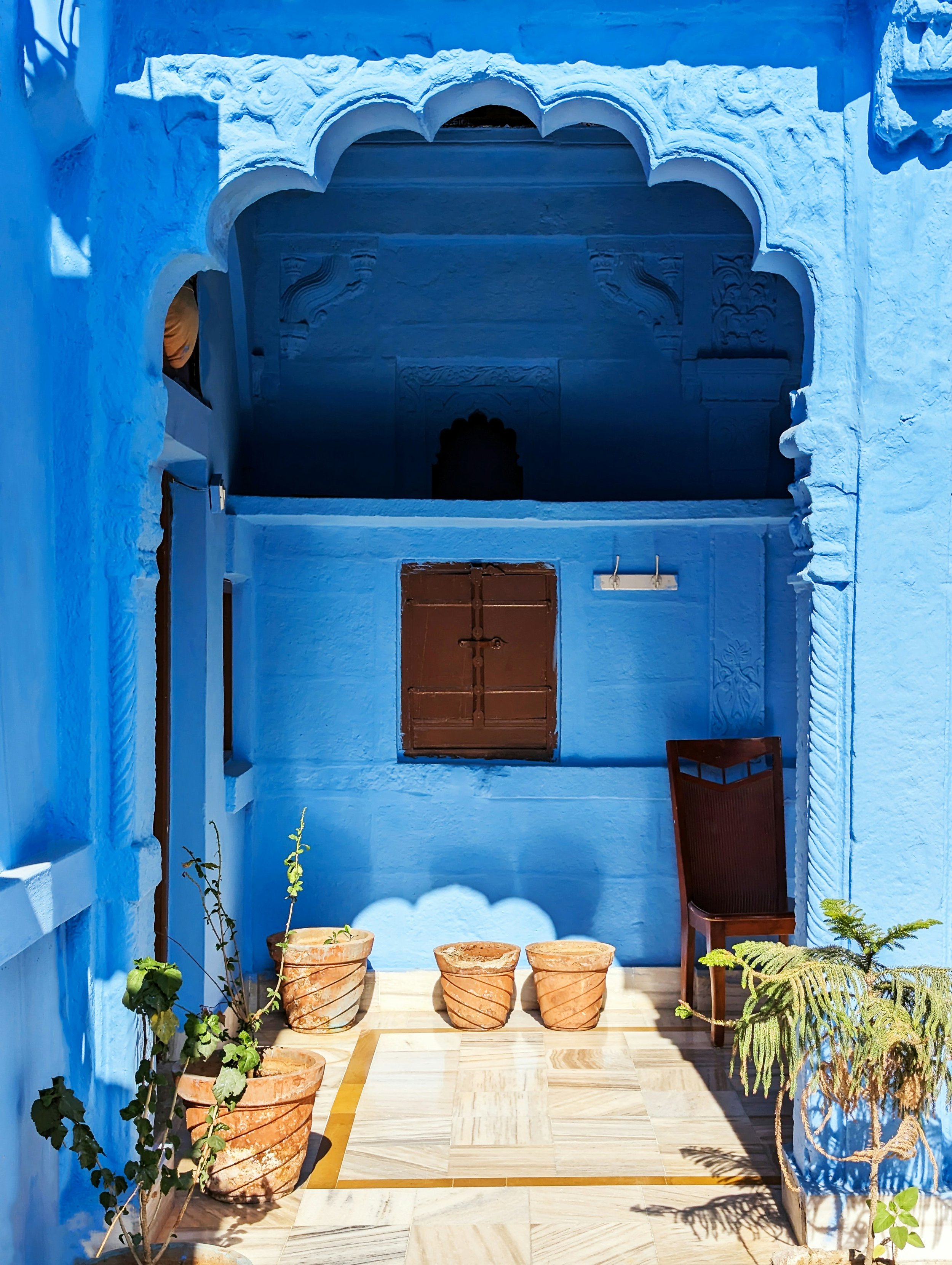
What happens when a color known for being dependable becomes something less expected?
Beyond Dependable
Blue is one of those colors that feels dependable. We tend to associate it with trust, stability and calm, and there’s good reason for that. We see darker blues over and over again in uniforms, business attire and other places where authority and reliability matter. But that is only one way blue can communicate.
Like any color, the way we respond to blue depends on the shade, the context, our cultural associations and our own personal experiences. A dark navy can feel serious and restrained. A pale blue can feel soft. A brighter blue can feel almost electric. And sometimes the styling completely changes what we expect the color to do. That is what interested me here. I wanted to look at blue beyond dependable.
The Psychology Behind Blue
Blue is often called a trustworthy color, but I wouldn’t say the presence of blue automatically makes us more trusting.
Color is much more complicated than that. Part of what we respond to comes from association. We repeatedly see darker blues in settings connected with professionalism, authority and stability, and over time those pairings can become part of what the color means to us.
Our personal experiences matter too. Someone can understand the broader association between blue and trust and still have a completely different response to it because of their own history with the color.
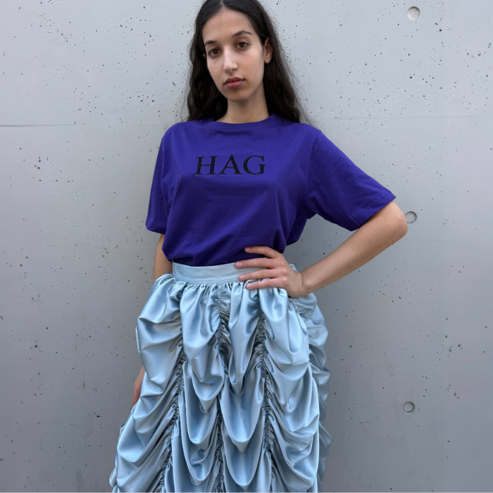
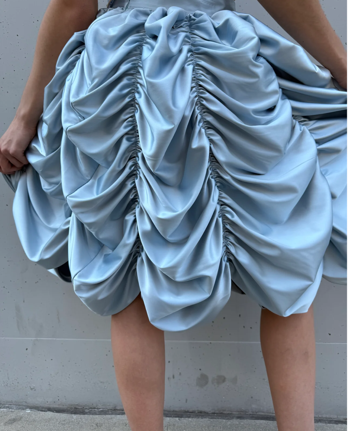
And context can change things quite a bit. The same pale blue that might feel sweet in one setting feels strange and expressive on a highly ruched skirt. Saturated turquoise across a floor feels immersive. Blue embroidery against natural linen feels tailored. An intense blue inside an antique-looking gold frame suddenly feels completely different again.
So rather than asking what blue means, I think it is more interesting to ask:
What is this particular blue doing here? Blue may be dependable but it doesn’t have to be predictable. Here are a few ways blue caught my attention.
Unexpectedly Expressive
I love this because pale blue could so easily feel quiet or sweet, but this skirt is neither. There is so much ruching and volume that the color suddenly feels expressive. I also love it with the grape T-shirt. The colors are close enough that the combination still feels relatively soothing, while the very casual top against such an elaborate skirt keeps the whole thing interesting. The blue may be soft, but the styling isn’t.
Easy Blue
Zoë Kravitz’s navy Picasso T-shirt
There is nothing particularly unusual about a navy T-shirt, and I think that is part of why I like this so much. Here blue works with Harry’s softer blue sweatshirt without looking like they intentionally dressed alike. Maybe because they’re a couple, the two blues also feel connected in a way that is just really cute.
Then there are the bright green shorts. Blue and green sit close to one another on the color wheel, so they work together, but that bright green against the softer blue creates just enough tension to make the whole thing feel less basic. Sometimes it’s just about what you put next to something.
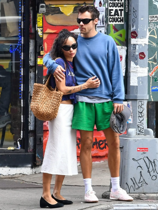
Image via Deuxmoi
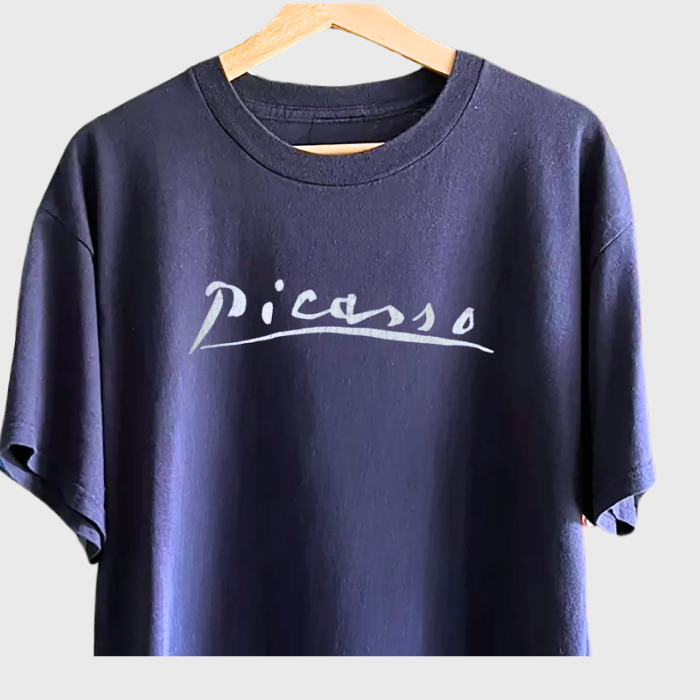
Image via Strike Anywhere
An Immersive Blue
Safavieh Himalaya Turquoise Wool Rug
I became obsessed with this Villa Borsani room because of the blue carpet against the blue walls.
There isn’t a lot of contrast between the two, which is part of what makes it feel so soothing, but the blues aren’t exactly the same. The floor is more saturated, so the room still has depth.
I like the idea of blue being used this way, not as a little accent, but almost as the atmosphere of a room. The Safavieh rug gives you a way to bring some of that same saturated turquoise-blue into a space.
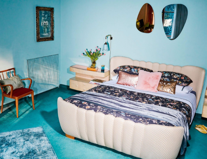
Image via Zara Home at Villa Borsani
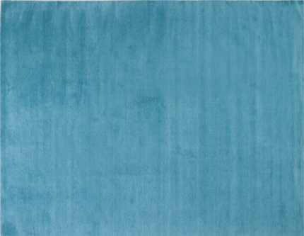
Image via Safavieh Himalaya Turquoise Rug
Classical, with a Wink
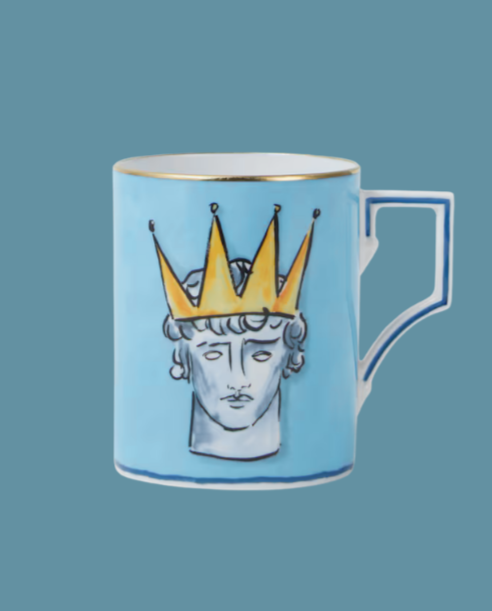
Ginori 1735 x Luke Edward Hall mug
I thoroughly enjoy this playful mug. The pale blue, the hand-drawn Neptune and that oversized yellow crown make something classical feel much less serious. It is witty and a little odd, which is probably why I like Luke Edward Hall’s work so much.
And I wouldn’t necessarily use it only as a mug. I could see a few little flowers in it, pencils, brushes, or just sitting out because it is a beautiful object.
(Trulery may earn a commission from products purchased through this link.)
Modern Blue, Old-World Charm
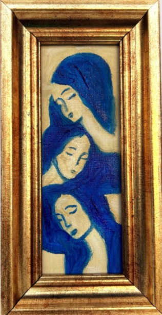
I’m not even completely sure why I like this as much as I do.
The blue is so intense and cool, and then it is presented in this tiny, ornate gold frame. There is something very modern about the strength of the blue, while the frame gives it this old-world quality. I think it is that contrast that keeps me looking at it.
Art Deep Art Love via Etsy
A Tailored Line
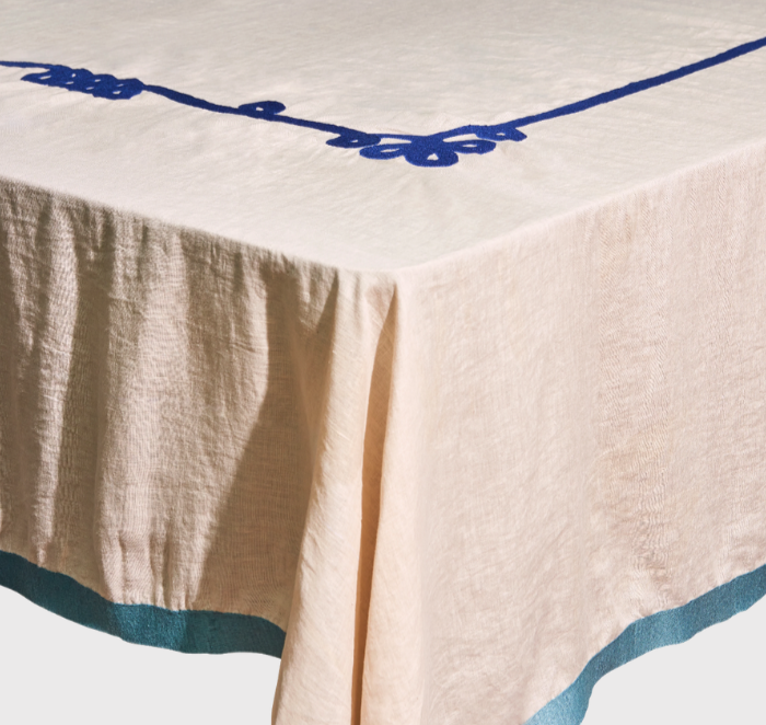
Misette Ribbon Linen Embroidered Tablecloth
This one feels like understated style to me. Against the natural linen, the blue-green embroidery reads turquoise, and I love how crisp and tailored the lines look. They remind me of piping or trim on a beautifully made piece of clothing.
There is also something about the linen and embroidery that makes it feel like the kind of thing you could keep for years. Not precious exactly, but special.
(Trulery may earn a commission from products purchased through this link.)
Perfectly Imperfect
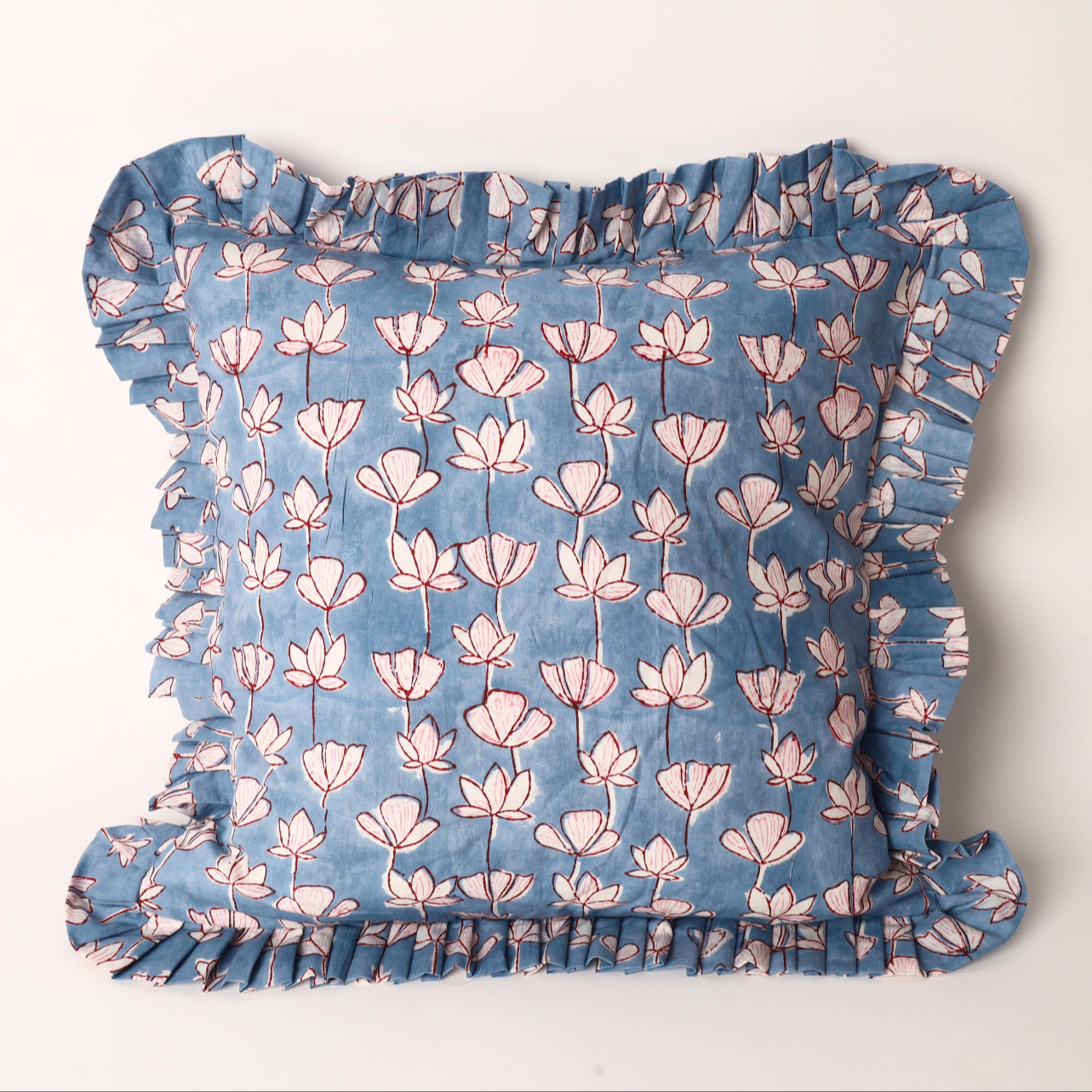
I just think this is fun. The flowers don’t look overly polished. The petals feel almost casually drawn, and I like that little bit of imperfection against the soft blue. Then you have the ruffle, which makes it even more playful. Pale blue can become very delicate and pretty very quickly. This still feels pretty, but it has a looseness to it that keeps it from feeling too sweet.
Palsey Print via Etsy
Try This…
Take a blue you already have and change the context around it.
Pair two different blues together instead of reaching for contrast.
Put a quiet blue with something strange or exaggerated. Use a stronger blue somewhere traditional.
Or take the most basic blue thing you own and see what happens when you put something unexpected next to it.