Communicating with Color: Magenta

Hey all! Hope you've had a good week and were able to bounce back from all the challenges you've had to face. I've decided to bring back my column, Communicating with Color since color has so much psychological significance. After all, we interpret the world through color, and it certainly impacts our mood. You can see my previous Communicating with Color posts here and here. I hadn't thought much about magenta until I was trying to decide on the right color to reupholster my new vintage office chair (see it on my Instagram here). To give you some perspective, my office space is in the family room, and it's painted white with white wood floors (kind of like a studio). I plan to bring in pops of color, and an eclectic mix of furniture to create a modern, glamorous bohemian vibe.

At first I thought I would reupholster the chair in white leather, which is pretty and what all the kids are doing these days. But with my white walls and floor, I felt like I needed something more. Strong warm colors like red and orange didn't appeal to me because they're not flexible enough to blend easily with other colors I might bring into the room. And cool colors, like blues and greens didn't appeal to me either. I think it may be because I have a turquoise blue sofa in there already. But I had this one magenta pillow with a funky hodge-podge of warm and cool colors on the front like orange, violet, and if you stare at it long enough, pink. It's the kind of pillow that makes it easy to bring in an unexpected mix of colors.  That's when I decided that magenta would be a great choice for my chair. It's versatile without sacrificing drama and excitement.

After doing a little research, I learned that magenta is a relatively new color created in the 19th century as a result of the Industrial Chemistry Revolution. Like other warm colors, it creates high arousal, stimulation, warmth, and excitement. But surprisingly, magenta isn't really a color at all. Meaning it has no wavelengths and doesn't exist in the spectrum of colors. Rather, we psychologically perceive magenta to make up for the gap between red and violet which are at both ends of the light spectrum. Maybe that's why magenta is so flexible and linked with creativity. They say magenta personalities are entrepreneurs and inventors, free-spirited and non-conformists. And that's exactly what I want to communicate in my office space where I make all my dreams come to life. Here are some magenta pieces you can use to infuse your space with energy and passion. Some of the pieces are no longer available, but I figured I'd include them for inspiration.

magenta-final9.jpg

What do you think of magenta? Do you use it in your home?

 Fern Living metallic wallpaper via Domino || magenta pouf via Lulu & Georgia|| magenta Peacock chair from the The Family Love Tree via From Moon to Moon||Burberry trench coat|| magenta sofa via One Kings Lane|| green patterned pillow via Lulu & Georgia|| blue Jil Sander clutch via Farfetch|| magenta pumps via Banana Republic

Communicating with Yellow

Some time ago I started a series communicating with color to highlight the strong psychological influence color has on our mood. When it comes to color, we often grow up with a learned set of rules. There was a time when redheads were told never to wear pink or red, or blondes were told never to wear yellow. And truth be told, because my skin has such gold, yellow undertones, I have always been cautious about wearing yellow, particularly when it comes to yellow make-up or nail polish. This summer, I've been taking notice of the yellow nail polish trend. I absolutely love the way it looks on dark skin tones, but never thought I could pull it off. Well, never say never, right? Because  I recently  decided to try a shade of yellow, and found one I was really happy with (see below). It's  a  strong yellow, and doesn't blend in with or wash out my skin tone. I'm glad that I've been able to move beyond "color typing" and experiment a little. Color typing is when we rely on a set of ideal rules that govern our color choices and interferes with our  individuality and creative expression. Really, we don't have to be limited to an ideal set of colors, as there are a range of factors (e.g.,cultural, physiological, environmental) that influence our perception of color. And as you may recall from my last post in this series, colors can communicate different messages depending  on the context, and even the shade. Of course yellow is no exception. Yellow is often thought of as an uplifting, happy color. But used too much, it can be stressful and lead to frustration and anger. It also evokes creativity or originality, and is best used as an accent color designed to stimulate the senses but not overload them.

If you're thinking of using yellow in your home or outfit, you can incorporate some global inspired yellow wallpaper for a well-traveled feel like this Aphrochic wallpaper, or wear yellow suede shoes for a cheerful, yet glamorous look as shown here by socialite Olivia Palermo. You can even paint your walls bright yellow if you you're looking for high excitement like this room designed by Nick Olsen, but just  make sure you and your guests can handle the stimulation. See these and more ways to use yellow below.

communicating with yellow_edited7

wallpapershoessofadresswallstable

What ways do you like to use yellow?

Communicating with Coral

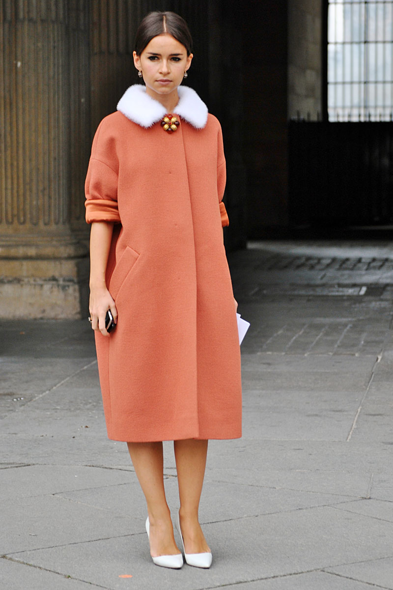
"They" say that the influence of color is so automatic,  we barely know it when it's affecting us. In an instant the way we think, feel, and behave in reaction to a given color depends upon the particular context with which we are experiencing that color. That means that depending on where we are and what we're doing  we may perceive or react to the same color differently. Let's take coral for instance—one of my favorite colors right now. When I think of coral, I think sunny days, long naps on the beach, and sherbert ice-cream.  But depending on the context, coral can communicate many different messages.

{image: vogue}

Coral can be glamorous like this.

{image: pinterest}

Bohemian and calming like this.

{image: j.crew}

Or masculine like this.

{image: exquisite designs}

Coral in nature is simply uplifting and refreshing.

{image: pinterest}

So is a nice coral-colored drink.

{image: toby fairley}

Coral can easily be feminine and sophisticated.

{image: bazaar}

And so very fabulous as a winter color.