Apartment Therapy’s Small/Cool NYC Pop-Up: Which Small Space Design is Ideal for Your Personality Type?

Last weekend, I visited Apartment Therapy’s Small/Cool NYC shoppable pop-up in Brooklyn. I love getting inspiration from show houses and capturing memorable pics (all photos by me). It’s always fun to see what designers are up to, and how they’re using furnishings in new and unexpected ways. The Apartment Therapy show house is especially interesting because it challenges designers to be creative with small, cramped NYC spaces. Each room is given a title that reflects the look and feel of the room, and aptly captures the unique qualities each designer brings to the space. As I processed the overall feel of the rooms and the details in it, I wondered what personality types would be ideal for them. Or, what personality types would experience the rooms as the designers intended.  

According to design psychology, our response to spaces is partly attributable to our past experience with place; and a space may trigger traumatic or negative experiences, or evoke high positive associations with past places, sometimes below our level of awareness. What’s more, our personality, including enduring thoughts, feelings, and behaviors that were developed within the context of these past places, also impact our experience of place. And while personality is complex, Dr. Sally Augustin in her book, Designology: How to Find Your PlaceType & Align Your Life with Design, simplifies it for us, offering place types based upon a few basic components of personality.

Essentially, Dr. Augustin highlights three components of personality, including introvert/extrovert, conscientiousness, and openness to experience. Keep in mind that both extroverts and introverts may be great with people and have the ability to move a crowd. The only difference is that people who are extroverted tend to get their energy by being around others, and those who are introverted tend to get their energy or recharge by being alone. Conscientious people are engaged, orderly, and very specific whereas less conscientious people are more laid back. And those open to experience tend to be more daring whereas those less open to experience tend to stick with tradition or what they know. 

Of course, many people don’t fall neatly into any one category; and we may have more or less of any one personality component. But Dr. Augustin’s scale is a quick way to begin thinking about where you lean; and better determine what design styles are most compatible with a working understanding of your personality. For example, extroverted people tend to be more inclined to favor open spaces with high energy, whereas introverted people tend to favor calming spaces that are segmented and allow for private time. Conscientious people are inclined to keep things orderly without much effort, and those who are laid back may need more organizational tools to keep things in order. Those who are open to experience are likely to try something new and unusual than those who are less open to experience. 

So using Dr. Augustin’s personality components, I decided to link personality types to some of my favorite rooms in the show house. While Dr. Augustin uses fancy names to identify the varied dimensions of personality, I won’t identify those names here for the sake of simplicity. Instead, I will just refer to the personality dimensions  themselves. 

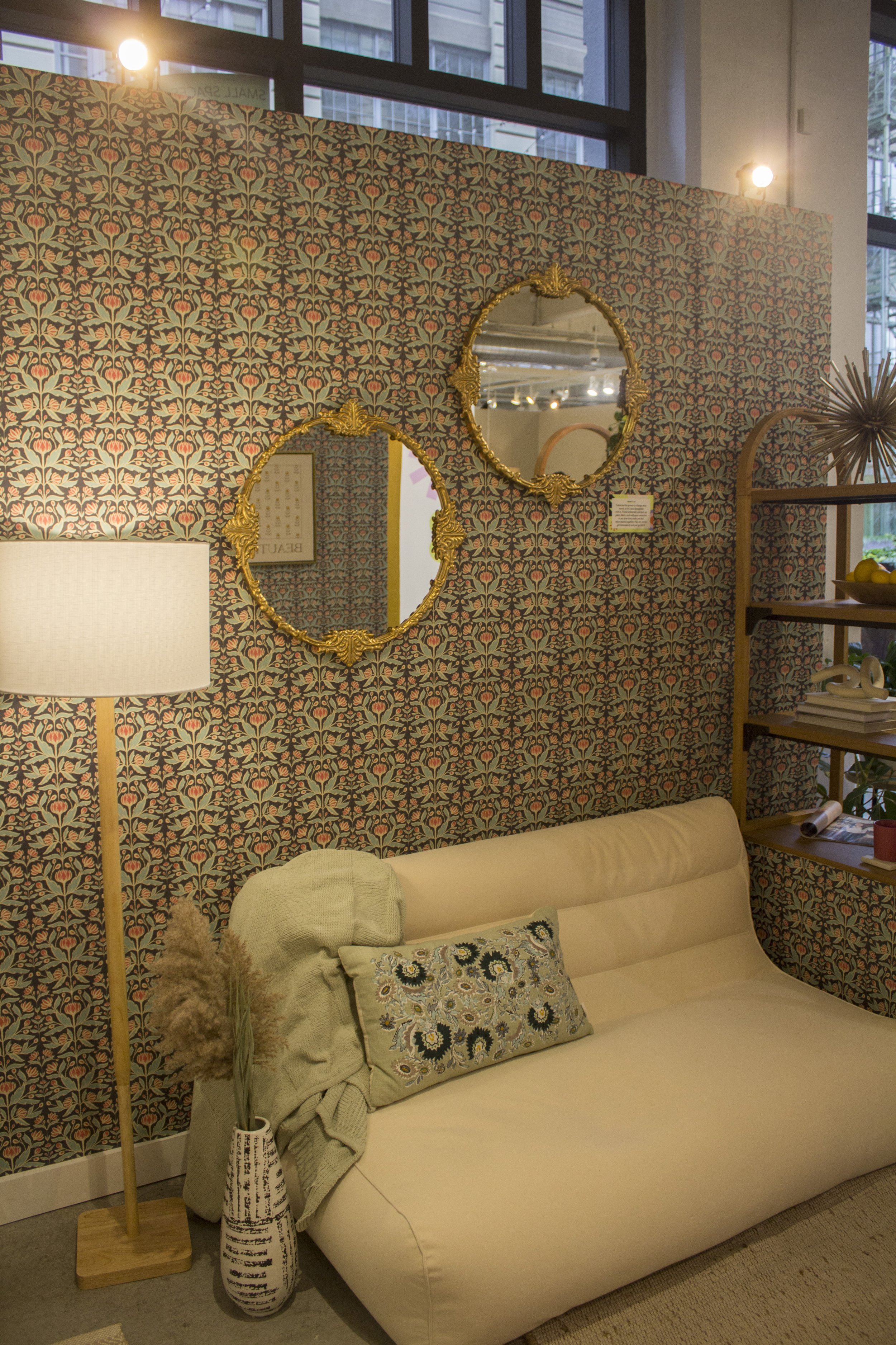
Drew Barrymore’s Sunny Style Studio: Extrovert, Conscientious, and Less Open to Experience

Drew Barrymore’s “Sunny Style” studio is said to feel like a “big hug”. It’s meant to be a “delightful”, “cheery”, and “functional”  space. And with pastels, rounded comfy seating, wood surfaces, and busy wallpaper, I’d say it is perfect for someone who is extroverted, conscientious, and less open to experience. 

Here’s why: according to the theory of color psychology popularized by Angela Wright, we are most responsive to seasonal-linked color groupings that match our personality patterns. Specifically, a spring-linked palette is characterized by bright and warm colors, containing no black. It’s associated with being playful, light in mood, and of course, extroversion. And let’s not overlook the William Morris-esque wallpaper. Research shows that curvilinear patterns like this are associated with friendliness and comfort, all very fitting for the gregarious person living in this “Sunny Style” space. 

Next, conscientious people are inclined to be organized and orderly with a penchant for details. So all of the open shelving and functional tools available in this room may be a dream for the more conscientious amongst us looking to show off their organizational skills. And while being less open to experience might seem like a negative, it isn’t. Keep in mind that personality categorizations are designed to help us gain self-understanding, not a judgment. So if you are less open to experience, it simply means you’re inclined to stick with the tried and true, leaning towards more traditional styling. And what’s more traditional than patterned floral wallpaper, wood paneled walls, and natural wood surfaces?

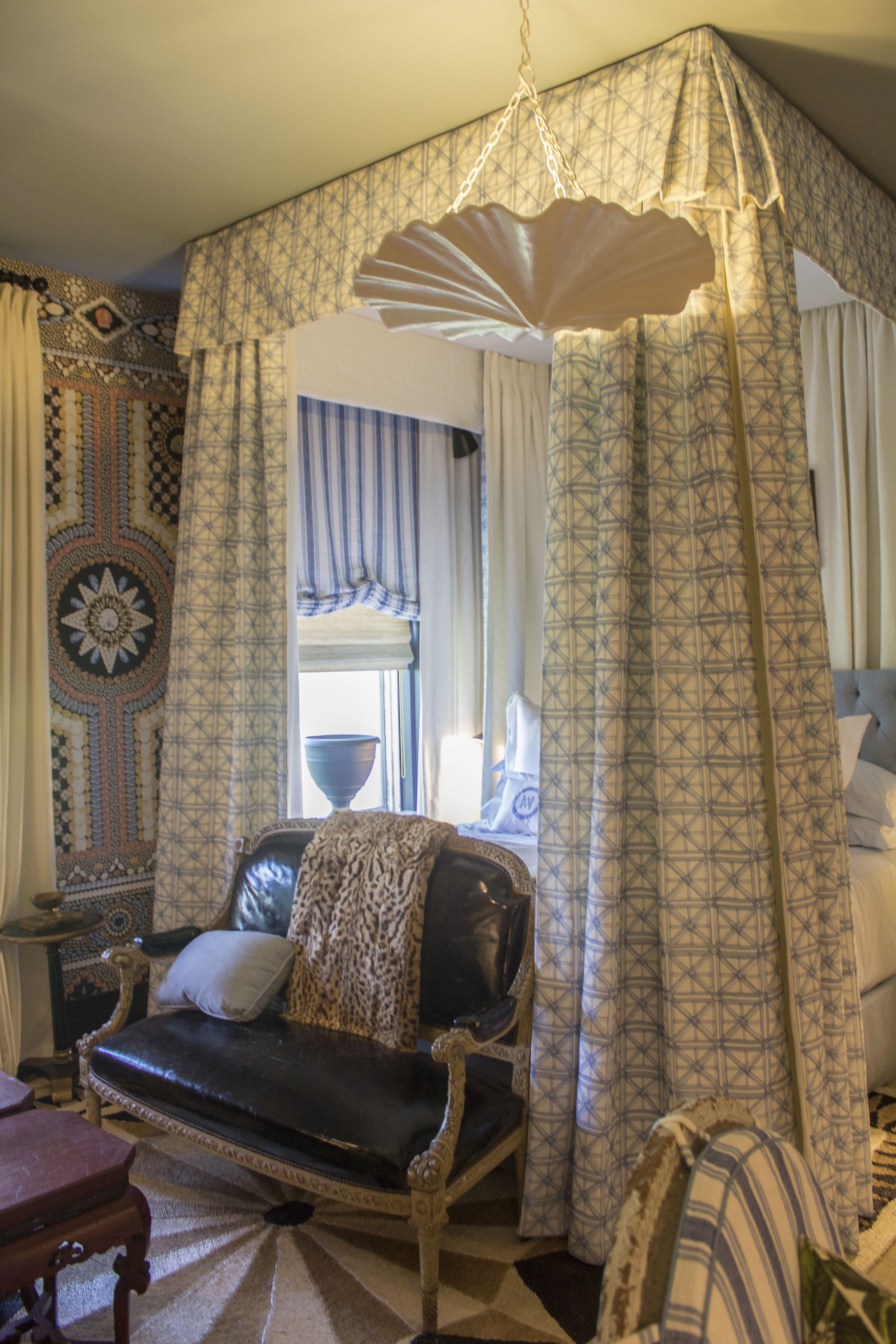
Hollie Velten-Lattrell’s Historic Nowstalgic Salon: Introvert, Laid-Back, Open To Experience

Hollie Velten-Lattrell’s salon appealed to my affinity for modern, English style. With it’s select vintage pieces and bespoke furnishings tied together with modern sensibilities, I’d say it best suited for one who is introverted, laid back, and open to experience. 

Here’s why: as mentioned above, introverts enjoy their alone time, and may want to step aside from the action a bit. Velten-Lattrell’s space has several different seating areas, also referred to as nested layers, that allow people different options within a larger space. So if someone prefers to be alone rather than talk with others, they can. Another thing to point out is the fairly neutral, faded color scheme with a few scattered patterns. Overall, it gives the feeling of calm, most suitable for those who are inclined to prefer relaxed rather than highly stimulating spaces. 

Those who are less conscientious tend to be carefree in their approach to design. And if an arrangement works, they may not exert the effort to change it. Velten-Latrell’s salon feels very easy-breezy, including its functionality as the floral print skirted sette doubles as a lounger. Personally, I’d love to lay out on the settee in front of that bespoke chandelier. The low-hanging skirted fixture creates a sense of intimacy and unpretentiousness characteristic of a more laid back vibe. And the coffee table doubles as both a place to hold drinks and play games, creating a lived-in, laissez-faire kind of feel.

I’d add that the introverted, laid-back person who is more open to experience would particularly enjoy the eclectic furnishings. A floral skirted sofa together with a glitzy mirrored side table; and a vintage modern chair (with to die for chrome legs and circle- shaped feet) next to an antique-looking tapestry is a treat for the daring. 

Kim White’s House of Hacks Living Space: Introvert, Conscientious, Open to Experience

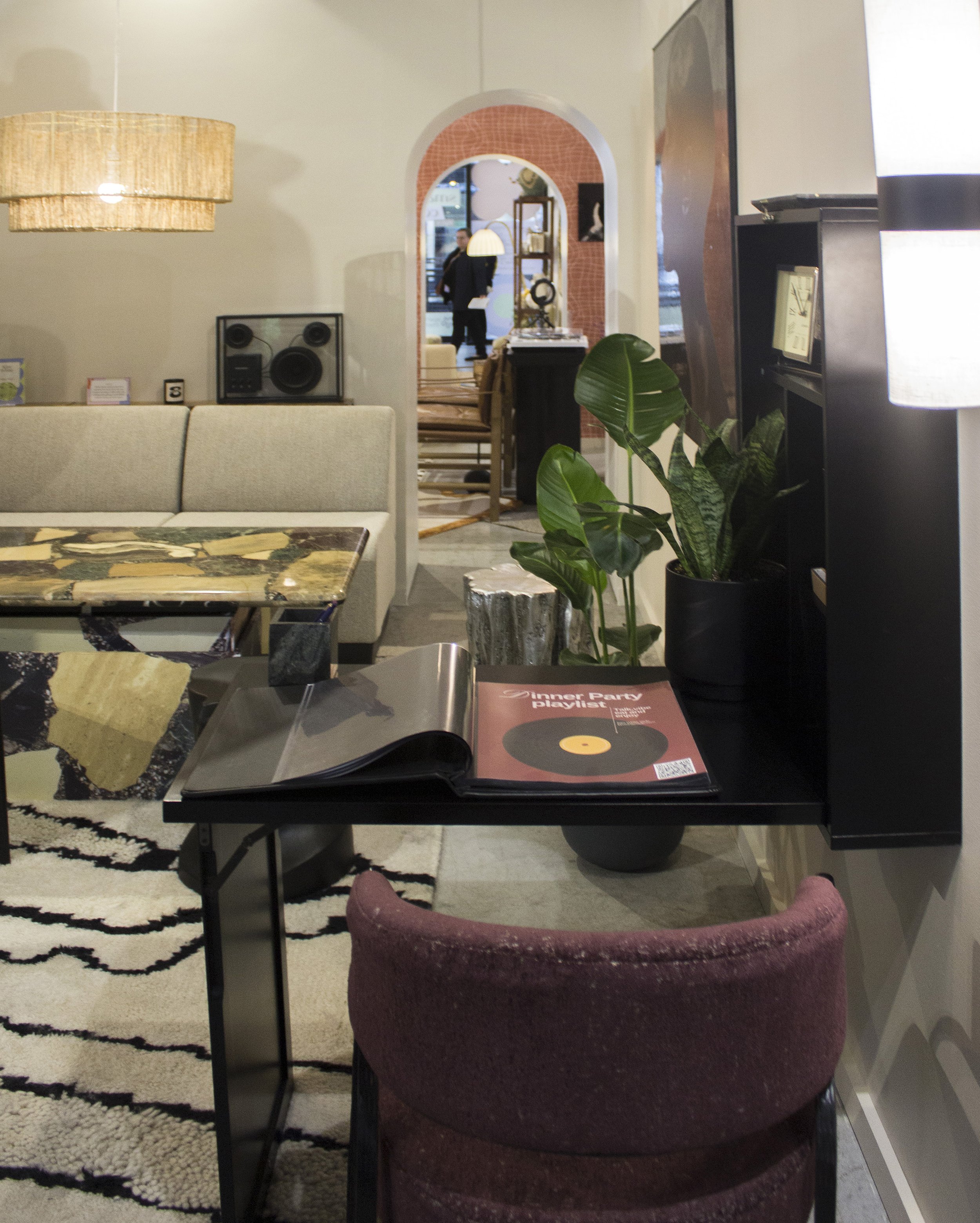
Kim White’s cool, chic modern living space is loaded with multipurpose, functional, and well-appointed furnishings. It’s just right for the jet-setter who needs to come home and regroup before their next trip abroad. With a restrained, yet dramatic color palate; a marble coffee table that doubles as a dining table; and earthy, old-world furnishings sprinkled throughout, this space would be ideal for someone who was introverted, conscientious, and open to experience. 

Here’s my take: chic introverts would be really into this minimal color palette. Introverts also respond well to curated spaces enhanced with varied textures, secents, and sounds as they are particularly sensitive to sensory stimuli. 

As mentioned above, the creative functionality of the space would delight those high in conscientiousness. More than the marble coffee table turned dining table, the neo-traditional storage cabinet also houses a bar, and the wall-mounted desk folds up into a cabinet. These hidden functional items gives the conscientious their much desired efficiency and organization for a clutter-free look.

And appealing to the daring, the mix of earthy and old-world furnishing such as the tree stump stool and the weathered pot, along with classical styles like the bust stool, and modern, streamlined pieces creates a world traveled feel that suggests openness to different experiences. 

Maitri Mody’s Creative Cabinetry: Extrovert, Conscientious, Open to Experience

Maitri Mody’s charming and energizing Scandinavia-inspired space is sure to brighten up moody mornings. The cabinets are said to be “vehicles for self-expression” and when your home feels like you, it goes a long way towards fulfilling your psychological needs. I’d say this space best suits someone who is extroverted, conscientious, and open to experience. 

Here’s why: extroverts tend to be most responsive to highly stimulating spaces; and this is achieved with a number of details such as the bright colored square tiles, different color cabinets, and quirky knobs. 

The kitchen space also includes colorful options for storage; and I think it’s safe to say those high in conscientiousness would be very into it. While those less open to experience are not necessarily risk averse, they may not be as excited by painting their cabinets two different colors in the way those more open to experience might be. For the more daring, it’s an opportunity to go against the grain and try something unusual. 

So what do you think–does your personality style fit any of these rooms? Or, are you drawn to any of the rooms in spite of what we might think given your personality? Maybe you saw other rooms in the show house you’d prefer. If so, I’d love to hear about them and why…Share with us in the comments.

Kips Bay Decorator Show House NYC 2023: 12 Mood-Boosting Decorating Ideas You'll Want to Try in Your Home

Misha Kahn Ammonoid Epsilon chair & Chris Schanck, Eye of a Little God mirror

What’s your favorite place and why? When I was asked this question, I reached far back into my childhood memories, and recalled a grand home I visited with black and white checkered floors, a stately staircase, and high ceilings. There was something about the grandeur that appealed to me. It felt far removed from the suburban split-levels I was used to seeing, and I could fantasize about the wonderful life I thought people had in those homes. 

Whatever our favorite places are, they tend to be ones that trigger strong positive emotions, and wake up our senses. In fact, the most impactful rooms work hard to spark all five senses because we’re likely to remember and possibly be transported by them. The Favorite Place Guided Visualization exercise developed by design psychologist Toby Israel, invites us to visualize our favorite place and the objects in it using as many senses as possible. She writes, “Look carefully around…Notice the colors. The shapes…Pick it up if you want to…What do you hear?... Remember the smells around you…” All of this helps us more fully connect with favorite places, and we can use the elements in them to help boost our mood in our home. 

If you’re having difficulty recalling mood-boosting spaces, you can always expose yourself to the work of interior designers or decorators passionate about creating memorable spaces. Notably, the Kips Bay Show House never disappoints when it comes to well-designed, creative spaces with meticulous attention to detail. This year’s show house rooms were full of texture, sounds, colors, and tastes (we couldn’t eat the cupcakes there but I sure wanted to) that definitely boosted my mood. I took snapshots of 12 decorating ideas to try in your home—see if you can find more.

Add bits of fantasy

Holographic seashell bed by John Pomp Studio
banquette in pink fur fabric from Start Carpet
draperies with bows and tassels from Fabricut

 If you’re looking for a room that feels like a cross between The Little Mermaid and Marie Antoinette, this is it. Designed by Sasha Bikoff of Sasha Bikoff Interior Design, the room is titled, Fantasy of Flight; and is exactly what you’d expect from a room inside a cozy seashell. The walls are covered in shades of effervescent pink and purple clouds; banquette seating covered in pink fur; and opulent drapes with bows. And that holographic clam shell bed is a definite showstopper. You can’t help but want to stare at every inch of the space.

One way to add a bit of fantasy into your space is to cover all four walls in a printed wallpaper, ala Bikoff style. Use a print that really speaks to you personally and preferably encourages daydreams. You can also opt for something more simple, like a large piece of artwork that captures your imagination.

Use more than one colored tile in a space

 Sometimes picking tile colors for a room is like eating potato chips, it’s hard to have just one. In this modern bathroom designed by Ahmad AbouZanat  of Project AZ, he used painted brick in two different colors to create boundaries between spaces. AbouZanat calls the bathroom “Untitled” to allow for the user’s “unbiased, emotional reaction”; and refers to an “ode to simplicity” and “a romantic, understated luxury.” It feels earthy and urban as the colors are drawn from the outside of the home.

The rust and white colored tiles creates visual symmetry and a sense of order that can possibly make you feel less stressed and hence, in a better mood. It’s great for smaller bathrooms as it creates the illusion of separate spaces without having to put up physical walls. If this is appealing, try separating your bathroom into sections using different colored tile in a similar manner. You can also install the same tile in different directions to create interest.

 Mix bold patterns

Navy Mary McDonald Portail Francais Fabric
Yellow chair with skirt

Mixing bold patterns can be challenging if you’re not sure whether they go well together. Mary McDonald of Mary McDonald Inc. Interior Design, does it in an awe-inspiring way that feels visually stimulating but not chaotic. She used an extravagant Shell Grotto wallpaper, against striped and geometric prints, and they all work together. Upon closer inspection, you see it isn’t just a random mashup of prints and patterns, but it’s all about being aware of scale and how the eye reads it.  

For instance, the busy printed wallpaper with large geometric shapes works well with smaller patterned or less busy fabrics in the room as the shapes do not compete, and the eye gets to take a break as it switches back and forth between prints. The eye also rests on solid fabrics throughout the room like the large area rug; the yellow chair, and the deluxe leather settee. To start, find two bold patterns samples you like, and put them side-by-side to get your gut reaction. If it feels like they could work together, figure out why. This will help to sharpen your eye.

 Add curved furniture and bright colors

yellow curvilinear coffee table

According to research, curved lines are associated with comfort and friendliness, great elements for mood-boosting. And this bright, modern living room created by Ghislaine Vinas, has curves galore, a definite pick-me-up. Not surprisingly, she calls it the “Good Spirits” room. The curved theme carries throughout the space, from the curvilinear coffee table to the black circle on the ceiling which acts a kind of faux medallion for the light fixture.

I enjoy Vinas’ restrained, yet impactful use of color. Warm colors like this brilliant yellow coffee table tend to be energizing (think of the energy from the sun); the black and white accents are strong enough to match its energy; and the large black abstract geometric prints on the wall add more unexpected touches to the room. But there are also cool and neutral colors like the blue chairs and tan plaid printed walls that prevent the room from looking too severe.  And we can’t forget the large crying baby print. While some may not consider this a mood-booster, it creates really interesting tension that gives the room another jolt of energy. You can start by incorporating bright colored curved accents into your room to give it a boost.

Try patterned tiled floors

geometric tile floor

A room with patterned floors may very well brighten your day. Notably, straight, pointy shapes tend to be energizing, and can give you the right energy to start your day. This black and neutral-colored geometric patterned floor by Neal Beckstedt of Neal Beckstedt Studio would look great in an entryway or a bathroom. And it goes well with other patterns and textures like this stone patterned wall.

 Fill your table tops with items you love

You can easily go to any big box store and get trendy pieces to put on your tables; and while I love a good trend, it may not be as fulfilling. Decorating your home with objects you love is important to meeting psychological needs of love and belonging as well as aesthetic needs. This table top, created by David Scott of David Scott Interiors, has a worldly, traveled vibe. Take note of the ways the different heights, textures, and shapes create interest. And a shell tassel casually draped over books makes the vignette more dynamic. 

Give them something they can feel 

White boucle couch
green vine printed carpet by the Rug Company

There’s something to be said for a room that makes you want to reach out and touch all the furnishings. That’s how I felt when I saw this cozy room designed by Kesha Franklin of Halden interiors. She calls it the Heart of the Vine room and describes Vine as “connection, strength, dedication, and friendship” all qualities that will bring joy even during difficult times.

The couch, pillows, and draperies were fully textured, creating an enveloping feeling of warmth. And the vine-like patterned green carpet, which Franklin designed for the Rug Company, along with the hand painted wall covering truly creates an enchanting experience. The palette adds depth to the room with soothing colors like dark green to pale yellow green. And again we see the emotional impact of an oversized photograph, a relatively inexpensive way to add drama. To add texture to your space, start with heavy draperies and pillows (they did wonders for Halden’s room) to create an abundant feel.

Create an emotional reaction with neutrals

Robert Thomas Lounge Chair and Ottoman withRobert Simon Fine Art Old Master Painting

When we think of mood-boosting rooms we tend to think of bright colors. But neutrals have their place too. Depending on your experience with neutral colors, it typically evokes a sense of calm and takes a back seat to the brighter colors in a room. But interior design duo, Sawyer and Berson of Sawyer Berson Architectural and Landscape Architecture created an entire room using neutral textures, including walls covered in neutral suede panels.  I felt intrigued by the room with its modern, understated, yet dramatic elements. I love the way the Old Master painting just captivates the space. Overall, a luxurious, restrained mood-booster. If you decide to try an all neutral room, make sure to include different textures and tones for interest.
Make your kitchen feel like a living space

pink banquette and marble dining table; picture by Robert Polidori of a 2000 year-old mural from the ruins of Pompeii

They say the kitchen is the heart of the home; and even if you aren’t much of a  cook, you can still make it cozy. Wesley Moon of Wesley Moon Inc. put a couch in the kitchen, making it feel as cozy as any living room. Even if you don’t have room for a couch or settee, you can incorporate smaller furnishings like a table lamp or unexpected artwork to give it a homey feel. 

Try opulent details

olive green banquette with tassels

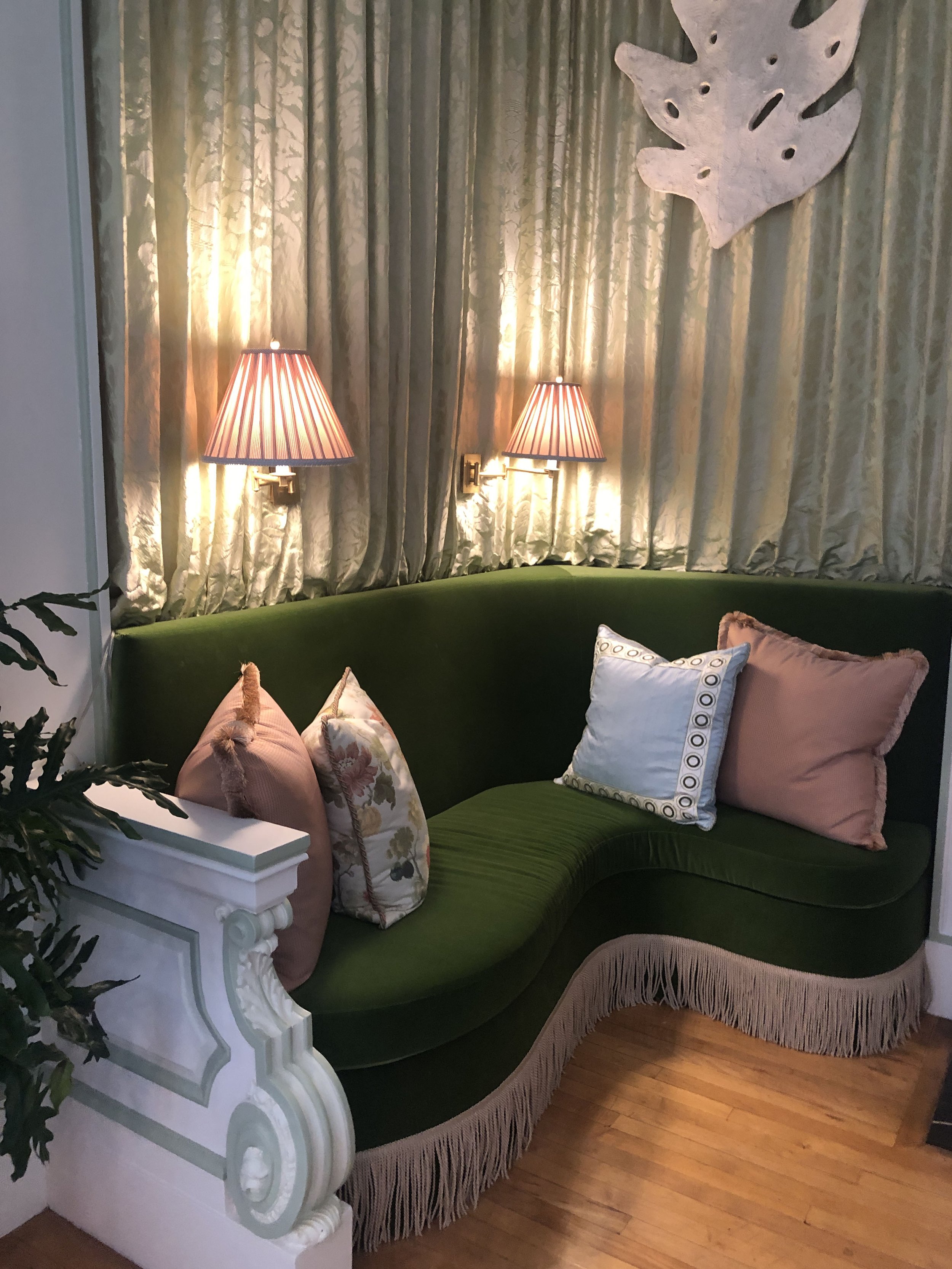
Even in a largely modern room, including small opulent details can add a little extra something that livens up the space and your mood. Interior designer, Timothy Corrigan, used tassels, painted molding, and pleated fabric to create opulence. He calls the room “Spring Fever” and the florals and pastels definitely make it feel fresh and light. The dark green settee works perfectly well in the spring and the cooler months. 

Decorate your door

blooming wallpaper on door

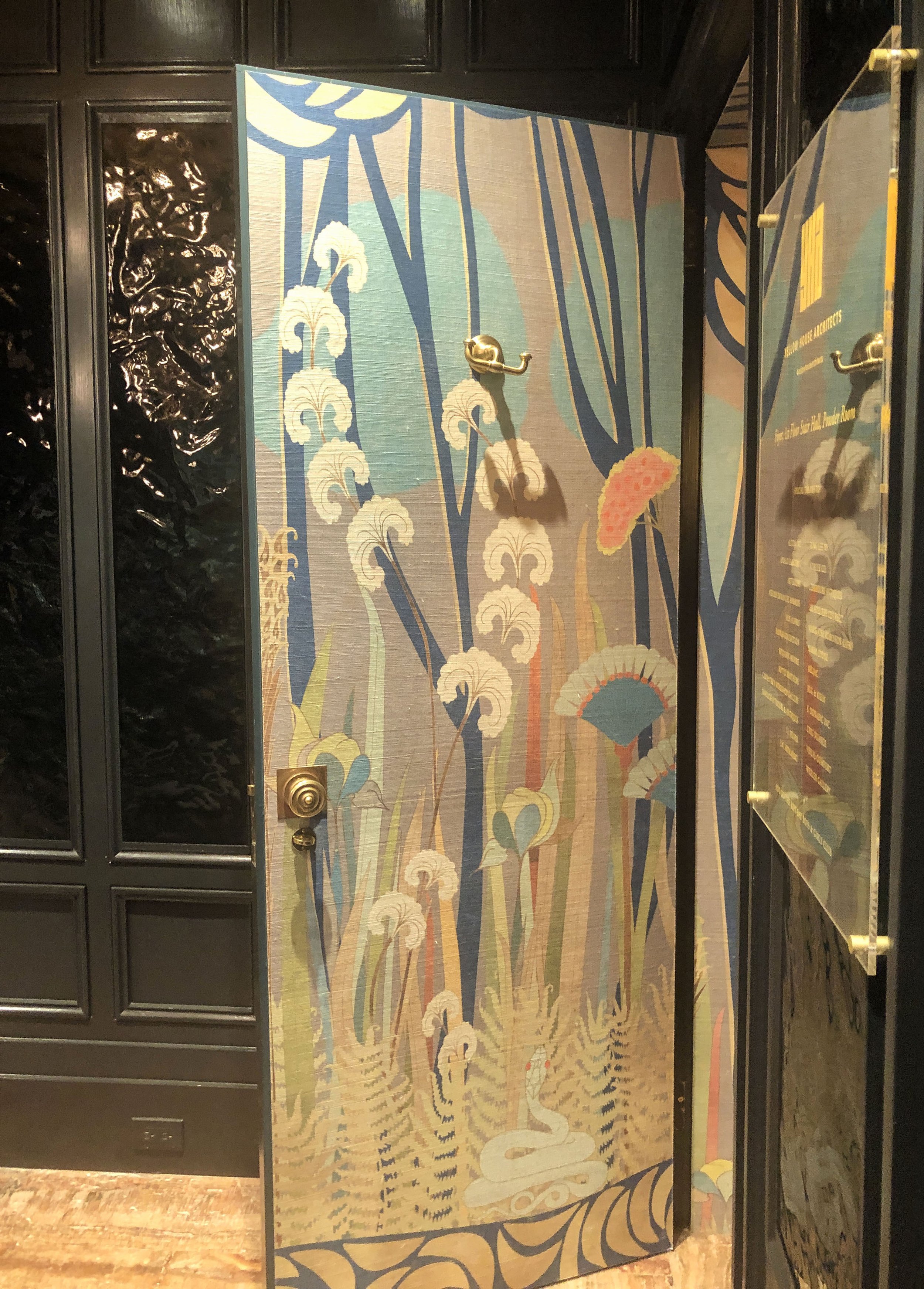
While walls get all the attention, doors can sometimes be neglected. But not by the designers at Yellow House Architects. They designed the lobby of the show house as well as this show-stopping bathroom they call “Enchanted Seduction Powder Room”. The textured floral patterned wallpaper engulfs the bathroom for a “wow, come see this” reaction. And did you peep the patent leather wall covering on the lobby walls? I couldn’t help but want to touch it, and think it would make a really cool door covering too. 

Create an art installation using books 

Using books as art isn’t new. But finding unexpected ways to use them requires flexibility and creativity. Interior designer, Jay Jeffers, painted a row of books on the bookshelf to blend seamlessly with the wall paint in this stylish library. It’s as if someone just painted the books with the wall; and feels edgy and fun— a great conversation starter for sure. Also, stacking the bookshelf with both books meant to be read and books as art feels really easy-going, and shows how a little ingenuity can bring joy into a study.

Recap: Colorful + Chic Harlem Digs

Hey Folks! How have you been? I'm still juggling my day job with my business and hoping to cross over soon to full-time business (*fingers crossed*, *hands clasped*). I've also been busy creating an undergraduate class, The Social Psychology of Clothing, and am excited about the prospects of teaching it. Hopefully, more on that soon. But today, I wanted to feed your senses with some serious home eye candy. Last month, I had the opportunity to tour the home of interior decorator, Minetta Archer, for Houzz. Minetta has a way of mixing color, patterns, and texture in such a wonderfully refreshing way. I don't doubt that she is on her way to becoming a powerhouse in the world of colorful interiors.

Harlem couch 1.jpg
Harlemr table long view.jpg

And her home is not the only thing that stood out during the tour. Her colorful outfit was a perfect complement to her home, and it made me think about how our wardrobes and interiors can really enhance the other. Minetta's outfit is classic bohemian chic with a fabulous yellow top and ethnic patterned head-wrap. I couldn't help but notice that she looks exactly like where she lives. If I just saw her on the street, I'd imagine she was going home to an global chic decor with lots of color and texture, just like her outfit.

Harlem Portrait.jpg

I've been really interested in ways to use interiors and clothes as a catalyst to the life you desire, and I see such great benefits in using your clothes and home to positively reinforce the other. I mean, shouldn't we look like where we live? Shouldn't our home look like us? At it's best, both our home and wardrobe provide us with opportunities to express our creative selves and reveal a lot about our emotional lives.

Harlem Full view 1.jpg
harlem green bench.jpg

So if your home was exactly the way you wanted it to be, what would your wardrobe look like as an extension of that aesthetic? I love classic furniture pieces mixed with the unexpected and pops of color; and that is how I'd describe my wardrobe as well. But if you haven't thought much about this, it may be good to consider, particularly if you think your home is doing way better than your wardrobe, or vice versa. You can look for clues in your home to build the wardrobe you want. If you like color, neutrals, and/or pastels in your home, you may like those colors for your clothes too.

Harlem Spare Bedroom.jpg
Harlem Master Bedroom headboard.jpg

And the reverse is also true. If you have a fanciful or a modern wardrobe, maybe you'd like a similar aesthetic for your interior. In essence, use the confidence you have in one to build confidence in the other. Agree? Let me know what you think in the comments below.

See the full tour here.


Recap: Modern + Fun NYC Studio

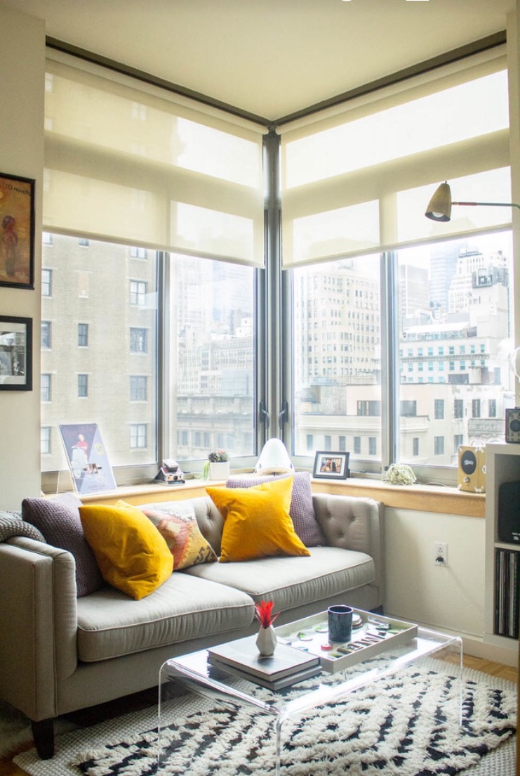
Hi There! This week I wanted to share with you a house I toured over the holidays. It's the home of interior designer, Molly Torres. She lives in NYC with her fiance, Hary Portnof. Molly's home is modern, young and fun, and right next door to the Empire State Building (definitely a wow factor)! But one of the things I really enjoyed about Molly's home is the passion she put into decorating it. Creating a home you're passionate about is really a catalyst for a passionate life, wouldn't you say?  According to design psychology, a home that fulfills your aesthetic, social, and psychological needs, to name a few, encourages you to be more fully expressive in other areas of your life, both personally and professionally.

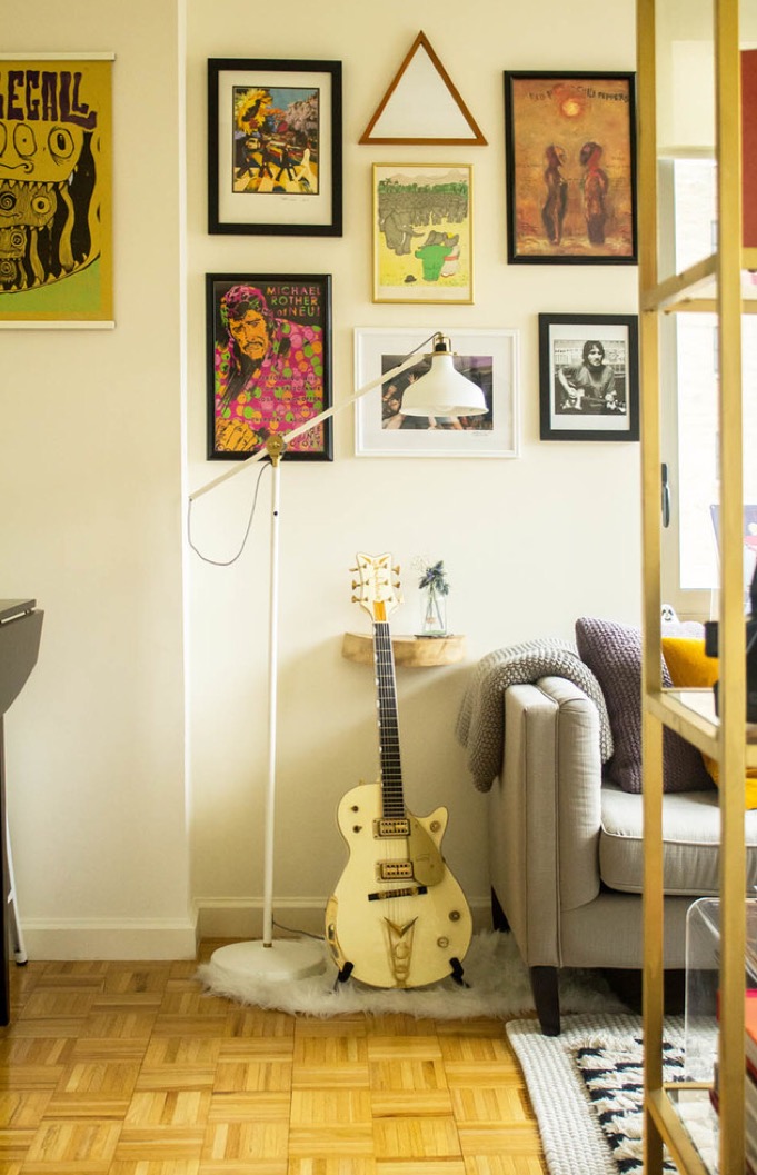
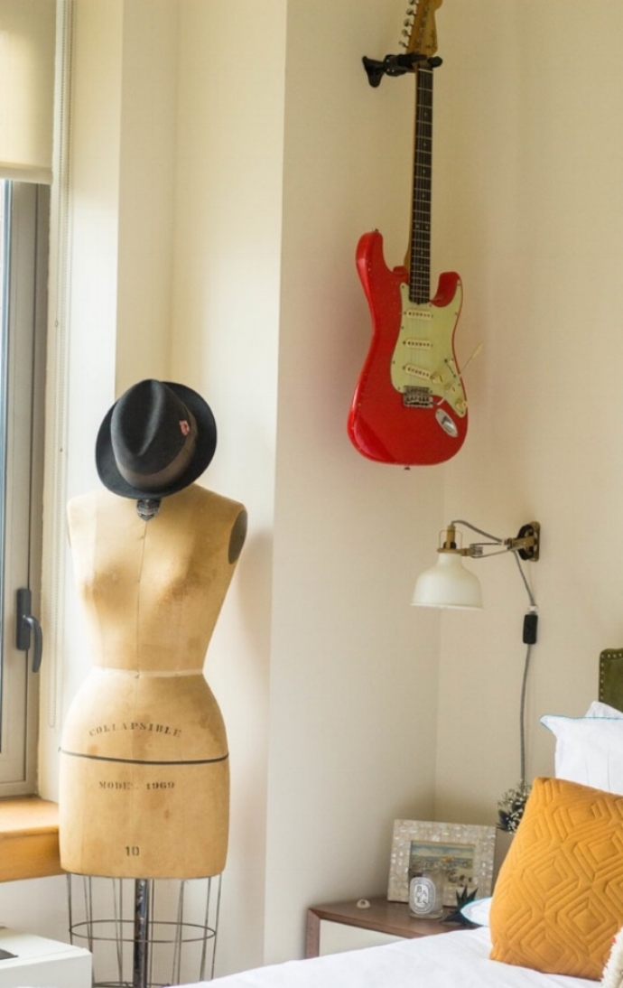
Molly's passion for her home is reflected in her attention to detail, and the creative ways she has made the physical challenges of the space work for her and Harry. When Molly first moved in, the space was more like a dorm room. But guided by her vision, she turned the 520 square foot studio into a chic home with clearly delineated spaces that both her and her Harry love. See some pics from the tour below:

I love the way Molly incorporated her fiancé's love of music (he is a music producer) with her more feminine aesthetic. Being able to decorate for everyone in the home goes a long way with fostering in them, a sense of pride and belonging. For me, it's been a challenge to incorporate my husband's interests, particularly since the aesthetics of home have not been a priority for him. But I've realized it's not so much about how attuned others who share your space, are with the aesthetics, as it is about allowing them to be reflected in the home in some way that is aesthetically and psychologically pleasing to everyone.

 How challenging has it been for you to incorporate the style or tastes of those you live with?

See the full article on Houzz.

These pictures originally appeared on March 13, 2017, on Houzz.

Recap: Charming Folksy Style in Brooklyn

Touring homes for Houzz has become one of my favorite things to do. I consider myself to be a keeper of stories, and my understanding of others has been enhanced because of it. As a psychologist, I've gotten to hear stories about others' emotional life, and as an interior design writer I get to hear about their emotional life as it's reflected in their home. To be able to go into people's homes, hear their home stories, and document all this is important to them is not a privilege I take lightly. 

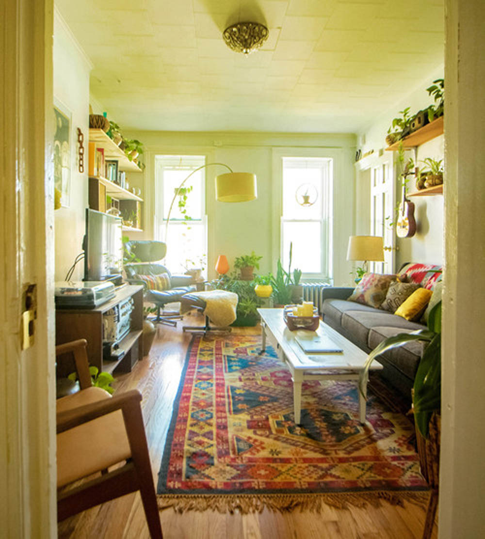
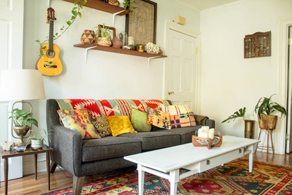
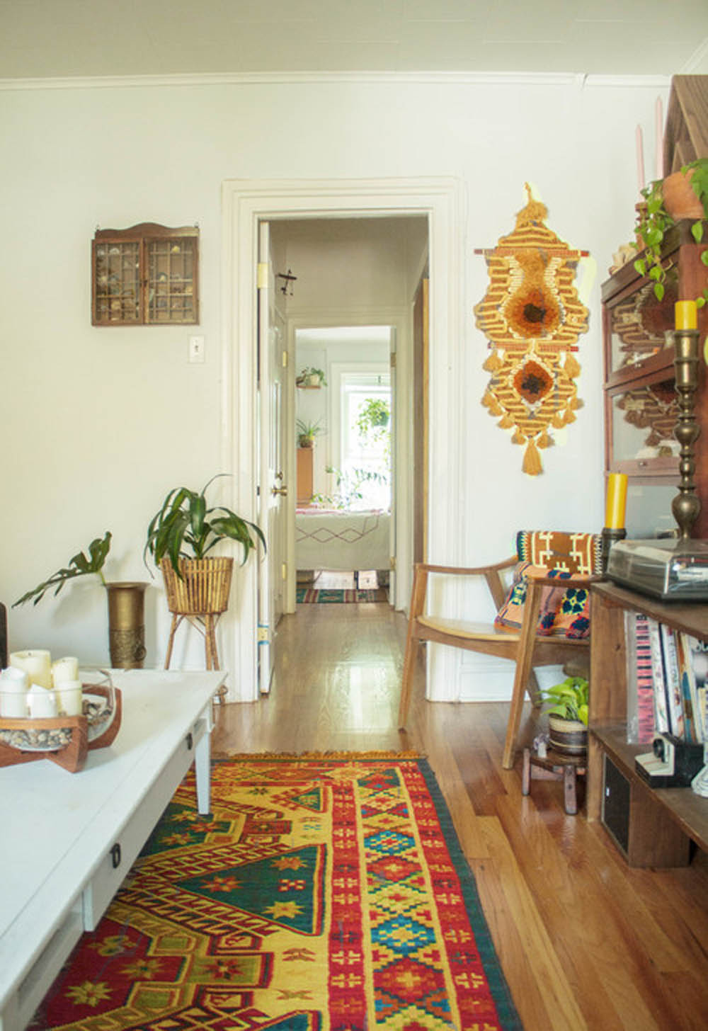
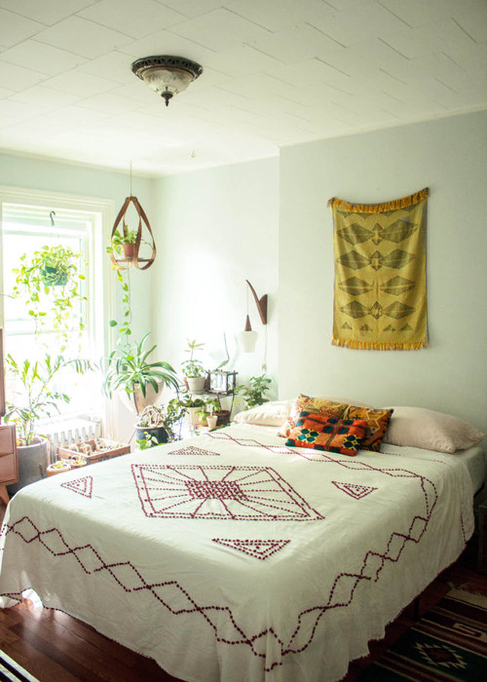
Last month I had the opportunity to tour the home of an Etsy seller at Mamakea Vintage, and her boyfriend, a vintage tech-recycler. Not only were they a cool couple to work with, but their home personifies their free-spirited, creative approach to life. It's filled with keepsakes, chotchkies from their many road trips, and vintage technology. Even if folksy isn't your thing, it's hard not to admire the way they have been able to use their home as an extension of everything that is important to them-- being environmentally conscious, celebrating their ancestry, and furnishing their home with objects that hold personal meaning. Here are a few pics I took from the tour.

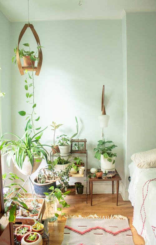
Clearly the plants are the star of this homey pad.  There's just something about plants in a home— they give it life, serenity, and the sense that the residents are truly caring individuals.

Read the full article on Houzz.

These pictures originally appeared on December 27, 2016, on Houzz.