Children's Hospital Spacelift: My Hospital Design Project
/So word got out that I love to design and decorate. You may know that I work in a hospital where I conduct psychological evaluations on children and families who deal with trauma and abuse related issues. We're big on personality assessments and putting together psychological profiles. And while it's really interesting, it's pretty heavy work. So needless to say I was thrilled when they asked me to decorate our department. It's a nice change of pace from the emotionally intense work I do, and of course a good portfolio builder for my company (read about it here). It all happened when our department expanded its office space and needed someone to decorate it as well as the older spaces that were never decorated. And instead of going through the painstaking process of hiring someone they don't know well, they hired me (yaaay!). They asked me to decorate all the common areas, including the front and back waiting room, the hallways, and the main conference room.
To prepare for the project, one of the first things I did was research articles on psychology and hospital design. (I wrote about some of it here). Given that the children and parents often come to our offices unwillingly in a state of turmoil and distress, it's important to create a space that is aesthetically pleasing, and reduces the stress of having to be there in the first place. So I used nature as my guiding theme for the design because studies show nature promotes healing, and people feel most comfortable around it.
Of course, I would love to go all out with this project, but apparently, the hospital has a number of limitations that I have to take into consideration. For one, I can't choose new furniture or paint because administration already picked those, and wants consistency throughout the hospital (go figure). So my challenge is to add items that enhance the existing design, and I'm all for a good challenge. So far, I've sourced items and created mood boards for several areas including the front waiting room and the hallways. See it here.

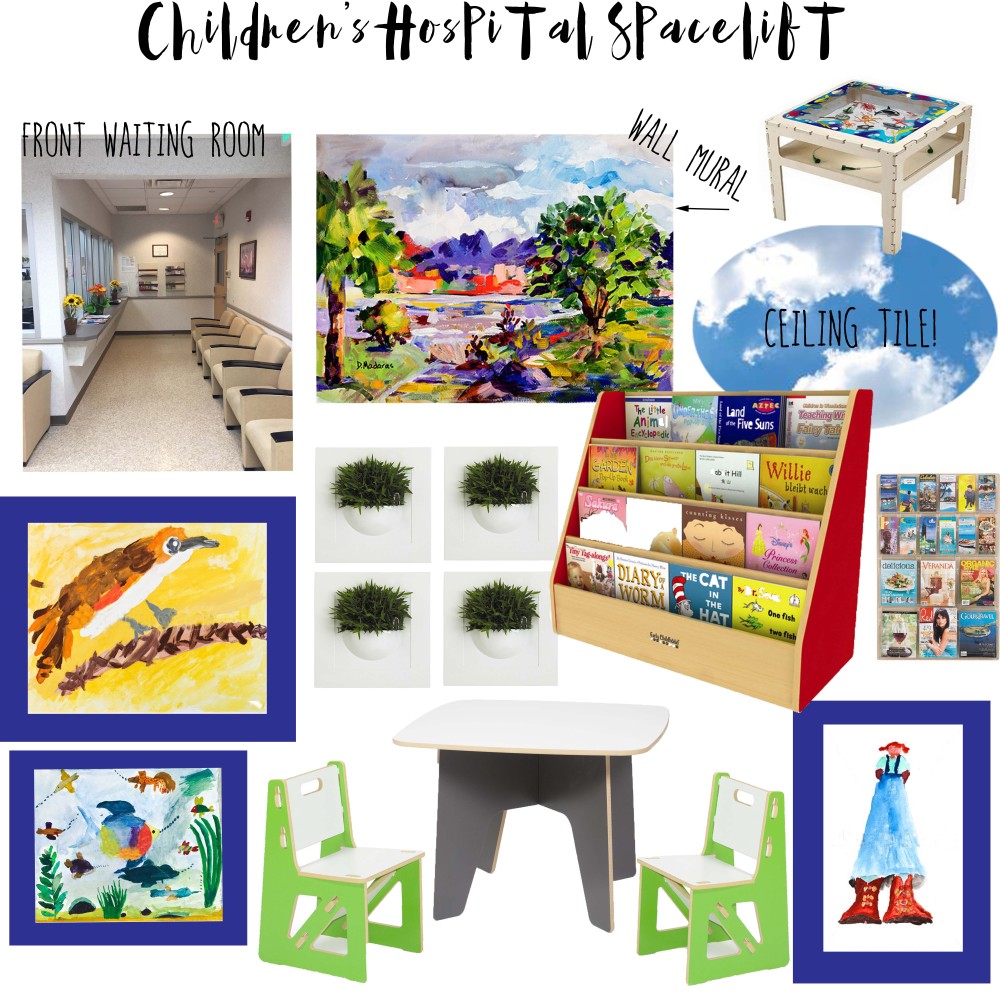
I wanted the front waiting room to be appealing to both children and adults. The water color images are a good fit because they are child-like, yet complex enough to be interesting to adults and older children. I really like the giant girl painting because she is ethnically ambiguous, and her oversized stature conveys a message of empowerment to the many vulnerable children we see. Also, because the entire space is neutral, I wanted to add a modern aesthetic with pops of color for a clean-lined look that draws clients in. The modern kid's table and chairs are about the only furniture I was able to add. I made sure to include blues and greens which often occur in nature.
mural|| sea life activity table|| cloud ceiling tile|| bookcase||magazine holders|| planters||forest bird painting|| fishes in sea painting|| chairs|| table||girl with red hair painting

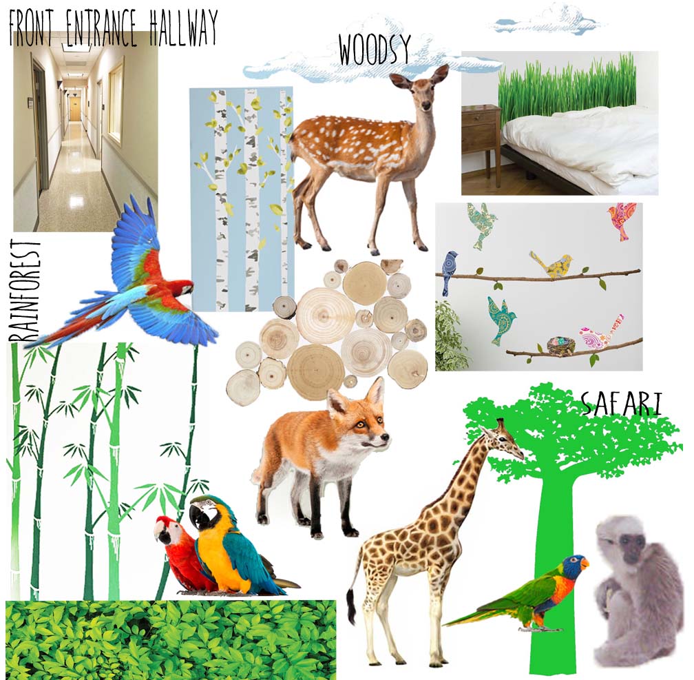
Decorating the hallways had it challenges especially since it's against regulation to hang pictures or anything that could potentially fall off the wall. So I used decals, and decided to go with a mixed media look since it was difficult to find a wide range of decals with a similar aesthetic. The woodsy, rainforest, and safari nature themes will line two hallways in a repeating pattern. It's appealing to children but I think adults will (at least I will) get a kick out of it too.
clouds|| cama grass || deer|| birch trees||macaw|| logs||paisley birds||bamboo trees||shrubberies||double macaws|| fox||giraffe|| lorikeet||African tree|| monkey
What do you think of a nature theme for a children's hospital? There are still a few more areas to do, and I'll be sure to feature each one as it's completed. So stay tuned.


