A Trip to Dwell on Design New York
/Dwell Store
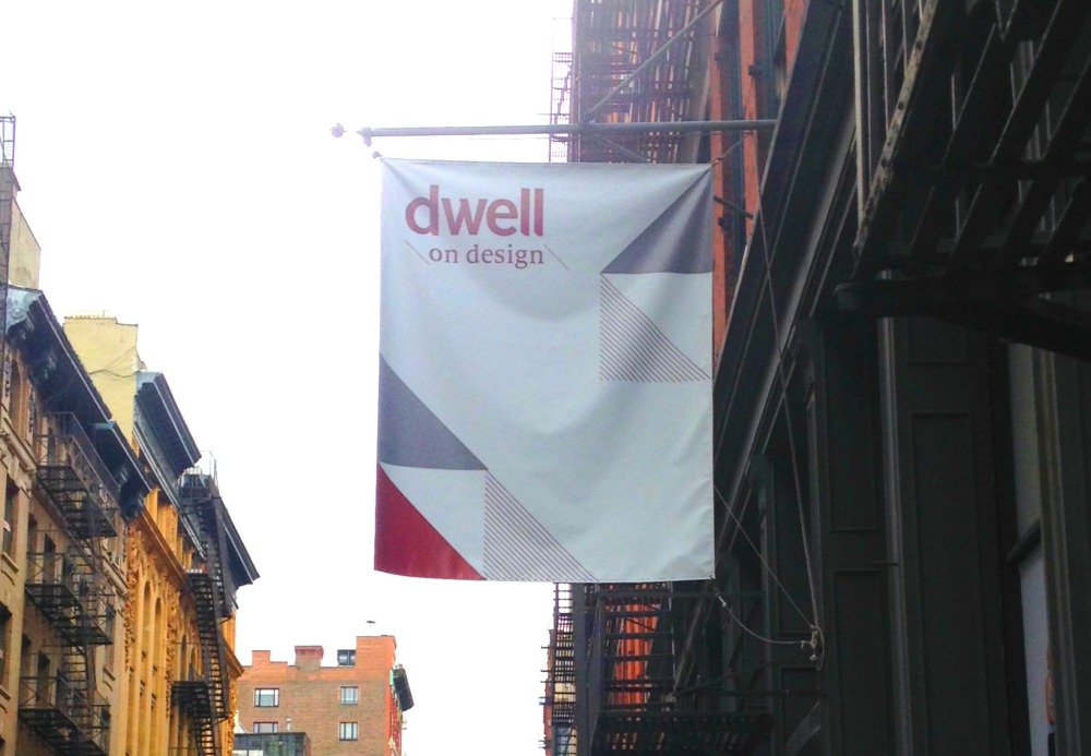
If you read my last post, you know that I've been trying to catch you up to speed on what I've been up to these last few months. This week I wanted to share with you the Dwell on Design conference I attended in October. Organized by the the editors of Dwell magazine, it was an informative three day affair that included top architects, designers, design professionals, and cultural and educational leaders in the field of design. Honestly, I've never gone to a design conference before, and didn't know what to expect. It was certainly more than just a showcase for pretty things. It was a full-fledged, academic-like conference that inspired thought provoking ideas on design and its impact on the lives of everyday folks like you and me. I was glad I went-- I learned a lot about major issues in design, particularly as it relates to public spaces and building a sense of community. I attended the conference on one of the three days. Here are a few pics from the event that I took from my iphone (I accidentally left my camera). A classic Dwell space--modern design that evokes an updated mid-century feel.
Steven Ladd
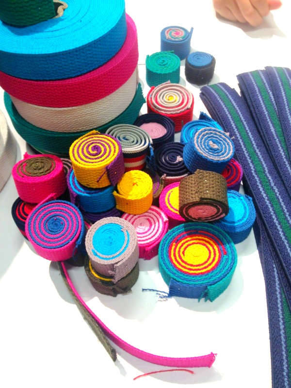
This is Steven Ladd of Steven and William, New York-based artists (and brothers) known for their collaborative art projects made from recycled materials. Throughout the event Steven and William held what they called a "Scrollathon." Scrolls are rolled-up strips of old fabric that come in all different colors. Conference attendees were invited to create their own scrolls as part of a larger shared artwork meant to promote a sense of community and togetherness. It's also promotes a healthier environment by using recycled material that would otherwise be thrown away. Steven was nice to pose for my picture (and he's pretty cute too).
Scrolls
Here are the scrolls. People were invited to mix and match as they pleased.
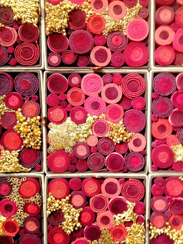
Shared Scrolls
And here are what the scrolls look like as a larger artwork- pretty impressive, right?
Sibling Revelry Article
If you want to know more about Steven and William, they've been featured in a variety of publications including Architectural Digest shown above.
Marimekko
Marimekko, a Finnish textile and clothing design company known for its original prints and colors, were one of the sponsors at the event. Love the vibrant patterns shown here.
Dwell View
A view from the entrance.
Humanscale
Humanscale, another sponsor for the event, is a company that specializes in ergonomic design-- "good" design that promotes well-being and productivity by enhancing people's strengths and abilities. They are known for designing innovative pieces for the workplace that are comfortable, functional and user-friendly. Those mushroom seats don't look comfortable, but they really are! I could've sat on them all day.
Thomas Balsley
I also attended one of the hour-long workshops, Reimagining New York City's Terra Firma. Before the workshop, I hadn't thought much about public landscapes or wayfinding. But this workshop really highlighted the issues involved in these types of designs. Here is a synopsis of what each of these architects/designers had to say about it.
Thomas Balsley (the one with the mic) is a renowned landscape architect who has designed bonus plazas in New York city. Bonus plaza's are small outdoor parks, not to be confused with destination parks. NYC bonus plazas make up 90 acres altogether, and in a city like New York, people definitely need somewhere to relax and connect with nature for brief periods during a busy day. Due to the the city's limited space, landscape architects have had to be very creative with where these parks are situated, and many are in unexpected places such as over parking decks. Thomas gave an historical view of these bonus plazas, and noted that plazas designed in the 60's failed because they were either not people centric or only designed for a specific purpose that later became irrevelant (such as for a theater that eventually closed down). But with the rise of humanism (a big movement in many professions including psychology), architects studied and developed a better understanding of how people used such spaces and the elements that were essential to the way people lived. According to Thomas, people change and so does the use of the neighborhood. Therefore bonus plazas should be designed to be temporary to adjust to the changes.
Michael Bierut
Michael Bierut is a leading graphic designer working with both the Look campaign and Walk NYC program to improve typography on parking signs and overall wayfinding. Of course, we could all benefit from easier ways to get around the city. He noted that one of the major challenges is learning how different types of transportation can "live" together, including motor vehicles, bikes, and pedestrians. With the new bicycle parking racks, transportation has gotten pretty hectic, and creating easy to read signage is one way to offset potential confusion.
Susan Chin
And Susan Chin, an architect and Executive Director of the Design Trust for Public Space, talked about the importance of thinking about how neglected, vacant spaces in underprivileged areas can be used in a new way to promote a sense of pride and trust in the community. She mentioned several programs including Under the Elevated, a program designed to make use of public space below the transit; and the Five Borough Farm where gardens are created on rooftops. These programs focus on ways to promote the welfare of the people which in turn improves overall well-being. She noted that data was collected to determine the benefits of urban agriculture including social welfare and job creation. It would be great to conduct research on the impact these spaces have on mental health and emotional well-being with specific populations.
Dwell end
Despite the very rainy New York City day, I would say that the event was a success overall. As a psychologist, I have an appreciation for forums that discuss the impact of design on people, particularly the emotional impact it has on them. It makes me realize how relevant psychology is in the field of design, and strengthens my desire to build a career in design psychology through research and consultation.
So have you been to a design conference? What do you think of them?


