Why the Idea of "Good Taste" Feels Out of Sync in 2023? A Design Psychology Perspective

Elsie De Wolfe’s Residence via Another

I grew up in an era when good taste was well, good taste. It didn’t necessarily need to be defined, but it implied there was a style standard to aspire to. Now this standard is being challenged, thanks to sociocultural shifts that manage to move the zeitgeist or frame of reference. 

Inspired by Sarah Archer’s article in Architectural Digest, Is It Time to Do Away With “Good Taste”? I set out to explore this idea further. Archer says good taste, once defined by the arbiter of good taste herself, Elsie de Wolfe, reflected “status”, “[old] money”, and “establishment.” We would recognize it today as the roots of grandmillennial style with lots of chinoiserie, chintz, trelliswork, and French antiques. Archer argues that De Wolfe’s idea of good taste reflected a kind of “visual soft power” that made it aspirational and by definition, unattainable at least by those who had not yet made it up the pearly, socio-economic ladder. 

In a similar vein, fashion legend and a leading figure in hip-hop, Dapper Dan told Hot 97 in a 2019 interview, that aspirational fashion is what maintained his brand as people want something that seems “unreachable.” This idea of aspirational fashion or interiors thrives on our desire for the ideal. According to a 2012 study, researchers found that luxury is appealing because it supports the self in everyday living and offers an opportunity for people to live out different selves. So while we may respect interior design elements with aesthetic and financial value, it is the story these elements tell that determine whether we connect with it or not. 

In her latest book, Designing-Women’s Lives: Transforming Place and Self, design psychologist, Toby Israel says that the way we perceive design depends on our perspective. Highlighting legendary architect, Denise Scott Brown who paved the way for women architects in the 50’s and 60’s, Israel writes that Brown was influenced by many “taste cultures”, including the kitschy vibe of the Las Vegas strip; and her “pluralistic perspective” allowed her to embrace “high, middle, low, and other design cultures.” Brown heralded “design-in-everyday-life,” and as she puts it, embraced “context”, “social concern”, “symbolism”, and “the messy vitality of the vernacular.” Interestingly, Dapper Dan said he did not design fashion as much as he “translated culture.”

Home of Denise Scott Brown via Superaggregration

The terms high, middle, or low taste cultures are loaded, and reflective of a societal framework that puts people in categories, for better or worse. Nevertheless, Brown’s ability to connect with and incorporate different taste cultures into her designs, even ones people frowned their noses at, was pretty groundbreaking for its time.  More recently, we have begun to embrace diverse experiences; and the cultural richness that comes from being exposed to different cultures. We see it in our language like “mixing high and low furniture” and while this is usually referring to price point and quality, it speaks to the shifting frame of reference of our time– that is, there is value in both low and high. 

While we don’t need to throw out the idea of good taste, it has different connotations than De Wolfe experienced in her time. That is, today’s “good taste” is not yesterday’s “good taste.” The term continues to imply standards which we need for motivation to attain goals and be better humans, but it’s more inclusive and based on varied values that can very well include De Wolfe’s vision of it. So that leads me to want to answer a few questions about this “new” good taste. 

Home of Denise Scott Brown via Superaggregation

What is good taste in 2023? 

Archer asked a number of designers what good taste is to them, and some memorable ones are “a kind of knowing” and “owning one’s aesthetic choices with confidence.” In other words, good taste is not insecure; and the idea of using your home to validate who you are (often by following a series of generic rules) is antithetical to good taste. Rather, when we design our home in a way that reflects who we are, then we put ourselves in a position to be tastemakers. Archer concludes that prioritizing comfort is a “subtly radical” approach to design, and a hallmark of good taste as it reflects an “authentic hospitality.” This is a willingness to serve others by translating diversity into design in much the same way as Denise Scott Brown and Dapper Dan.

If I had to come up with my own definition of good taste, I’d say it is the ability to translate into design elements, a specific point of view that is unique to you and inspiring to others. This too requires a “knowing.”

Is good taste learned or are we born with it?

I’d say the answer is both. We are all born with sensibilities, and some of us may be particularly sensitive to design and the way we combine design elements. But as De Wolfe says, good taste can be developed. So we have to have enough self-awareness to know what we respond to and why. We all have a working design sensibility we can improve upon. And by improve, I mean make it sharper and more identifiable for you and others. Like with anything, it takes some work to grow and get better.

What are some ways to develop my design tastes?

According to design psychology, our sense of home is impacted by our past experiences with place and the impact it has on our emotional life. So we should be aware of the ways lived experiences impact our affinity for different styles and spaces. One way to do this is through environmental autobiographies that help you better understand your self-place connection. This way, your home reflects you and meets your social, psychological, and aesthetic needs. 

We must also educate ourselves on what different design styles mean, and the impact they have had to better determine if they are suitable for us. Consider ways to use different design metaphors for your experiences so like Dapper Dan, you too can translate culture, for yourself and others.  

What Luxury Fashion Can Teach Us About Creating Our Ideal Wardrobe

Louis Vuitton runway model spring/summer 24 menswear

image via vogue

We typically associate luxury fashion with status; and it’s impactful enough to affect us and the way others react to us. According to the concept of enclothed cognition, clothing affects the way we process information when we are wearing something that has symbolic meaning for us. And if you’ve worn a luxury item, you may know what it’s like to take on the characteristics, positive or negative, of what you think it means to wear it. Luxury fashion also sends a message to others that may cause them to make judgements and inferences about us. According to a 2011 study in Evolution and Human Behavior, people tend to treat a person who wears a luxury fashion item “more favorably” than when the person is not wearing one. While it’s tempting to judge these people, how many times have we responded to a piece of clothing differently when we realized it was a brand we admire? 

Brands are powerful, and rely on brand schemas (i.e., a script or framework that epitomizes the meaning of the brand for consumers) to solidify their reputation with us. Notably, as indicated in a 2021 paper presented at the International Science and Art Research Center, “brands reach out to their customers’ self-images by offering products that symbolize the lifestyles they have or would like to have and thus establish emotional bonds with them.” In other words, brands have mastered the art of creating stories we connect with and buy into.  

Likewise, our desire for human connection is also powerful. While some of us have a healthy desire for relationship, others struggle with validation and may over-rely on symbols like luxury items to get it. Notably, studies show that those who are high in self-consciousness are more likely to judge others by their appearance as they judge themselves by the same standard. So if people respond to you more favorably when you are wearing a luxury item, don’t judge too harshly, they may be great people, just influenced by brand schemas and struggling with insecurities like the rest of us. 

Pharrel Williams

Image via Julia Marino for Vogue

Nevertheless, our perception of luxury varies and depends on a number of factors like our socioeconomic status, our cultural context, our lifestyle, and our sensibilities.  Pharell Williams, the newest creative director of Louis Vuitton menswear, told Vogue luxury is “convenience.” This is a very even-tempered approach to luxury; evokes images of comfort and ease; and is embodied in his line. For LV’s spring/summer menswear 2024 line, models flounced down the runway in oversized, relaxed proportions embellished with classic Damier patterns, and Williams’ signature “damouflage” print (i.e., a mix of Damier and camouflage). 

While we may be quick to say those in the upper echelons of society can afford ease, part of the reason luxury brands are expensive is because of the brand’s image and history which isn’t directly related to price, but to the story that we’ve been told about them. Similarly, Williams’ LV brand image isn’t entirely about financial status. He asserted that his gift is to “collaborate”; and this was evident by the diversity experienced during the show. There were clear references to hip-hop and the Black experience as models strutted down the runway to the sounds of a joyous gospel choir. In this vein, Williams projects a luxury that is inclusive, something antithetical to our understanding of it. He goes on to tell Vogue. “I realize… I am not the 100 percent author of my destiny. I know that I collaborate with fate, but I’m not running the show… I have immense gratitude for this moment, and I am electrified with excitement.” Interestingly, Williams’ infuses the luxury brand with intangibles like being grateful, spreading love, and valuing creativity in unexpected places. And these intangibles are reflected in the collaborative nature of his designs. Many would say these values are hard to come by, and perhaps like the brand itself, expensive. 

model walking spring/summer '24 Louis Vuitton runway show in oversized rugby shirt

Image via Vogue

So whether we can afford luxury items or not, what stories do we tell ourselves about who we are in our clothes? How do we infuse our values into the way we look? What is our personal brand schema? We may not have luxury items but we can use clothes as a catalyst to create ideal versions of ourselves that makes us feel positive, isn’t dependent on validation, and makes us feel comfortable. Often when we experience gratitude and approach life from a place of humility and trust in our Creator, we can be at peace with our circumstances, excited for the future, and like Williams, have enough emotional energy to create a wonderful wardrobe. That is, we can create a wardrobe that fits in with who we are, that feels “convenient.” So if you’re looking to develop your fashion sense and create a wardrobe that works for you, consider these tips used by luxury brands. 

Identify your personal brand schema

model walking spring/summer '24 Louis Vuitton menswear wearing damouflage print jacket

image via vogue

As mentioned above, when we see a luxury fashion item, it usually doesn’t take long to conjure up an image of well, luxury—something elevated and unattainable. So just like luxury brand schemas are quickly activated, you can develop a personal brand schema, a framework that epitomizes your ideal image, the elevated version of you. Drawing from implicit personality theory (i.e., the expectation that certain traits co-occur), our appearance communicates something to ourselves and others through symbols or salient cues (i.e., parts of an outfit that stand out). In order to determine what image you want to project, you’ll have to be attuned to the symbols that characterize your outfit. This will take a little research, as it may be helpful to identify the images of others that appeal to you, and then figure out what about it resonates. This will help solidify an image that works for you. If you want to know more about developing a personal brand schema, I talk all about it in my Skillshare class. 

Curate a wardrobe that suits the lifestyle(s) you want to lead

model walking the Louis Vuitton spring/summer '24 show wearing Damier print suit

Image via Vogue

Luxury fashion brands do a good job of creating lifestyle through clothing and accessories. When you see a LV bag, you associate it with “women who lunch”, or people who have access to resources. Similarly, you can develop a lifestyle story with your clothing that helps to solidify your personal brand schema and dictate the contents of your wardrobe. This involves re-organizing your wardrobe to make sure it only includes pieces that contribute to your overall personal brand schema. Set a time to do a closet cleanse, and give away any piece of clothing you no longer wear or does not suit the image you want to project. Then assess all the clothes you have left, be certain they suit the activities you will be doing as you move forward with the life you desire (if not, give those away too), and see what more you need to complete your wardrobe. 

Make sure each outfit is consistent with the image you desire for yourself. 

model walking the spring/summer '24 Louis Vuitton show wearing oversized green jacket

Image via vogue

It would be odd to see an ad for a luxury item that didn’t match the image we associated with it. It may even hurt the image and lower it’s status. Thus, for the luxury item to maintain its status, the branding must be consistent. Similarly, whenever you assemble outfits, be clear on the image or personal brand schema you are projecting. If you have difficulty doing so, consider the message you want to send to others with each specific outfit. Perhaps you have completed school, are establishing a career, and want to project “mature professional” on your first day at the job. What is the image you desire that goes along with that? Have you seen it anywhere? Collate ideas through a visual mood board or Pinterest; write down notes with descriptive words that detail the image and mood; and put together an outfit that suits your vision. This is one way to take advantage of the benefits of enclothed cognition, as it ensures you wear clothes that have a very clear symbolic meaning to you. The more you do this exercise, the clearer your personal brand schema will be, and the easier it will be to put outfits together. 

Self-Empathy in Design: Using Objects to Create a Fulfilling Space

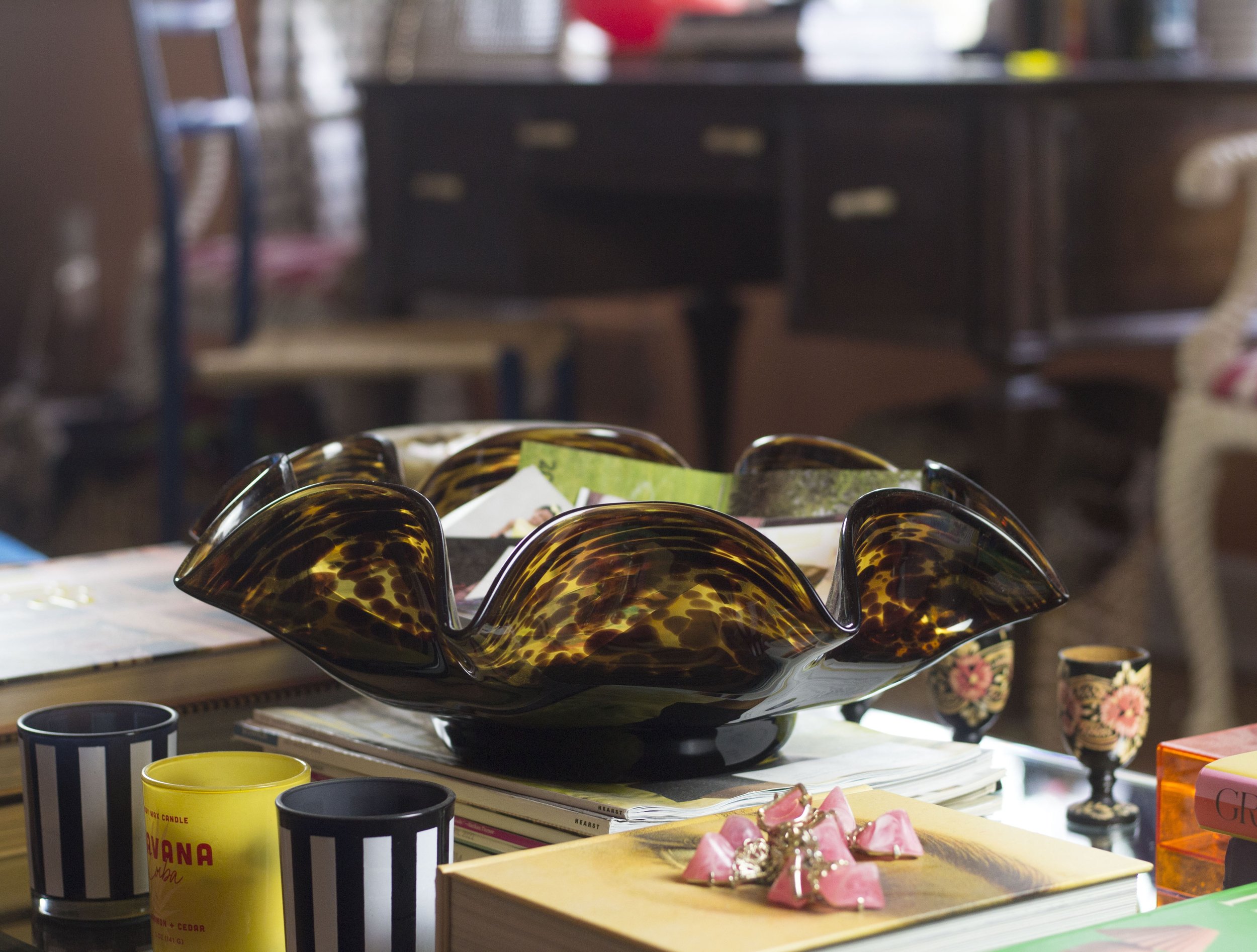
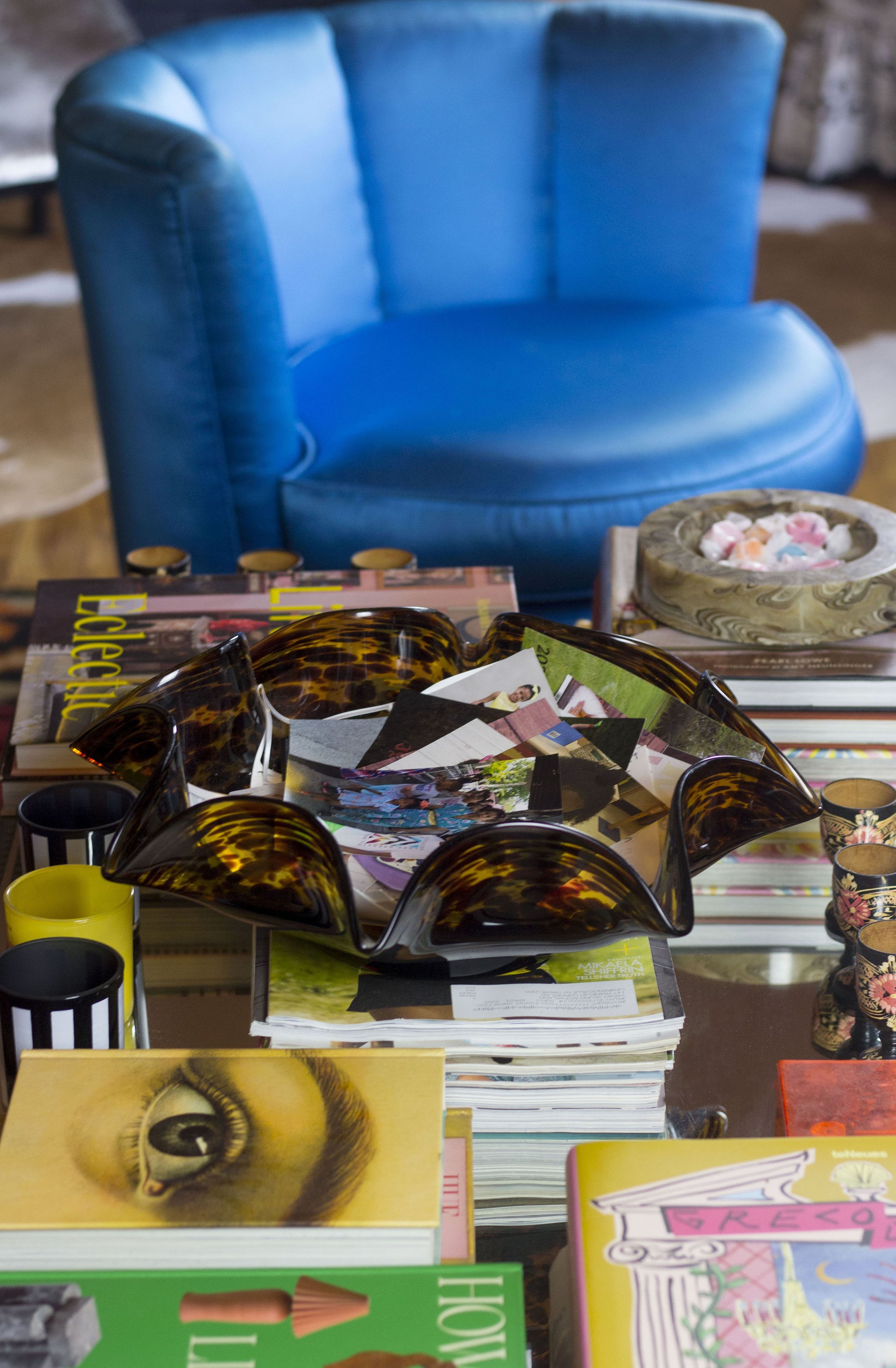
tortoise wavy glass bowl

Years ago when my teenage niece visited my two-bedroom apartment in a very builder’s grade apartment complex, she commented, “my friend [who lives a few doors down] has the same apartment as you…but yours looks so different…Hers is like a box.” My perceptive niece was referring to the contrasting approaches her friend’s family and I had to home design. In typical maximalist fashion, my apartment was filled with color and things. And while I didn’t see her friend’s apartment, I assume the family either wasn’t into decorating and/or didn’t have the (emotional) resources to create a sense of home. 

For some, decorating is not a priority; and simply having a home that meets basic needs for shelter and safety is enough. However, according to the design psychology hierarchy of needs created by design psychologist, Toby Israel, we can have a self-actualized home, i.e., a home that supports the best, most fulfilled versions of ourselves, only if certain needs are met. These include needs for shelter and safety, social and psychological needs, and aesthetic needs. 

While needs for shelter are basic and necessary for survival, psychological and social needs are also important but often minimized or overlooked. These are needs that meet our desire for a sense of love, belonging, and esteem, as well as a need for community and privacy. It’s deeper than just having a pretty home, it’s about having a home that supports us emotionally and allows us to integrate different parts of ourselves, particularly the parts that have been suppressed due to societal constraints. 

In her latest book, Designing-Women’s Lives: Transforming Place and Self, Israel highlights the challenges women architects and other female place-makers have had in creating human-centered projects within the context of a male-dominated field that values objectivity and rationality over subjectivity and emotionality. She proposes that women architects often have to neglect parts of themselves in order to be successful professionals. Nevertheless, many of these women have been trailblazers in creating human-centered spaces. These are spaces that are infused with empathy for people’s stories and elicit strong, positive feelings such as honoring marginalized women’s social needs by creating often overlooked private and social spaces, or otherworldly architecture that symbolizes higher ideals.

Israel summons us to follow the lead of these inspiring women by using our space to more consciously honor the aspects of ourselves we may have hidden so that the home becomes a “catalyst” for wholeness.  One of the ways to do this is to consider the objects of our home and the meanings they have for us. Notably, founders of the popular design website, Sight Unseen, and authors of, How to Live with Objects, Monica Khemsurov & Jill Singer, mirror Israel’s sentiments about using objects to create fulfilling spaces.

In their book, they write that “living with objects we care about–for reasons that transcend their basic function—is always something that has come naturally to humans.” It’s this ability to transcend design with objects and create spaces that reflect the highest versions of ourselves Israel urges us to strive for. As if Khemsurov and Singer plucked the information right out of Israel’s design psychology books, they assert that objects are part of our “personal emotional landscape” and “ reflect us”, “tell stories,” and “make us feel.” 

The authors go on to say, “Your objects can establish your identity...” In other words, in design psychology terms, the objects in your home, consciously or unconsciously, tend to symbolize your persona; and when you become conscious of these symbols you can more easily use objects to help achieve place self-actualization. The authors further reason that when “someone walks into your home and sees the items you live with, they may start to understand you better…and may even see commonalities between your interests and their own…” This shows how meaningful objects may also help to create connections and satisfy social needs. So if you are looking to include more specialized objects into your home, here are some ways to consider using them to create a more emotionally fulfilling space.

Identify objects in your home that you would not want to give up

tortoise wavy glass bowl

my Glass Bowl: I Adore it for its swanky 70’s vibe, reminiscent of something that would be displayed at a cool aunt’s house party.

If you were going through the design psychology process, you’d be asked to go through a number of exercises that help you to better understand your experience with place, including an exercise that helps you identify meaningful objects in your home. So consider the objects in your home that you’d have a hard time giving up; and determine why they are meaningful. This will help to bring your unconscious thoughts and feelings to the fore. 

Incorporate similar favorite objects from the past into your current space

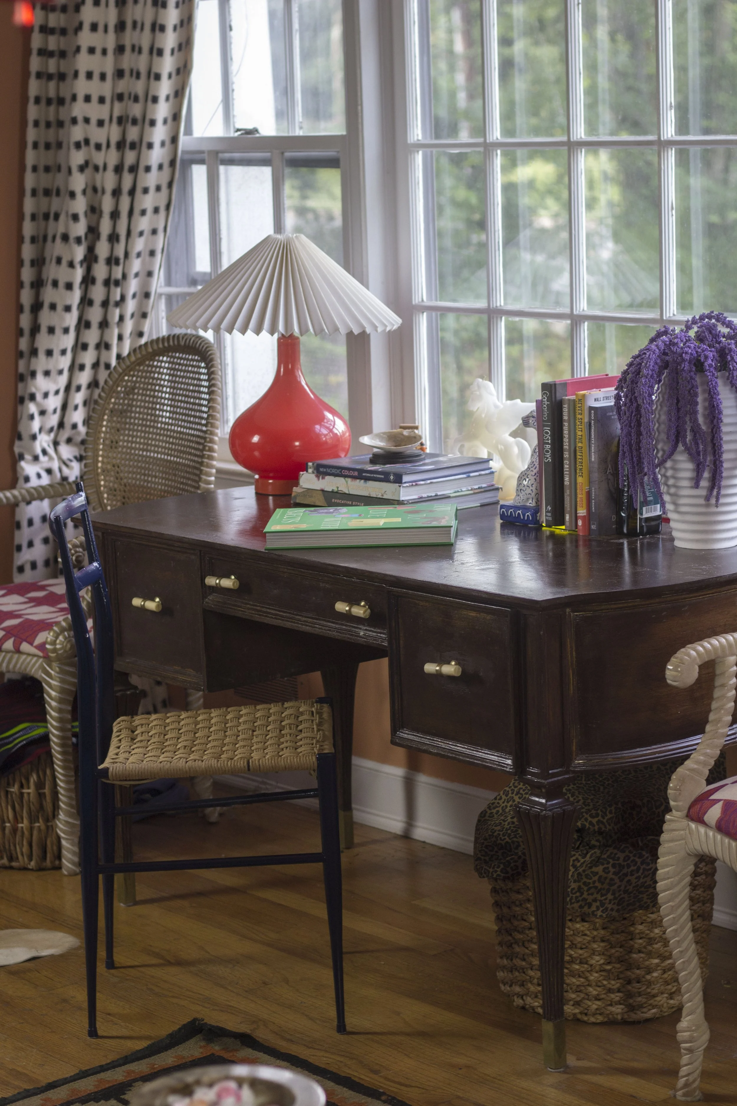
antique style writing desk

My antique writing desk: After painting it all sorts of colors and putting it in the garbage pile, we decided to keep it and now it’s part of our family’s story.

Perhaps you don’t currently have meaningful objects in your space, or you have very few and would like more. If so, consider favorite objects from past, and the reason they were meaningful to you. Then see if you can find similar objects to place in your current space. The objects do not have to be the same, they only need to  remind you of the objects you remember. Note that design psychology is not about re-creating the past, but rather it’s about capturing the essence of past beloved objects. 

Expand your search for meaningful objects

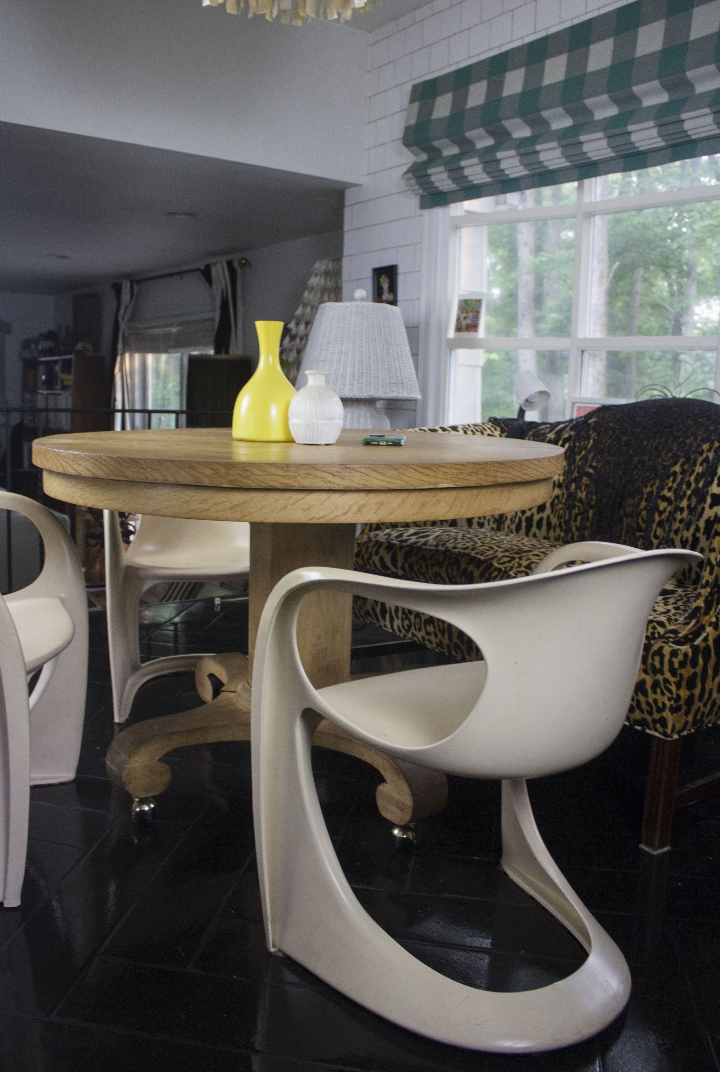
Pedastal table

My 1930’s pedastal table: my husband spent a lot of energy striping it , so it’s definitely not going anywhere anytime soon.

Not sure where to find meaningful objects? Many special objects can be found in unexpected places, so don’t rule out any store. Nevertheless, many objects with soul can be found secondhand; and there are a plethora of vintage stores online you can peruse. Often, however, when you go to vintage stores or flea markets looking for a specific object, you’ll be hard pressed to find it. So you will need to have a little patience and trust the process.

Resist the urge to buy an object just to fill up space

Empire style stool

My Empire Style stool: It has a wordly, expresive vibe that was part of my ideal home statement.

This brings me to my next point which is don’t just buy any object because you need to fill the space. If you are looking for carefully curated objects that mean something, and are a reflection of you, then leave a space empty until you can find the “right” piece to fill it. The empty space will be a reminder of what’s to come; and will reduce the chances that you will stop looking for the object because you’ve replaced it with something else.

Use Your Personality Style to Create the Perfect Outfit

Of course we know there’s no such thing as perfect, but you can put together an outfit that’s perfect for you with increased self-awareness and a working understanding of your personality style. Personality is complex and beyond the scope of this little blog post; but for our purposes, you can break personality down into three major categories. They include the following areas:

  1. Extroversion (get energy from being around other people; thought of as outgoing) to Introversion (get energy from alone time and thoughts; thought of as more reserved)

  2. More conscientious (engaged and attentive) to less conscientiousness (more laid-back and carefree)

  3. More open to experience (take risks and are psychologically flexible) to less openness to experience (more comfortable with the tried-and-true or what’s familiar)

Keep in mind that simplified personality tests which place us neatly into either of these three categories are only meant to be a starting point. We usually fall somewhere along the continuum of these and other personality components. But for the sake of picking outfits, these will do for now.

According to research in the Frontiers in Psychology journal, personality traits, body image, and clothing choices are related. So let’s break down some of the research results.

Women who were extroverted with an openness to experience preferred an “urban style” of dress (i.e., more eclectic and playful). They were creative and unconventional and preferred fashion brands perceived as “cool”, “exciting”, and “adventurous.” Those who were more conscientious tended to be self-assured and individualistic in their fashion choices. And women with all the above personality types were less likely to feel the need to camouflage their bodies, possibly feeling sufficiently unbothered by body ideal pressures.

On the other hand, those women who were more introverted with a low openness to experience and a desire to try to camouflage (related to poor body image) favored a minimalist style (jeans and a t-shirt).

While the research results do not account for every aspect of personality, we can extrapolate from these findings. Essentially, the better women felt about their bodies, the more likely they were to use clothes for self-expression and enjoyment. And those who did not attempt to camouflage their bodies, presented with a more positive body-image. They also had a tendency to be more extroverted, conscientious, and open to experience.

This does not mean these personality traits cause you to feel better about your body. Rather, it means that the presence of these personality traits along with more self-assurance may allow you to feel freer to express yourself without feeling the need to hide away.

So whatever personality style you have, with a positive body image, you can create outfits that support it without feeling a need to make yourself smaller. I’ve put together some outfit choices for different personality traits that of course can be worn by anyone looking to express or enhance their positive body image. Note that I have taken some creative liberties and it’s not an exhaustive list of possibilities. It’s only meant to get you started.

Outfit 1

Personality type: extrovert, openness to experience, conscientious

red sparkly dress with white shirt and tie

Dress explanation: a sparkly red dress and sparkly shoes are attention-grabbing, and capture the extroverted spirited as well as a willingness to try something new. The white shirt and tie is characteristic of the organized, detail-oriented (aka conscientious) among us.

 Outfit 2

 Personality types: introvert, open to experience, less conscientious

Tan maxi skirt, tan top, tan shoes

Dress explanation: the neutral color scheme reflects a calming, introverted vibe. The modern cuts suggest an openness to experience, and the mules are laid-back, similar to someone lower in conscientiousness.

 Outfit 3

Personality: extrovert, less open to experience, more conscientious

 Dress explanation: an all pink outfit grabs attention for a more extroverted vibe. The matchy-matchy look is perfect for someone who likes to stick with the tried-and-true, and details such as ankle ties on the shoes show glimpses of conscientiousness.

Do any of these styles fit your personality type?

Kips Bay Decorator Show House NYC 2023: 12 Mood-Boosting Decorating Ideas You'll Want to Try in Your Home

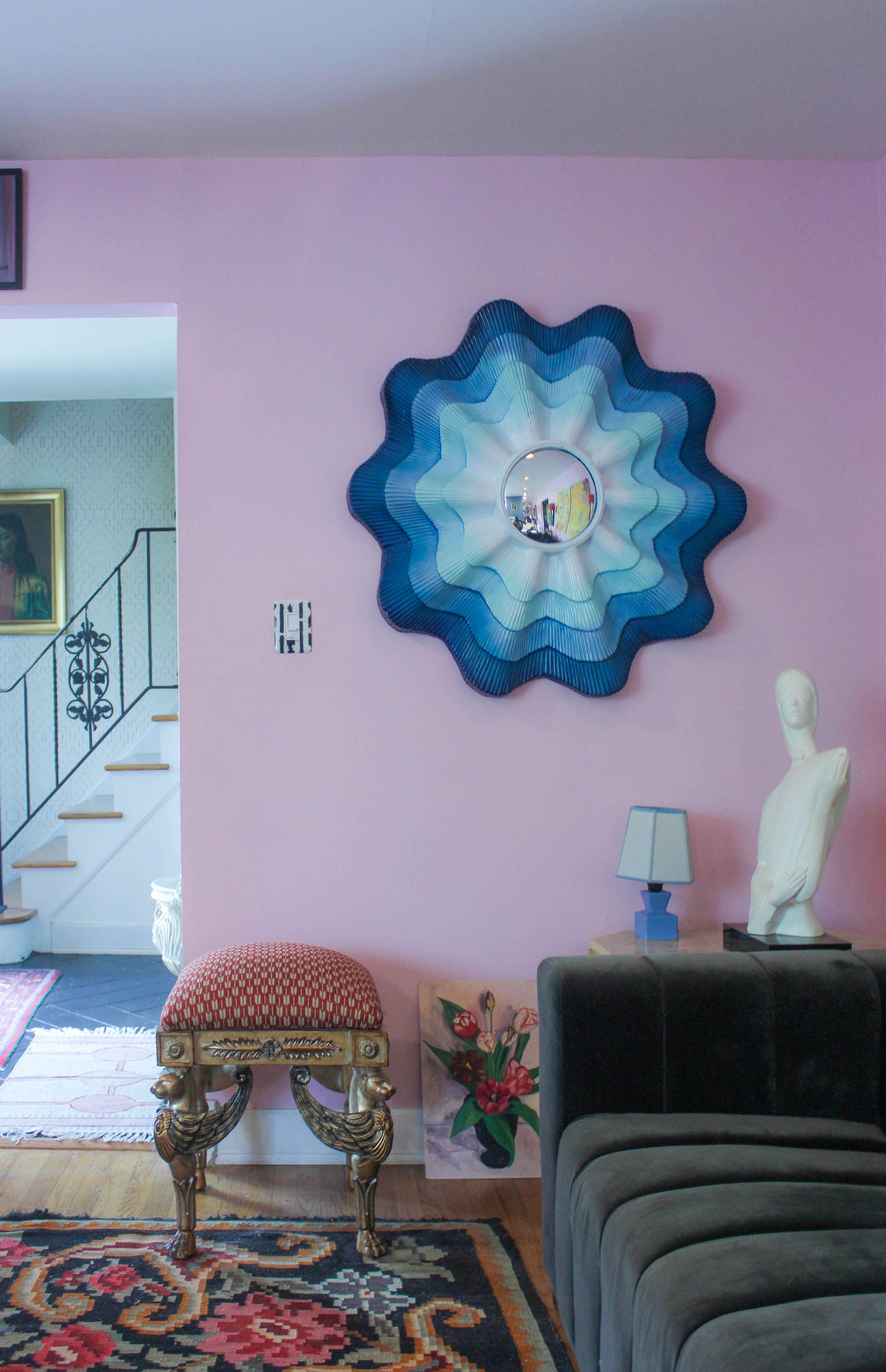
Misha Kahn Ammonoid Epsilon chair & Chris Schanck, Eye of a Little God mirror

What’s your favorite place and why? When I was asked this question, I reached far back into my childhood memories, and recalled a grand home I visited with black and white checkered floors, a stately staircase, and high ceilings. There was something about the grandeur that appealed to me. It felt far removed from the suburban split-levels I was used to seeing, and I could fantasize about the wonderful life I thought people had in those homes. 

Whatever our favorite places are, they tend to be ones that trigger strong positive emotions, and wake up our senses. In fact, the most impactful rooms work hard to spark all five senses because we’re likely to remember and possibly be transported by them. The Favorite Place Guided Visualization exercise developed by design psychologist Toby Israel, invites us to visualize our favorite place and the objects in it using as many senses as possible. She writes, “Look carefully around…Notice the colors. The shapes…Pick it up if you want to…What do you hear?... Remember the smells around you…” All of this helps us more fully connect with favorite places, and we can use the elements in them to help boost our mood in our home. 

If you’re having difficulty recalling mood-boosting spaces, you can always expose yourself to the work of interior designers or decorators passionate about creating memorable spaces. Notably, the Kips Bay Show House never disappoints when it comes to well-designed, creative spaces with meticulous attention to detail. This year’s show house rooms were full of texture, sounds, colors, and tastes (we couldn’t eat the cupcakes there but I sure wanted to) that definitely boosted my mood. I took snapshots of 12 decorating ideas to try in your home—see if you can find more.

Add bits of fantasy

Holographic seashell bed by John Pomp Studio
banquette in pink fur fabric from Start Carpet
draperies with bows and tassels from Fabricut

 If you’re looking for a room that feels like a cross between The Little Mermaid and Marie Antoinette, this is it. Designed by Sasha Bikoff of Sasha Bikoff Interior Design, the room is titled, Fantasy of Flight; and is exactly what you’d expect from a room inside a cozy seashell. The walls are covered in shades of effervescent pink and purple clouds; banquette seating covered in pink fur; and opulent drapes with bows. And that holographic clam shell bed is a definite showstopper. You can’t help but want to stare at every inch of the space.

One way to add a bit of fantasy into your space is to cover all four walls in a printed wallpaper, ala Bikoff style. Use a print that really speaks to you personally and preferably encourages daydreams. You can also opt for something more simple, like a large piece of artwork that captures your imagination.

Use more than one colored tile in a space

 Sometimes picking tile colors for a room is like eating potato chips, it’s hard to have just one. In this modern bathroom designed by Ahmad AbouZanat  of Project AZ, he used painted brick in two different colors to create boundaries between spaces. AbouZanat calls the bathroom “Untitled” to allow for the user’s “unbiased, emotional reaction”; and refers to an “ode to simplicity” and “a romantic, understated luxury.” It feels earthy and urban as the colors are drawn from the outside of the home.

The rust and white colored tiles creates visual symmetry and a sense of order that can possibly make you feel less stressed and hence, in a better mood. It’s great for smaller bathrooms as it creates the illusion of separate spaces without having to put up physical walls. If this is appealing, try separating your bathroom into sections using different colored tile in a similar manner. You can also install the same tile in different directions to create interest.

 Mix bold patterns

Navy Mary McDonald Portail Francais Fabric
Yellow chair with skirt

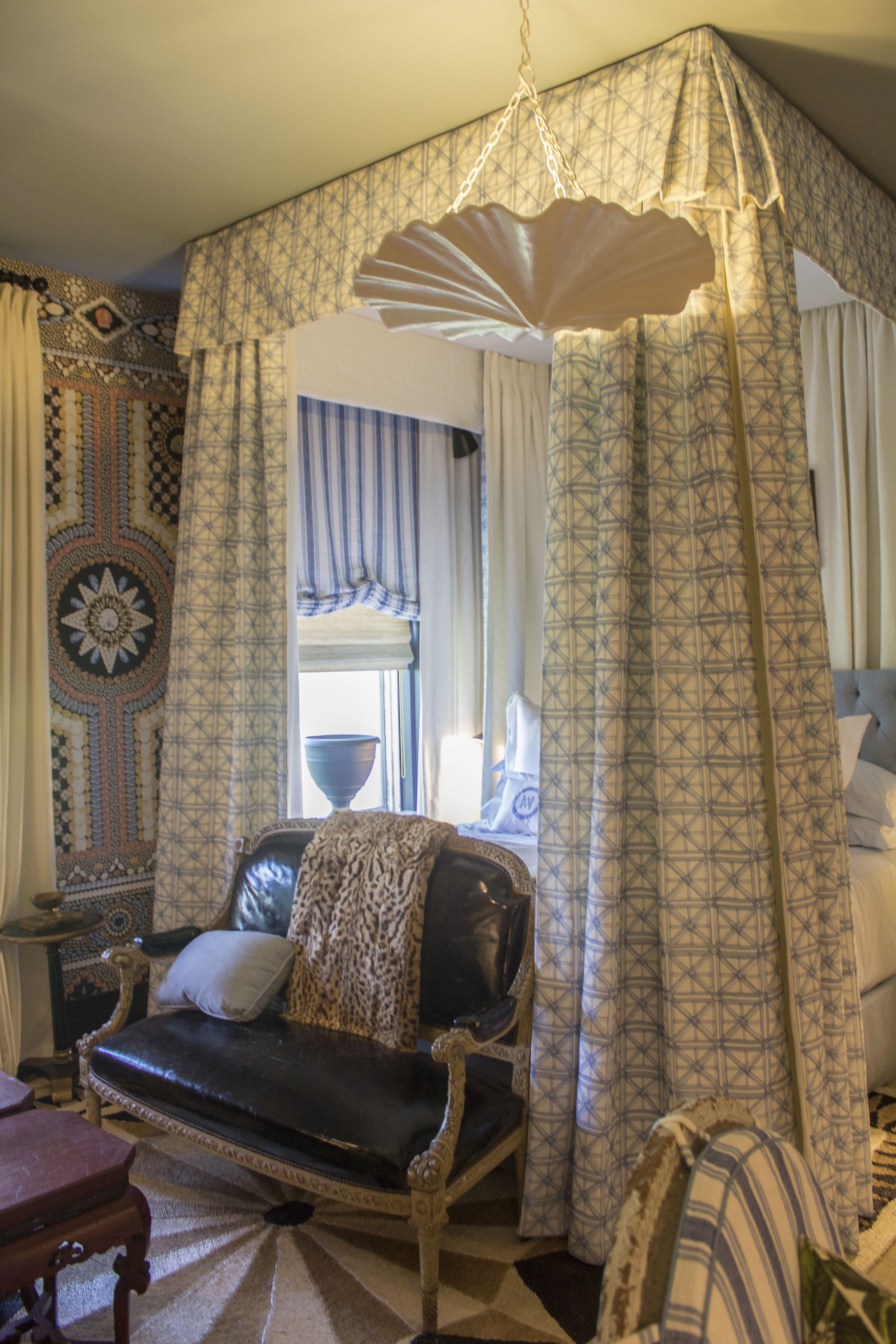
Mixing bold patterns can be challenging if you’re not sure whether they go well together. Mary McDonald of Mary McDonald Inc. Interior Design, does it in an awe-inspiring way that feels visually stimulating but not chaotic. She used an extravagant Shell Grotto wallpaper, against striped and geometric prints, and they all work together. Upon closer inspection, you see it isn’t just a random mashup of prints and patterns, but it’s all about being aware of scale and how the eye reads it.  

For instance, the busy printed wallpaper with large geometric shapes works well with smaller patterned or less busy fabrics in the room as the shapes do not compete, and the eye gets to take a break as it switches back and forth between prints. The eye also rests on solid fabrics throughout the room like the large area rug; the yellow chair, and the deluxe leather settee. To start, find two bold patterns samples you like, and put them side-by-side to get your gut reaction. If it feels like they could work together, figure out why. This will help to sharpen your eye.

 Add curved furniture and bright colors

yellow curvilinear coffee table

According to research, curved lines are associated with comfort and friendliness, great elements for mood-boosting. And this bright, modern living room created by Ghislaine Vinas, has curves galore, a definite pick-me-up. Not surprisingly, she calls it the “Good Spirits” room. The curved theme carries throughout the space, from the curvilinear coffee table to the black circle on the ceiling which acts a kind of faux medallion for the light fixture.

I enjoy Vinas’ restrained, yet impactful use of color. Warm colors like this brilliant yellow coffee table tend to be energizing (think of the energy from the sun); the black and white accents are strong enough to match its energy; and the large black abstract geometric prints on the wall add more unexpected touches to the room. But there are also cool and neutral colors like the blue chairs and tan plaid printed walls that prevent the room from looking too severe.  And we can’t forget the large crying baby print. While some may not consider this a mood-booster, it creates really interesting tension that gives the room another jolt of energy. You can start by incorporating bright colored curved accents into your room to give it a boost.

Try patterned tiled floors

geometric tile floor

A room with patterned floors may very well brighten your day. Notably, straight, pointy shapes tend to be energizing, and can give you the right energy to start your day. This black and neutral-colored geometric patterned floor by Neal Beckstedt of Neal Beckstedt Studio would look great in an entryway or a bathroom. And it goes well with other patterns and textures like this stone patterned wall.

 Fill your table tops with items you love

You can easily go to any big box store and get trendy pieces to put on your tables; and while I love a good trend, it may not be as fulfilling. Decorating your home with objects you love is important to meeting psychological needs of love and belonging as well as aesthetic needs. This table top, created by David Scott of David Scott Interiors, has a worldly, traveled vibe. Take note of the ways the different heights, textures, and shapes create interest. And a shell tassel casually draped over books makes the vignette more dynamic. 

Give them something they can feel 

White boucle couch
green vine printed carpet by the Rug Company

There’s something to be said for a room that makes you want to reach out and touch all the furnishings. That’s how I felt when I saw this cozy room designed by Kesha Franklin of Halden interiors. She calls it the Heart of the Vine room and describes Vine as “connection, strength, dedication, and friendship” all qualities that will bring joy even during difficult times.

The couch, pillows, and draperies were fully textured, creating an enveloping feeling of warmth. And the vine-like patterned green carpet, which Franklin designed for the Rug Company, along with the hand painted wall covering truly creates an enchanting experience. The palette adds depth to the room with soothing colors like dark green to pale yellow green. And again we see the emotional impact of an oversized photograph, a relatively inexpensive way to add drama. To add texture to your space, start with heavy draperies and pillows (they did wonders for Halden’s room) to create an abundant feel.

Create an emotional reaction with neutrals

Robert Thomas Lounge Chair and Ottoman withRobert Simon Fine Art Old Master Painting

When we think of mood-boosting rooms we tend to think of bright colors. But neutrals have their place too. Depending on your experience with neutral colors, it typically evokes a sense of calm and takes a back seat to the brighter colors in a room. But interior design duo, Sawyer and Berson of Sawyer Berson Architectural and Landscape Architecture created an entire room using neutral textures, including walls covered in neutral suede panels.  I felt intrigued by the room with its modern, understated, yet dramatic elements. I love the way the Old Master painting just captivates the space. Overall, a luxurious, restrained mood-booster. If you decide to try an all neutral room, make sure to include different textures and tones for interest.

Make your kitchen feel like a living space

pink banquette and marble dining table; picture by Robert Polidori of a 2000 year-old mural from the ruins of Pompeii

They say the kitchen is the heart of the home; and even if you aren’t much of a  cook, you can still make it cozy. Wesley Moon of Wesley Moon Inc. put a couch in the kitchen, making it feel as cozy as any living room. Even if you don’t have room for a couch or settee, you can incorporate smaller furnishings like a table lamp or unexpected artwork to give it a homey feel. 

Try opulent details

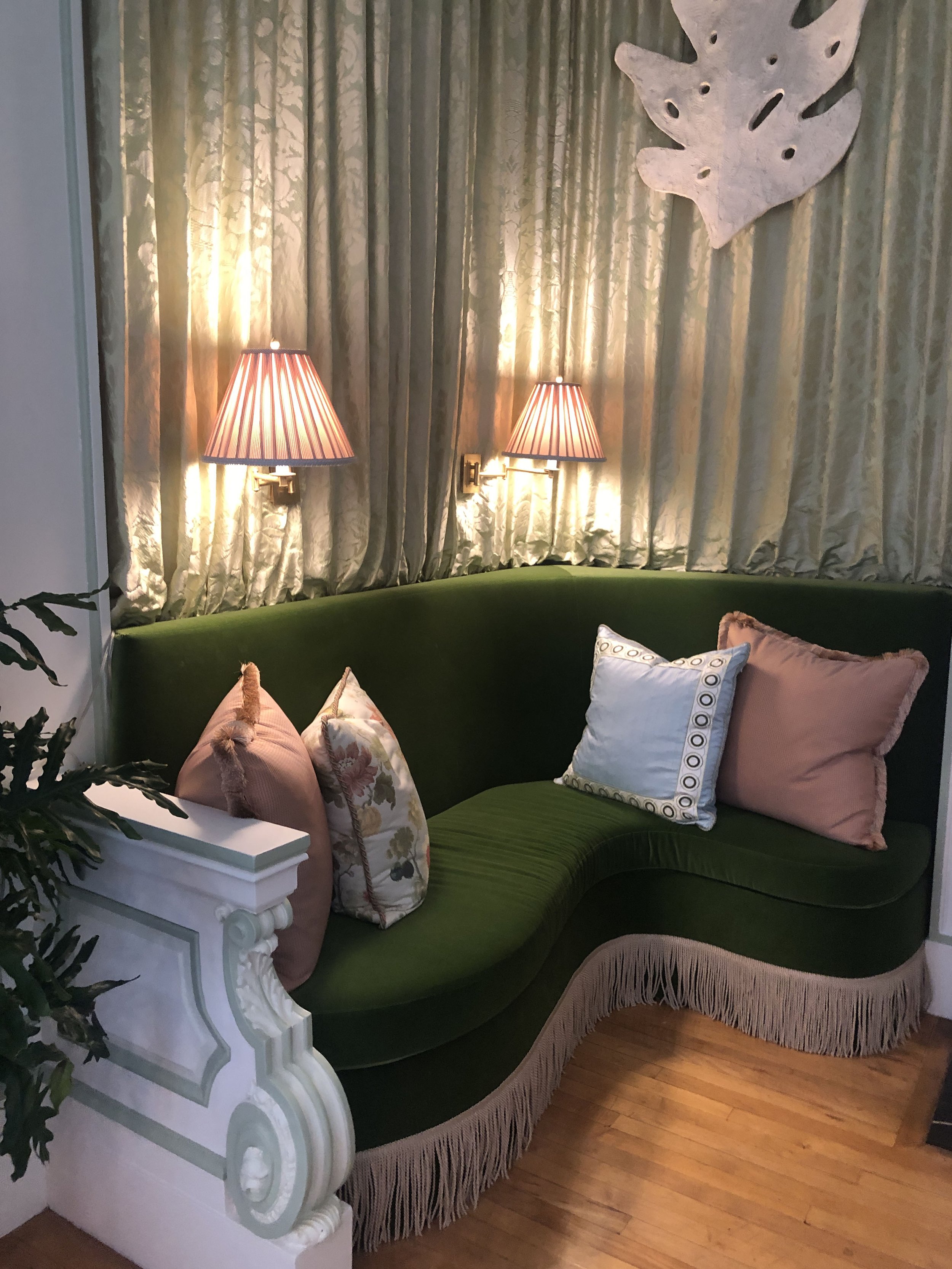
olive green banquette with tassels

Even in a largely modern room, including small opulent details can add a little extra something that livens up the space and your mood. Interior designer, Timothy Corrigan, used tassels, painted molding, and pleated fabric to create opulence. He calls the room “Spring Fever” and the florals and pastels definitely make it feel fresh and light. The dark green settee works perfectly well in the spring and the cooler months. 

Decorate your door

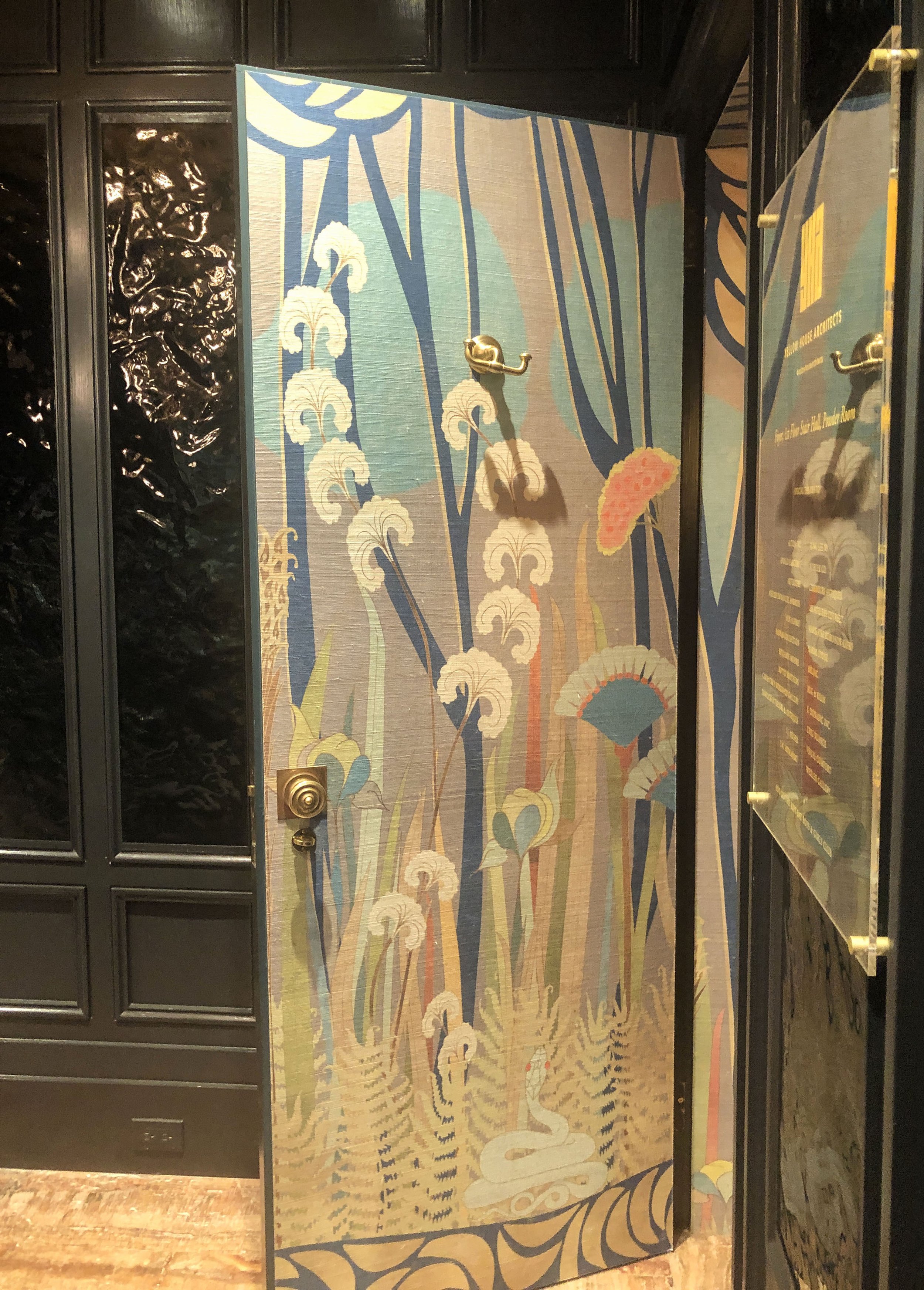
blooming wallpaper on door

While walls get all the attention, doors can sometimes be neglected. But not by the designers at Yellow House Architects. They designed the lobby of the show house as well as this show-stopping bathroom they call “Enchanted Seduction Powder Room”. The textured floral patterned wallpaper engulfs the bathroom for a “wow, come see this” reaction. And did you peep the patent leather wall covering on the lobby walls? I couldn’t help but want to touch it, and think it would make a really cool door covering too. 

Create an art installation using books 

Using books as art isn’t new. But finding unexpected ways to use them requires flexibility and creativity. Interior designer, Jay Jeffers, painted a row of books on the bookshelf to blend seamlessly with the wall paint in this stylish library. It’s as if someone just painted the books with the wall; and feels edgy and fun— a great conversation starter for sure. Also, stacking the bookshelf with both books meant to be read and books as art feels really easy-going, and shows how a little ingenuity can bring joy into a study.

Want Inspiration for Your Space? Try Turning Outfits into Rooms

Design and fashion psychology are not all that different. One uses psychology to create emotionally supportive spaces, and the other uses it to help people create outfits that support the better versions of them. Our spaces and clothes don’t just help us survive, they are also extensions of our identity; and many aspects of ourselves can be reflected in them—our personality traits, our mood, our goals, and aspirations.

I’d say one thing that differentiates putting together outfits and putting together rooms is the sense of permanency we feel when we decorate spaces. We can more easily switch out an outfit than we can a couch; or wallpaper that cost a pretty penny, not just to buy, but to install. Studies show if there is a large gap between the conditions of someone’s home and the expectations they had for it, the person will likely be dissatisfied. So it would seem we risk more when we decorate spaces than when we assemble outfits.

Considering the relatively high cost of decorating, what is one way that we can be more intentional about how we design our space? How can we best design a space that meets our psychological, social, and aesthetic needs, just to name a few? One way is to be more attuned to what inspires us. Inspiration can come from anywhere; and while we may be aware of what stimulates us, we may not always be able to articulate the reason. The elements of design we respond to are often connected to high positive associations between our experiences and the spaces they occur in. In other words, life happens within the context of design. An experience from childhood that is intricately connected with a certain color or design style can have a strong impact on our aesthetic, even if we are not aware of it.

In an attempt to get inspired, I turned to vintage pics to create virtual rooms. I love history, and I’m especially drawn to pics that remind me of my cultural background. Both my parents were raised in Jamaica, and my father is half-Chinese. During their young adult years, my parents relocated to England, and started our family there. My older siblings were both born in England, but I came along much later after my parents moved to the States. As the only one in my family born in America, I have quite the mash-up of cultural experiences. I’ve had the privilege (although it didn’t seem like it at the time) of moving through different cultural spaces— Black culture, White Culture, Jamaican culture, and Jamaican church culture. I’ve seen a lot; and these multicultural experiences have certainly shaped my aesthetic. So I’ve managed to take these vintage pics from Blackarchives.co, and turn them into a room that inspires and feels like something I could really live in. Not only did I use their outfits as inspiration, but the I considered the vibe of the entire picture. Check it out below.

This picture reminds me of the Carribbean— with all it’s blues, mints, and turquoise. I imagine everyone heading to church; and the children yearning for church to be over so they can eat dinner. But don’t even think of drinking or having dessert until after you finished eating everything off your plate! This imagery inspired the “Dumplings before Dessert” dining room. (photo by Otto Stupakoff via Blackarchives.co)

Dumplings Before Dessert Dining Room

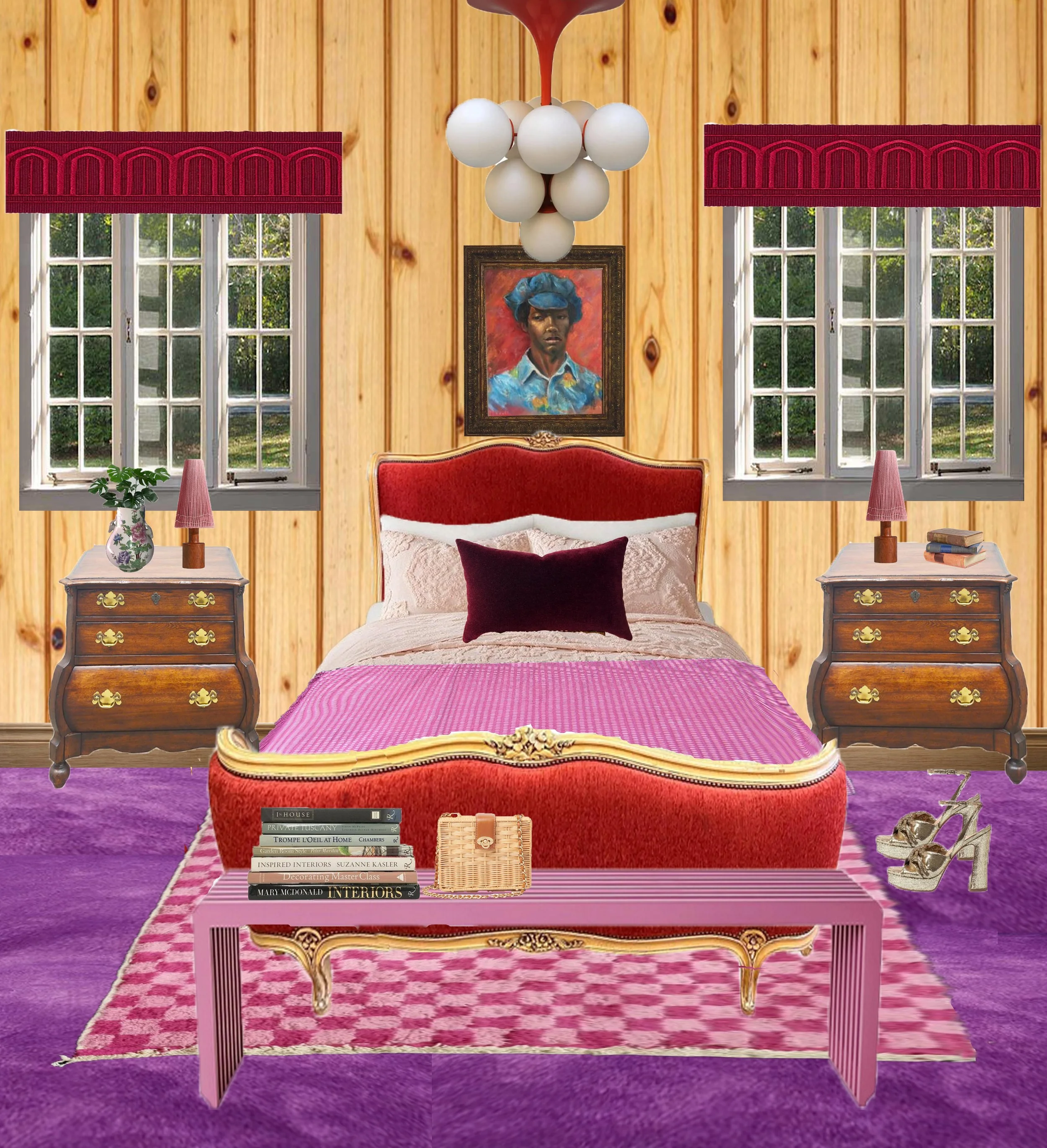
This man is fully decked out, and no one can tell him otherwise. He’s gonna give you all those reds, pinks, and purples—so be sure to take notes. I once read a study that showed African-Americans are more likely than other subjects to focus on appearance. And without getting into all the historical, sociopolitical reasons why that might be, it makes sense that appearance would be very important to a people group who have been oppressed or discriminated against for the way they look. This picture inspired me to create a smorgasbord of pink, purple, and red with super confidence. I’m calling this one the Ya Dig bedroom for obvious reasons. (photo by Michael Horsley via Blackarchives.com)

Ya Dig Bedroom

I’m not sure where these young people are going, but I imagine at least some of them are being forced (yes, I said forced) to attend week night service. The church skirts give it away—lol. I grew up in a time where parents made their children go to church multiple days of the week. This was often the case with Caribbean parents who used the church not only to meet spiritual needs, but to meet the social needs of their children who may otherwise get caught up in some negativity should they be left at home alone. For this room, I attempted to capture the feminine ruffles with the edgy leather. I’m calling it the Week Night Service Living Room. (photo by ? via Blackarchives.com)

Week Night Service Living Room

I really enjoyed this process of turning outfits into rooms. How about you, would you ever give this a try? If you are interested in the links to my sources, see below.

Dumplings Before Dessert Dining Room

wallpaper; floor; table; abstract picture; portrait; chandelier; head vase; dining chairs; side chairs; blue cabinet

Ya Dig Bedroom

carpet; knotty pine wall; portrait; bed; rug; bench; side tables; lamps; chandelier

Week Night Service

carpet; wallpaper; sconces; chandelier; side chairs; couch; coffee table; portrait; abstract art; side tables